This mom found something strange in her kid's Halloween candy. Could it be cause for concern?
Halloween is a favorite among kids. They get to dress up, stay out late, and above all, get lots and lots of free candy.
But as a parent, it's important to be vigilant when it comes to what strangers are handing out. If something seems off, it's better to throw it out than let your child eat it.
Is this a KitKat?
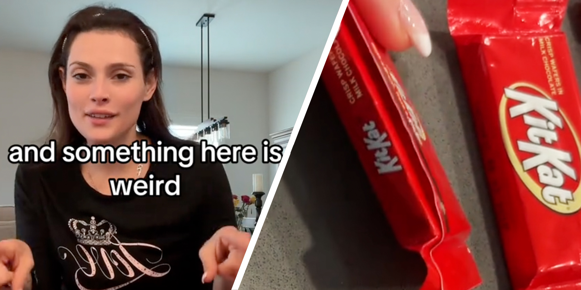
In a viral video with more than 3.6 million views, a mom and TikTok user, Isabelle, explains that she was going through her daughter's hefty candy haul when she noticed something weird.
Isabelle seems to have a methodical way of inspecting her child's candy, grouping together all the same candy types and sizes to make sure nothing is off.
She had about 20 KitKats of varying sizes laid on the table and noted that "something here is weird."
"One of these things is not like the other," Isabelle says.
As she pans over the red-wrapped chocolate wafers, one sticks out. The oddball is missing some extra words in the upper left corner. But the big difference is that the logo has changed, no longer featuring the signature cream oval.
Other than that, the rest of the labeling on the underside of the candy, like the batch number and tagline, were pretty much the same.
"I wouldve thought it was tampered with," a commenter said.
But Isabelle clocked it as being the new KitKat logo the brand launched earlier this year.
"I love that in crazy times we all come together to still talk about something simple like new candy packaging," Isabelle told T=the Daily Dot in an Instagram direct message.
@belleboo @KITKAT did i miss the memo? Are these your new logo?! #kitkatnewlogo
♬ original sound - Isabelle ❤️
Does KitKat have a new logo?
KitKat has a new, retro look (isn't that an oxymoron?), at least in the United States. That's because in the U.S., KitKat is licensed by Hershey, while it's under Nestlé everywhere else.
Creative Bloq noted that the retro look is in right now, citing similar brand changes from Goldman Sachs, the New York Jets, and DC Comics.
The new logo has more streamlined colors, removing the yellowy cream once prominently featured, and they chose to go with a thicker brown shadow around the KitKat lettering.
"The thicker letters look like they would give a loud snap if broken in two," journalist Hunter Schwarz wrote for Fast Company.
Aside from that, the new logo stays pretty true to the original design, still remaining recognizable but updated.
Fast Company noted that the rebrand came as Hershey tried to increase candy sales after the CEO noted that people were pulling back on discretionary spending.
Keeping candy safe
If you're a parent still sorting through your child's mounds of sweets, here are a few tips from the U.S. Food and Drug Administration (FDA):
- Check labels for potential food allergies.
- Chuck items that aren't commercially wrapped (like handmade goods).
- If you have very young kids, remove choking hazards like gum, peanuts, hard candies, and small toys.
- Inspect the packaging for tampering. Things to look out for include discoloration, pinholes, and tears in the wrapper.
Commenters react
"That’s a temu KitKat," the top comment read.
"You guys go through the candy? I be eating it as soon as I turn around. If I die, I die happy," a person said.
"My daughter also got one of those and I thought it was so weird lol," another wrote.
Update 8:55am CT, Nov. 6: “Talk about a breakthrough! @bellebo is one of the very first to get their hands on our brand-new KIT KAT® Snack Size packaging! We love that it’s being shown off in style – can’t wait to see more of our fans breaking it in!” a KitKat spokesperson said in an email.
The Daily Dot reached out to Isabelle for comment via Instagram and TikTok direct message.
Internet culture is chaotic—but we’ll break it down for you in one daily email. Sign up for the Daily Dot’s web_crawlr newsletter here. You’ll get the best (and worst) of the internet straight into your inbox.
