U.S. soccer fans are not happy about how their men’s national team is looking on the field. And that doesn’t just mean with how they played in their most recent friendlies to prepare for the upcoming World Cup.
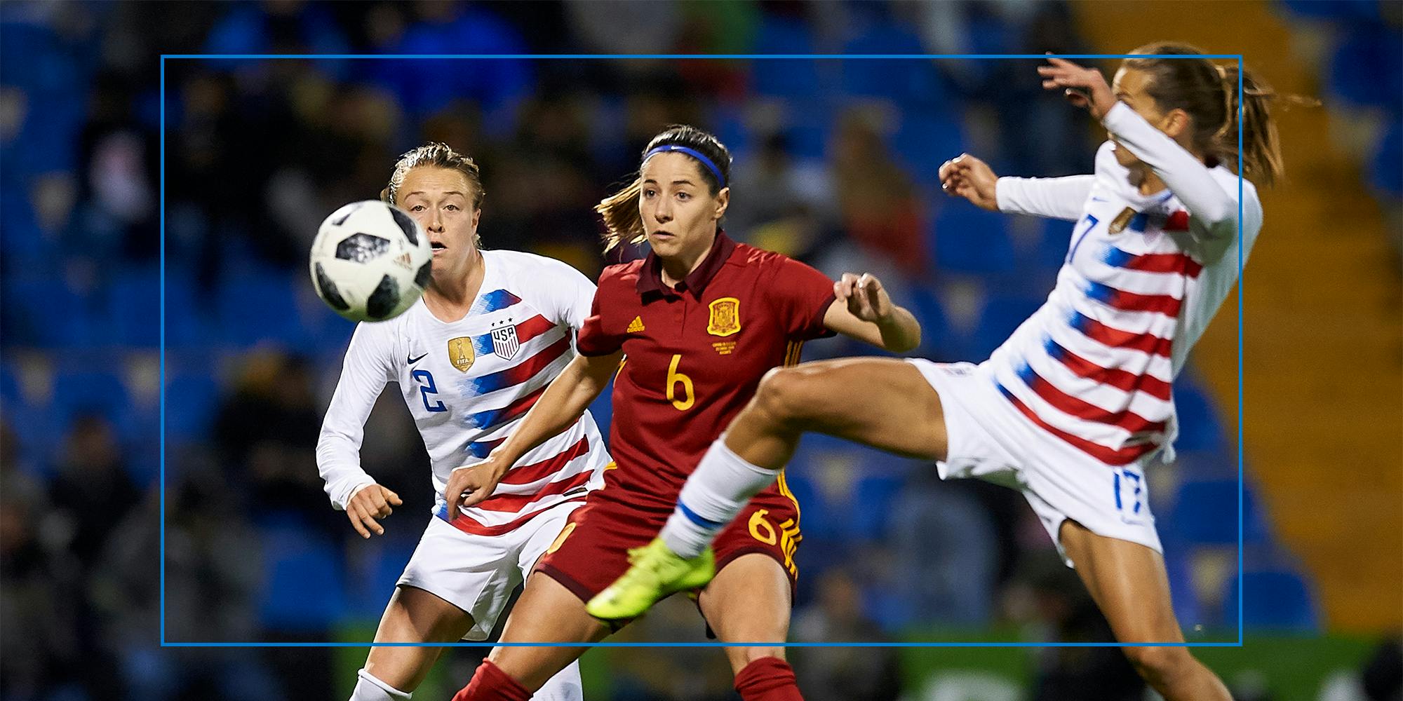
Nike’s Sept. 15 launch of the jerseys—or “kits,” as some soccer fans dub them—was met with widespread disappointment from U.S. soccer fans on social media channels. Then, fans got to see the TV debut of those new jerseys in a pair of European-hosted matches—a dismal 2-0 loss to fellow World Cup contestants Japan on Sept. 23 and a lackluster 0-0 draw to Saudi Arabia four days later—confirming for many that the jerseys did not, as is the hopeful phrase used when fans are trying to assess jerseys in the maybe zone, “look better on TV.”
And throughout the U.S. and even around the world, some people thought: We can do better than this.
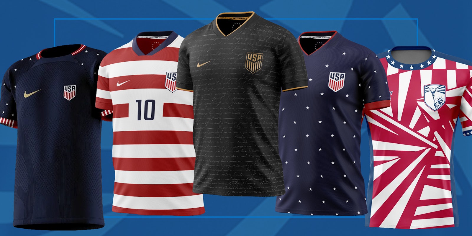
Independent graphic designers, responding to the dissatisfaction fans are voicing, took to social media platforms to share visions of what could be. And thanks to partnerships these designers have forged online with kit-producing entrepreneurs, the jerseys don’t just live in pixels on a screen—they’re being transformed into fabric and sold to fans who want to rep the U.S. in something they feel is superior to what Nike’s offering.
It’s not that Nike isn’t articulating a clear vision of what they’ve aimed for in outfitting the men’s and women’s national teams this go-around. In marketing language aimed to gin up enthusiasm for the kits, Nike claims the new predominantly white home uniform is “anchored in a timeless red, white, and blue color scheme, while drawing inspiration from the United States’ diversity and storied legacy across a variety of sports, leagues, and associations,” whereas the blue away kits “employed a unique ice-dying technique to create a vibrant, youthful print that brings the jersey to life.”
But even the people who will be wearing them in front of an immense global audience aren’t quite ready to match that scripted enthusiasm.
‘They’re not my favorite’
Kellyn Acosta, likely to make the U.S. squad that will play in Qatar next month, dished about the uniforms in an Oct. 1 Soccer America interview in which he fell considerably short of endorsement.
Acosta—asked “How do you feel about the jerseys?” in the interview—remarked, “They’re not my favorite. Personally, they’re fine. They’re fine. But I wanted it to be something more extravagant, something more out of the ordinary. Adidas dropped a lot of these new jerseys for the World Cup and they’re so cool. Ours felt plain.”
Then, he added, “It sucks when you see the custom jerseys made online and you’re like, ‘Dang, that would’ve been sick if we had that.’ But it is what it is.”
Pressed further on the online designs he liked, he observed, “I saw hoops, black jerseys, quite a few. People are creative. I liked the hoops the most. You saw that and knew it was the States. You look at our jersey now and you’re like, ‘OK is that France? Who is that?’”
“You want to know that it’s us who’s playing without realizing it,” he assessed. Noting the team wanted something “super unique, thoughtful and meaningful,” and adding that “Nike has done a great job with our jerseys in the past,” the inference from Acosta is he doesn’t think Nike’s done a good job in the present.
Designing ‘the proper set’
The day that Nike released their kits into the wild, Raleigh, N.C.-based designer Chris Bunn shared his vision via Twitter. Bunn had been underwhelmed with online leaks of the Nike jersey designs several weeks prior, and set about envisioning what could be, starting with the American flag as a template.
Bunn, 33, who does design for a software company as his day job, recalled that he “had some time on a Sunday morning and I wanted to like learn how to do something,” so took a whirl at a series of jerseys.
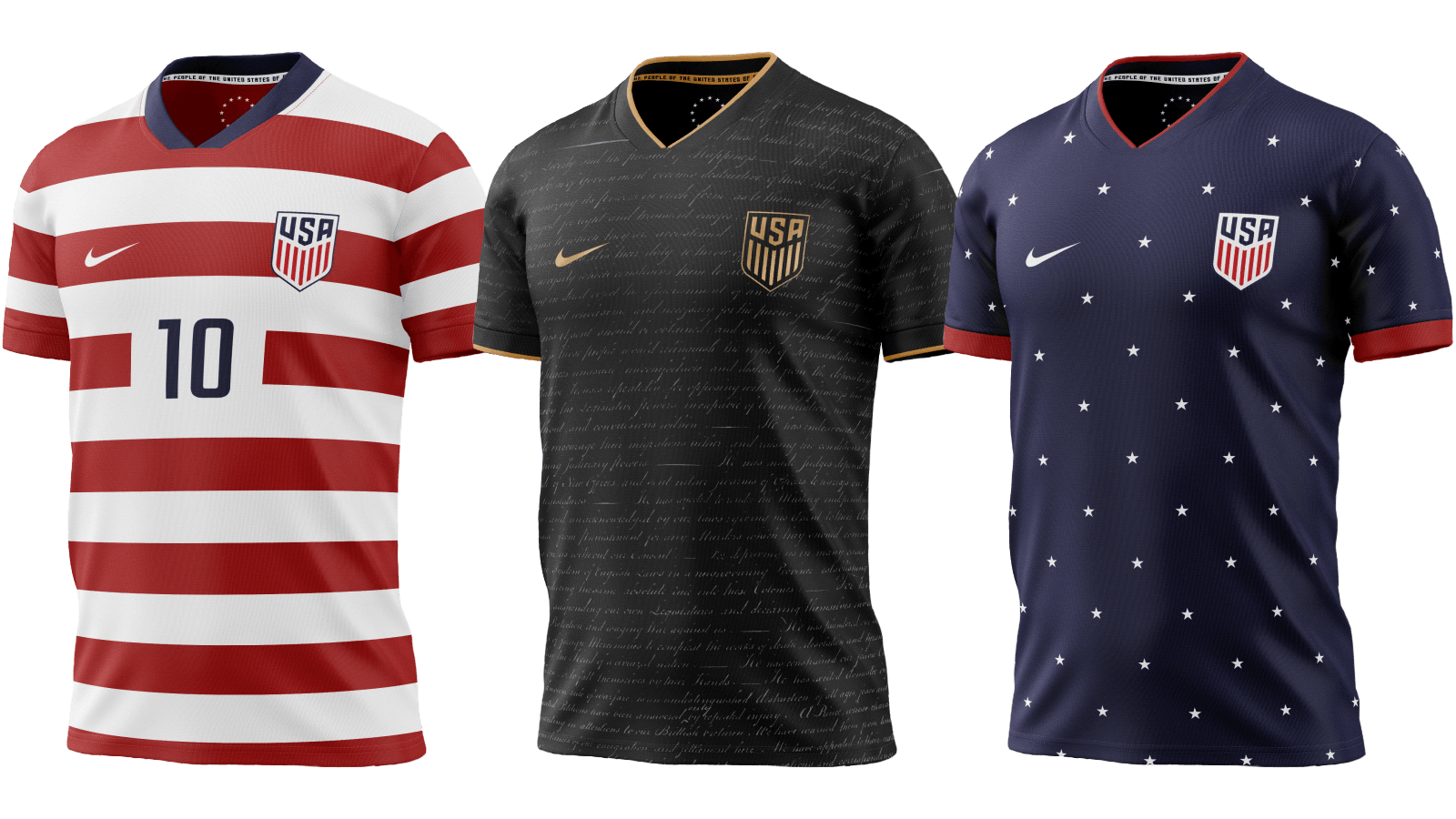
For the home kits, he modified what U.S. fans know as the “Waldo,” a white and red jersey with horizontal stripes (or, in kit parlance, “hoops”) released by Nike in 2012. A number of fans think it’s the best look the U.S. team’s ever had; American Outlaws board member Donald Wine, advocating for a default jersey that “screams America” in Black and Red United in 2017, argued that by adopting the Waldo, the U.S. would have a unique design scheme “that will be identifiable from anywhere.”
The plain white version that the U.S. has adopted in a number of one-year or two-year design cycles is also identified with traditional soccer powers England and Germany, and is also just a plain white jersey.
For the away kits, Bunn drew on the blue field of stars in the flag, calling it the “perfect foil” to the Waldos; Wine’s article also advocated for navy blue as the default away color for the same reason.
For the third kit—which some teams create to be worn on special occasions and to be a little more playful with design—Bunn did some Googling to generate iconically American ideas, and seized upon an inspired choice: The Declaration of Independence.
“You look at the calligraphy of the Declaration of Independence, the handwriting, you see how beautiful that really is written … the pen strokes are thin and unique and beautiful. I just thought honestly, because it’s so well written out, paced out, it’d be a perfect backdrop.”
Responses on Twitter were immediate and galvanic; Bunn recalls, “I’m not really the kind of social media user used to that kind of engagement. When I posted it, and all of a sudden, notifications just start rolling in and rolling in. I think that’s when I realized people really liked these.”
Companies with the capacity to produce jerseys were among those who reached out; Bunn eventually connected with Olive & York, a Miami-based company that creates custom jerseys for supporters’ groups as well as lower-division teams.
Michael Schafer, who runs Olive & York, noted that he didn’t know or follow Bunn online prior to his design—a Twitter user pointed Schafer to Bunn’s designs in the hopes that Olive & York would be interested. That led Schafer to contact Bunn and saying, as he puts it, “Do you want to actually do this? Because we have the capability and it seems like the desire is there. We’re all about giving U.S. fans something a little more entertaining and exciting for the Cup.”
The company went online with pre-orders last month after teasing them on its Twitter account, generating orders for all three designs, including a white version of the Declaration of Independence kit, aiming for fans to get jerseys by the time the U.S. plays its first World Cup match on Nov. 21. Schafer notes that the response was so overwhelming that he’s hired three people to help with shipping and packaging, realizing that he’d need the extra help to get jerseys to fans before that key date.
Though Bunn envisioned the Declaration of Independence kit to be reserved should the U.S. make the final, a number of fans could make a statement wearing it for the Nov. 25 match, where the U.S. will be underdogs to England in a very 1776 trope.
‘Let’s just try this’
The U.S.-themed kits join an Olive & York roster of imaginatively-designed kits, largely the work of Aaron Flynn, a Conroe, Texas-based artist, who Schafer hired to create distinctive and defining looks for the company’s clients.
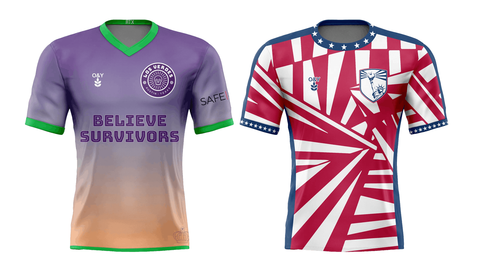
He’s designed a domestic violence awareness kit for Austin FC supporters’ group Los Verdes, drawing from both the campaign’s lavender color and a photo of Q2 Stadium at sunset, as well as an ugly Christmas sweater-themed look for San Antonio FC supporters’ group Crocketteers, a sublime purple jersey for Flower City Union (Rochester, N.Y. supporters’ group) Defenders of the Garden and a wildly patriotic American Chaos jersey for U.S. fans—complete with a badge with the Statue of Liberty holding a soccer ball—doubling as a fundraiser for Preservation Corps United.
As Flynn’s developed his skills over the years, he’s taken some of his design ideas online, noting that soccer fans can be extremely opinionated about using their teams’ identities as a creative playground, en route to designs that do bring fans together.
“Usually when I do it, I don’t just go, ‘Oh, this would be the best jersey for them,’” he explained. “I’ll do some research on the team, and then I’ll just design it and think, ‘I want to try something with stripes today. Let’s just try this. Let’s experiment with something’—and someone takes that as, ‘Oh, this is really terrible, I don’t know why you’re doing that, how dare you.’
“If I did a Houston Dynamo jersey with a Texas flag, trying to tie it into Texas, they’re like, ‘How dare you? Those are Dallas’s colors’ and I’m like, ‘OK, listen, I’m trying to build some kind of connection.’”
‘This is what the U.S. should wear’
Though Olive & York is getting attention for its U.S. alternative kits, it’s not the only company offering its take on the Waldo. Philip Storer, a Columbus, Ohio-based entrepreneur and U.S. fan, announced his intention last month to make what he’s calling The Unity Kit (and a navy away jersey) under the Legend Kits banner.
Declaring it “the USMNT kit we wanted, the kit we deserved, the kit we made,” Storer notes that the Waldo—employing some blue accents—was designed by Amir-Ali Aftabi, an L.A.-based Iranian-American designer, while the American Dream kit, similar to Bunn’s blue-with-stars offering, came courtesy of Chidubem Victor “Vickey” Nwokolo, based in Abuja, Nigeria.
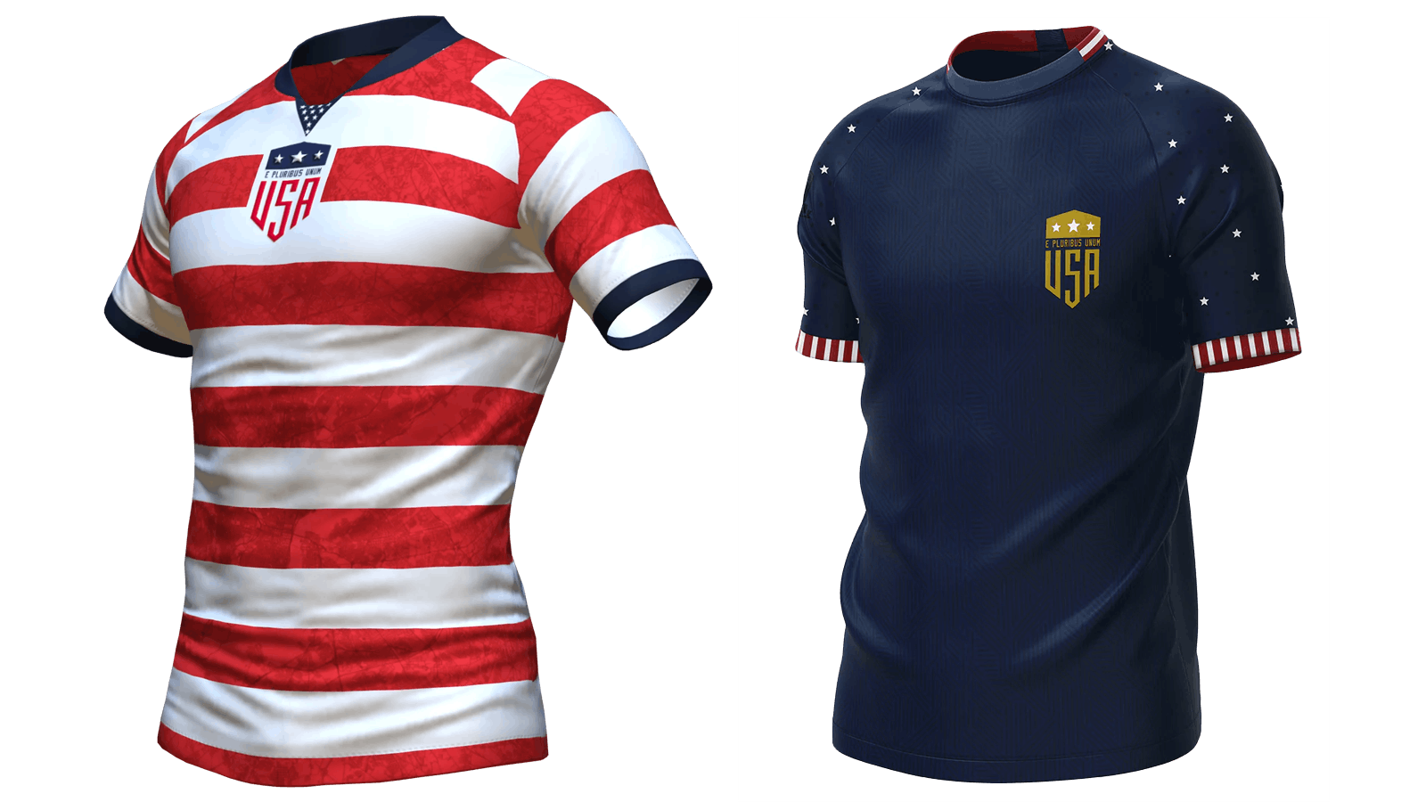
Storer found both of them after they posted their designs online—as well as being one of the original people reaching out to Bunn about making his designs into real jerseys.
Nwokolo aspires to someday design kits professionally and maintains an Instagram page with some of his favorites, which bills him as a music producer, illustrator, apparel, graphic and packaging designer and kickboxer.”
He delved into U.S. kit designs as part of exercises he was doing involving multiple clubs and countries. “I was posting jersey designed on Reddit getting favorable reviews and feedback,” he explained, going to subreddits for big professional teams like Chelsea and Bayern Munich before moving over to the U.S. subreddit, /r/ussoccer, to post some design ideas among the hot takes and statistical deep dives that users there favor.
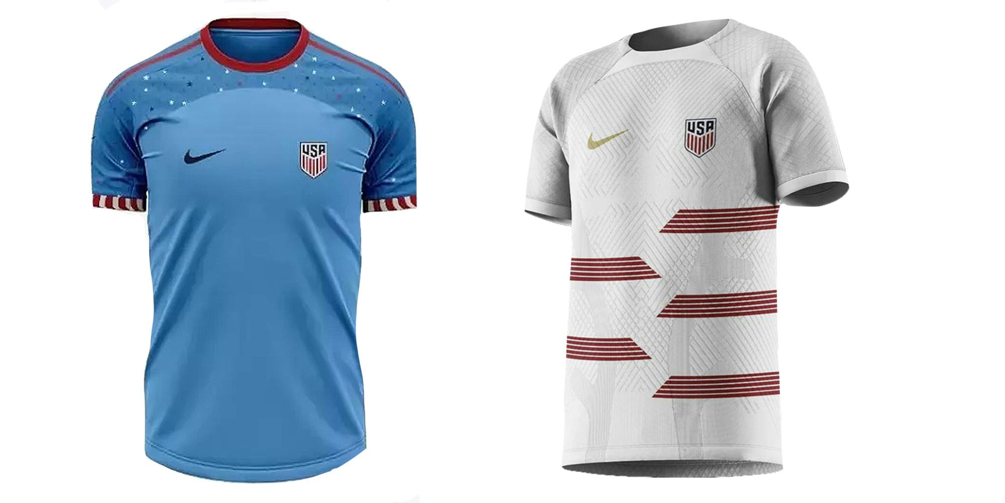
As he recalled, “They were like, wow, this is what the U.S. should wear.” Though the designs on his posts were “removed by Reddit’s spam filters,” the comments are still up on the site and reflect the enthusiasm for superior alternatives.
The first fan in on his original post remarked, “Lol these are so unrealistic because they’re way too good,” while one fan commented on the unusual shade of blue Nwokolo chose by noting, “Oh that baby blue is tasty.”
While not everyone was sold on the lighter blue, his overall effort impressed—or, as one fan opined, “I ONLY like the White one but I fucking love it,” adding, “15/10 I’d buy two.”
‘Why do we need an official kit?’
Storer gets a bit philosophical when talking about this movement of independent creators that he’s made himself part of—and it’s noteworthy that when we had our initial Zoom interview, he was wearing a Columbus Crew jersey from Supporters Supply Co., an independent jersey maker with its own line of U.S. kits, including modified versions of the Waldo and blue-with-stars kit designers are gravitating toward.
“I just think it’s a really interesting idea to have the fans who are saying, listen, not only are the hoops the identity that we want, independence can make up part of our identity,” he asserted. “And supporting independent creators and having a sea of people who are all wearing their own gear that they’ve created plays off of this identity. That could be an identity in and of itself.
“Why do we need an official kit?” he continued. “The players can play in whatever they want, we can wear whatever we want, we can support whatever we want. And what’s more American than going out and just saying, ‘I don’t like that, I’m gonna go do it myself, and having a whole fan base that’s that’s doing different iterations of independent creators creating identities.’”
Storer’s just getting started on that mission. He’s also aiming to get out Canadian jerseys to address a fan base that didn’t even get a new World Cup jersey for 2022—with Nike just providing last year’s model that the team qualified in, and Adidas releasing a line of Canada gear last week, themed around the 1986 look the company created for Les Rouges the last time they qualified for the tournament, to meet the desire of fans wanting something “new.”
Storer’s quest to get just the right quality of jersey for his initial two U.S. jerseys—including a badge with a 3D effect he’s particularly excited about—meant that getting those to fans in time for World Cup matches will come right down to the wire, but he looks to satisfy fans of Les Rouges rooting on Canada in the 2023 Women’s World Cup with Nwokolo designs.
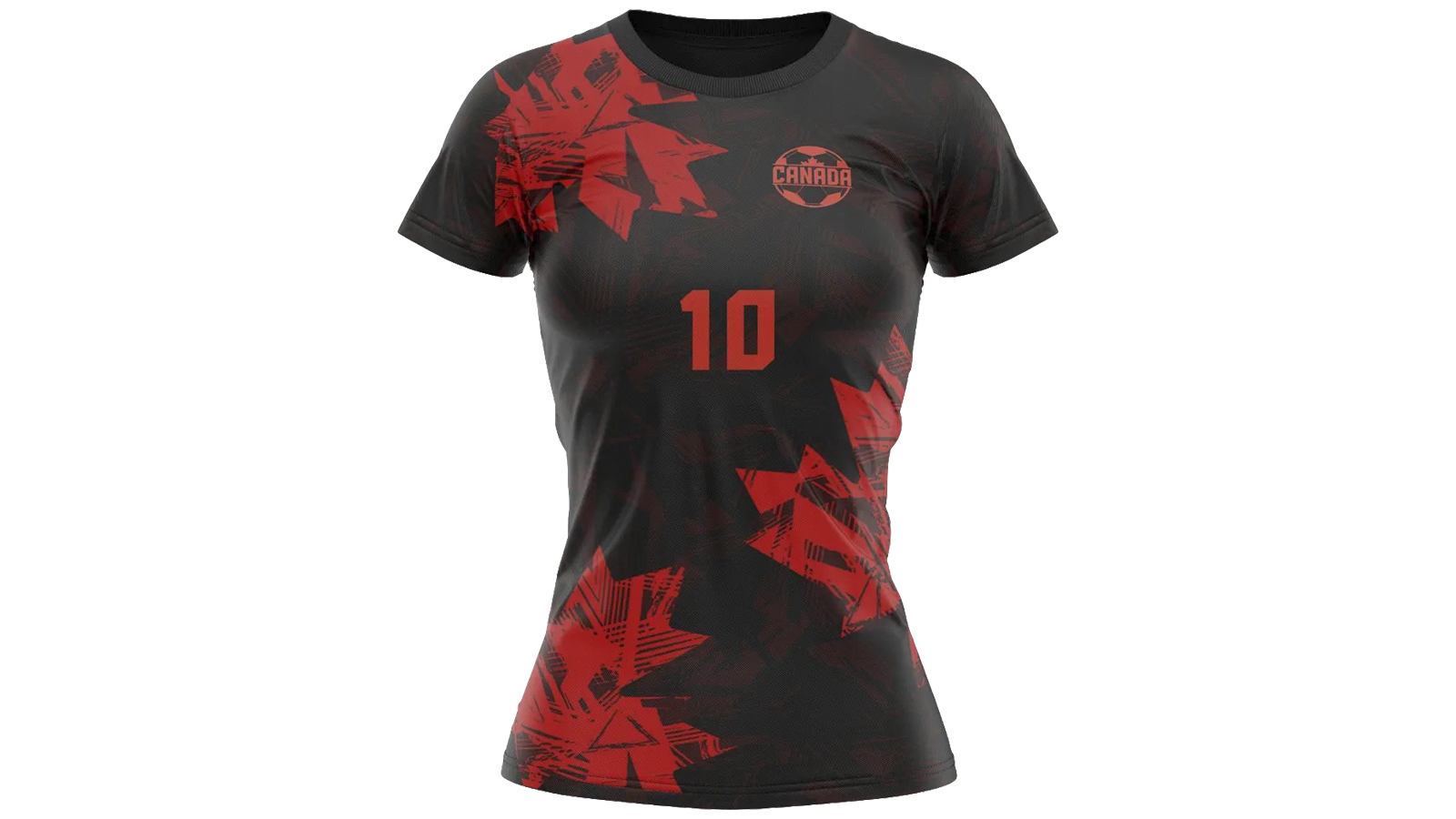
“I wanted something where the quality was on par with Nike and Adidas,” Storer said of his U.S. jerseys. “It basically meant I’ll make almost no money on them, but I don’t care. I just want them to be awesome.”
This story is part of the Pixel Pitch series, exploring the spaces where soccer, the internet and identity intersect. Pixel Pitch is a joint project partnering The Daily Dot with The Striker, a soccer-centric online publication “where every day is a soccer news day.”
See more stories from Presser – examining the intersection of race and sports online.

