Get ready for a tidal wave of vloggers complaining how lame YouTube is for changing all the time.
The video-sharing site has just launched a series of updates to its Browse page, Video Manager and Video Editor, which are being spruced up to give the pages a new look and more tools to play with.
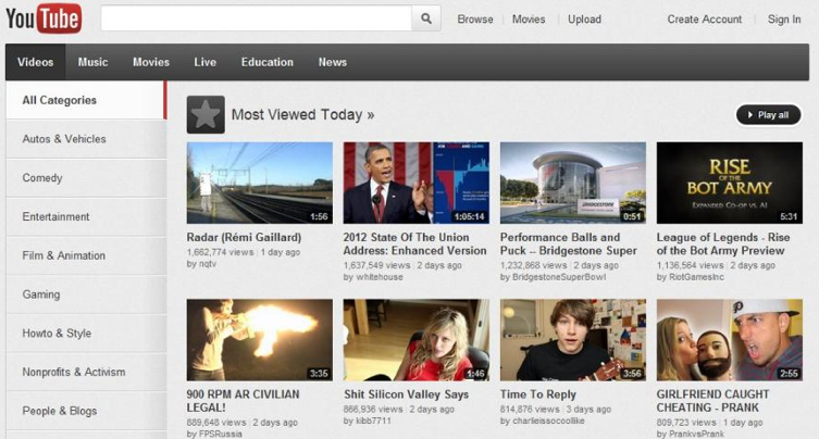
Following an update to the homepage design, the Browse page has been given a fresh look, with the aim of helping you discover new channels and videos. The design is a little cleaner; you receive recommendations based on your viewing habits, while the “Most Viewed” videos section gets prime real estate at the top of the page.

At the bottom, below a selection of videos from various categories, there’s a new section where you’ll receive suggested videos from custom channels based on your viewing history. For instance, after I watched a bunch of videos from a band called The Swell Season, the browse offered me new Swell Season videos that I hadn’t seen before. Nice touch.
There’s also now a giant “Play Now” button, which will create an instant playlist of the videos in a channel or section so you can start discovering more content quickly.
The Video Editor also is getting a fresh lick of paint, in order to bring it more in line with the rest of the YouTube design. A few new features have been added, including a timeline, an easier way to trim clips and a moving playhead (the indicator of the current progress of the video during playback). Video’s a visual medium, after all, so it makes sense to make the editing process more visually dynamic and simpler to operate.
YouTube also is making changes—in addition to the ones made last month—to its video player page. It’s pushing out a few improvements and features in addition to tweaking it visually. The Video Manager now includes your search history, and has an improved display of your claimed videos and scheduled uploads.
Likes and dislike stats have been reinstated following feedback from YouTubers, as has the sorting of videos by popularity. The Video Manager update should be live for everyone over the next day or so.
Though Google might have ended its divisive Cosmic Panda experimental redesign on YouTube, it’s certainly pushing forward with its plan of unifying all its products with a similar design and cohesive experience. The new look of the Browse page is reminiscent of Gmail and Google+ in that it uses big labels and is easy to navigate.
YouTube isn’t exactly enjoying the warmest relationship with some of its users right now, after the announcement of its professional content project. People have mixed feelings over the latest redesign too.
“The new YouTube design actually sucks balls! Nooo I’m going to cry when it changes mine.. DONT.DO.IT..weh,” tweeted SeraaVickers.
“The new video manager is just like the new channel design, AWFUL. What will you butcher next?” asked CityLeagueHoops.
However, there were plenty of people who sat on the other side of the divide.
“Happy about these,” tweeted KristiRobertson.
paulashton1979 was also pleased: “Nice changes to the YouTube admin section (Video Manager).”
Photo by marioanima


