Cosmic Panda only rolled out last year, but it looks like YouTube is already testing out a new homepage design.
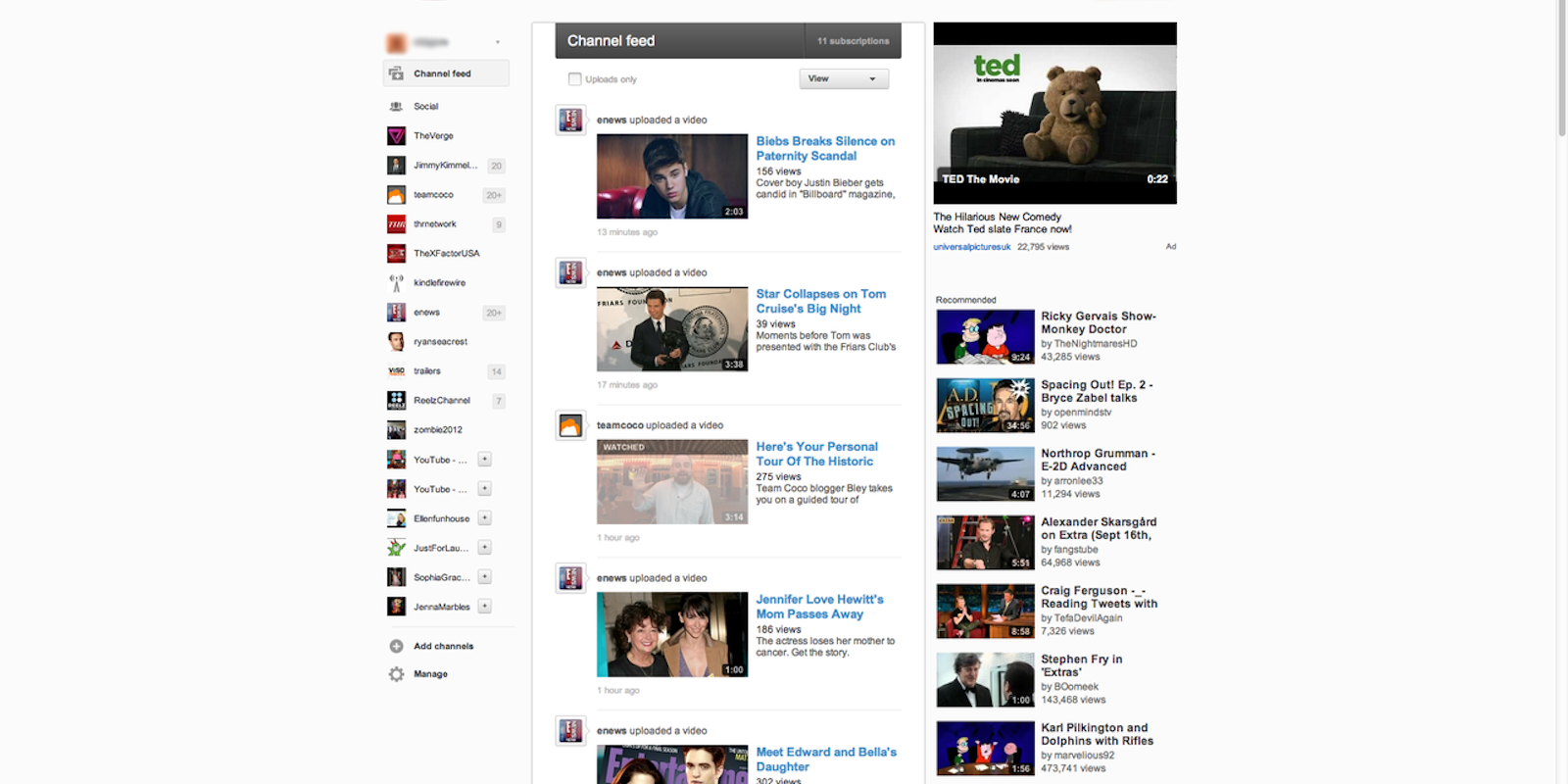
Screencaps of the new homepage posted to Tumblr last night show a slightly different layout that follows Google’s recent trend of tweaking its sites to match the look of Google+.
The experimental design still includes a sidebar with your subscriptions and friends, but will now let you know when a channel has any new activity. It also gives you the option to only show uploaded activity on your homepage.
YouTube hasn’t commented on the specifics of the design update, or revealed how many users can currently see it, but they released the following statement to Engadget:
“With more videos coming to YouTube every minute we’re always experimenting with ways to help people more easily find, watch and share the videos that matter most to them. As always, we’ll consider rolling changes out more broadly based on user feedback on these experiments.”
That could be good news for the many YouTubers who have spoken out against Cosmic Panda.
Photo via YouTube Redesign


