Donald Trump was reportedly weighing his options until the last minute, but he finally announced Friday morning that his running mate would be Mike Pence, governor of Indiana.
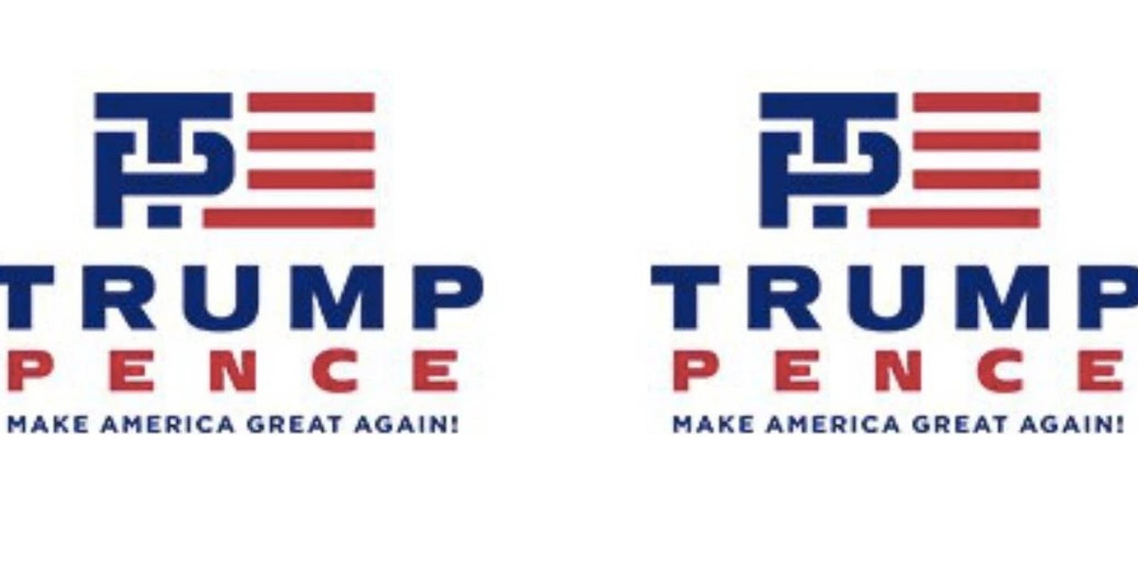
The two also revealed their new official logo, which looks like it was designed at the last minute and only given a cursory review.
From campaign email, here’s the Trump-Pence 2016 logo… pic.twitter.com/elp0qYMM9n
— Hunter Schwarz (@hunterschwarz) July 15, 2016
If Trump had really looked at it, wouldn’t he have noticed it’s a penis?
It’s literally a T penetrating a P
— Hunter Schwarz (@hunterschwarz) July 15, 2016
Oh boy.
https://twitter.com/DylanLathrop/status/753984333782802432
https://twitter.com/morninggloria/status/753983668608172032
https://twitter.com/darth/status/753983871880790016
https://twitter.com/saladinahmed/status/754000137257615360
Maybe we’re all just children, obsessed with sex and looking for dick jokes wherever we can find them—but how hard would it have been not to overlap those two letters?
In the past few decades of successful presidential campaigns, no other pair of running mates has opted for implied typographical penetration. “Bush” never touched “Quayle,” nor did “Clinton” touch “Gore.” The second Bush? His name didn’t touch Dick—Cheney, that is—either.
Was the designer behind this logo just trying to troll Trump? You wouldn’t be alone in suspecting so.
Somewhere there’s a designer who just pulled the most epic prank. And I want to shake his or her hand…
— Mlle. Bébé Gottbach (@gottbach) July 15, 2016
On the other hand, maybe Trump sees the innuendo in the logo and loves it. Maybe he’s the kind of megalomaniac who, if he has to accept a running mate, must make it abundantly clear who is the top of the ticket. And who is the bottom.


