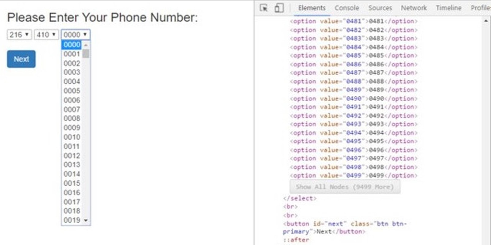
There are a lot ways to go wrong in building a website, but this one is just unbelievable. So unbelievable that when designer Stelian Firez stumbed on it, all he could do is throw a screenshot up on Twitter with an “oh. my. god.” What madness is this?
oh. my. god. pic.twitter.com/DpXu7bpqkA
— Stelian Firez (@stelian) April 15, 2016
Yep, instead of a text field for your phone number, that’s three separate drop-down menus, the last including every number from 0000-9999.
It could have ended there. We could’ve walked away laughing and shaking your head. But the screenshot went viral, and people in the front-end business started to wonder whether they could invent an even worse way to botch the simple problem of entering a phone number.
.@xenoplexus @jeffbonhag @karenmcgrane @stelian @ftrain lets do a binary search for the phone number. only 33 steps! pic.twitter.com/byfat8T1qp
— mgadda (@mgadda) April 19, 2016
This is a hate crime.
@jeffbonhag @stelian @ftrain Challenge accepted! pic.twitter.com/LLqfxMyhr3
— Paulo Gaspar (@paulomgaspar) April 18, 2016
Oh, no.
@paulomgaspar @jeffbonhag @stelian @ftrain Missing that element of surprise pic.twitter.com/GHG8ob0CIi
— Justin Blank (@hyperpape) April 18, 2016
Christ. Why?
https://twitter.com/xtasy64/status/722205659811430400
What am I even looking at, here?
@paulomgaspar @jeffbonhag @stelian @ftrain let me get in on this pic.twitter.com/WE8z5oqSVv
— Dan K (@dfkoz) April 18, 2016
Is there no end?
https://twitter.com/jbones3000/status/722155527774593025
@ftrain @hyperpape @paulomgaspar @jeffbonhag @stelian Kaoss Pad phone number entry! pic.twitter.com/U2sw2Ogah9
— ideology of graphql (@martineno) April 18, 2016
.@paulomgaspar @jeffbonhag @stelian @ftrain Hmmm… pic.twitter.com/5LVRR9hFin
— Jordan 2024: More Jordan (@ploogle) April 18, 2016
@Ploogle @paulomgaspar @jeffbonhag @stelian @ftrain entry from @sbisson pic.twitter.com/NjMISo8yVt
— Mary Branscombe (@marypcbuk) April 18, 2016
Ah, wait—maybe this:
@marypcbuk @Ploogle @paulomgaspar @jeffbonhag @stelian @ftrain @sbisson The final solution for this problem. pic.twitter.com/62kZVFCRkM
— Ale/xander P. (@_iamale_) April 19, 2016
I give up. Can I just write my number on a piece of paper and fax it in?


