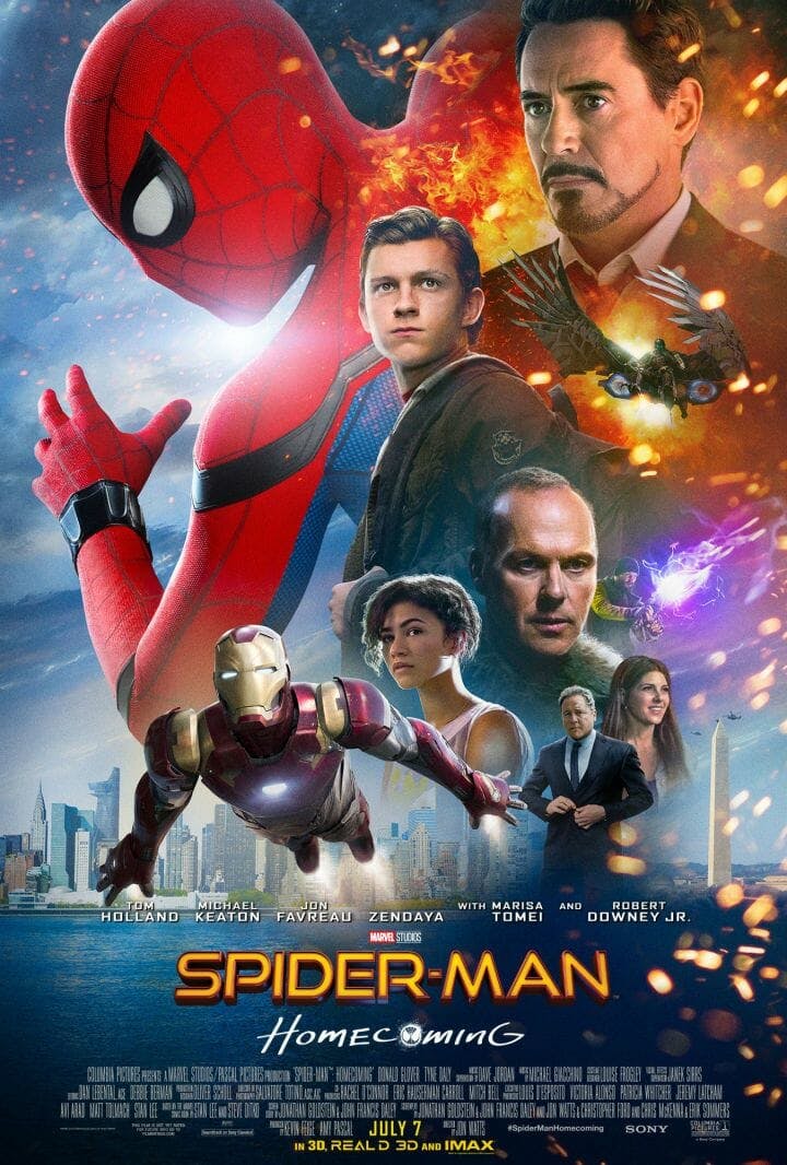
Internet reactions to cultural events can often be split into two parts: genuine excitement, followed by incessant mocking. The gap between the two is ever shortening, as demonstrated by Twitter’s treatment of the new Spider-Man: Homecoming poster.
Marvel revealed the poster along with two new Homecoming trailers on Wednesday, and users quickly noted its cluttered design and emphasis on Iron Man. Some folks contented themselves to make fun of the design, with one person asking, “Did someone win a competition on Reddit?” Others compared it to the iconic posters for previous Spidey films. An elite few took it upon themselves to redesign the poster completely.
Thoughts and prayers to the designer of the Spider-man Homecoming poster during these troubling days.
— Joe Dunn (@joedunn721) May 25, 2017
…Okay someone needs to get fired for this poster. Whatever happened to keeping it simple, like the Spider-Man 1 and 2 posters? pic.twitter.com/XrEhuV3Rgb
— TheBatstan (@TheBatstan) May 24, 2017
https://twitter.com/HSW3K/status/867400119569833984
https://twitter.com/kylebuchanan/status/867387183044407296
https://twitter.com/solaveIIan/status/867425790815875072
The new poster for Spider-Man Homecoming looks way too busy. pic.twitter.com/nGUBpF7ZVc
— Ian Miles Cheong (@stillgray) May 24, 2017
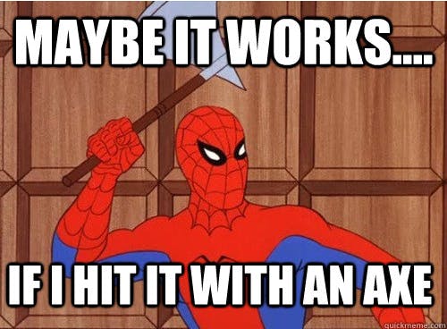
Admittedly, with his softened edges and more cartoonish suit, the new Spidey also recalls the highly acclaimed ‘60s Spider-Man meme that dominated your news feed in 2011.
Perhaps the wisecracking Peter Parker seen in the two new trailers would approve of the thorough roasting. Watch them below.
H/T Uproxx


