Want to feel depressed about the state of humanity and kindness?
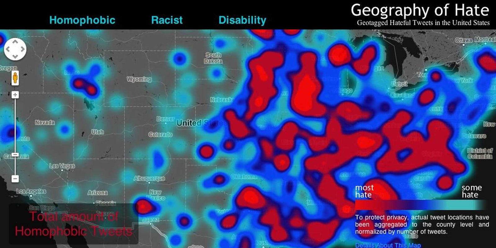
Geography of Hate is a new project by Floating Sheep, a group of geography academics at Humboldt State University, that maps racist, homophobic and ableist tweets by region in the U.S.
Between June 2012 and April 2013, students combed through tweets with slurs to determine if the word was used in a negative, positive, or neutral way, according to Mashable.
In total, over 150,000 geotagged tweets contained a hateful slur that was deemed negative.
The group then compared the number of hateful tweets to overall tweets by county, in order to show the disproportionate amount of hateful tweets compared to overall tweeting activity in that county.
Orange County, Calif., for example, has the highest absolute number of tweets containing slurs, but due to its high level of overall Twitter activity, the hateful tweets are less prominent, and therefore are not that conspicuous on the map.
The tweets they determined to be racist and homophobic included uses of the n-word, the derogatory use of “homo” and “gay” and the ones that were ableist included “cripple.” There is, of course, room for error. Some commenters have pointed out that spellings like “fa99ot” might be used to avoid being caught in the group’s research, or that sexist tweets should also be included in a “hate map.” It’s also hard to know if one individual who tweets a lot of terrible things isn’t just messing up the stats for the rest of their county. But either way, the Hate Map is a great start in discussing hateful speech on social media.
Last November, the same group created a similar map to show racist responses to President Barack Obama’s re-election, which you can view here. For extensive posts on their findings, you can read Floating Sheep’s blog here. To see the actual map of hate, separated by “homophobia,” “racism” and “ableism,” go here.
Sigh. You know what? Just blow this whole Earth up and start over. We clearly don’t deserve to exist.
Screengrab via Geography of Hate


