Forget the Starbucks holiday coffee cup controversy. We have a new coffee cup design in our midst, and this time it’s from McDonald’s—and it’s hilarious.
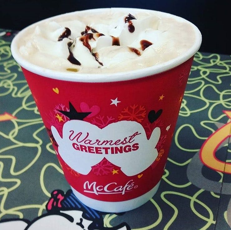
Here’s was how the original coffee cup looks. It’s a nice message with a pair of mittens, signifying the warmth of the season and the fast food company’s coffee.
Makes you feel all warm inside, right?
But take the thumb on the mitten, draw five finger-like shapes, and boom, you’ve got McDonald’s spreading its ass for you.
Um… @McDonalds methinks you need help with your graphics. pic.twitter.com/h1i88R7mLs
— Earthling (@ziyatong) December 11, 2016
McDonald’s daring homage to contemporary art. pic.twitter.com/wjNrAz9rI8
— Giovanni Tiso (@gtiso) December 11, 2016
The obvious jokes immediately came drizzling in with some ecstatic that McDonald’s was “spreading” the holiday spirit. Others suggested how the reimagined design makes sense because McDonald’s coffee tastes like ass anyway.
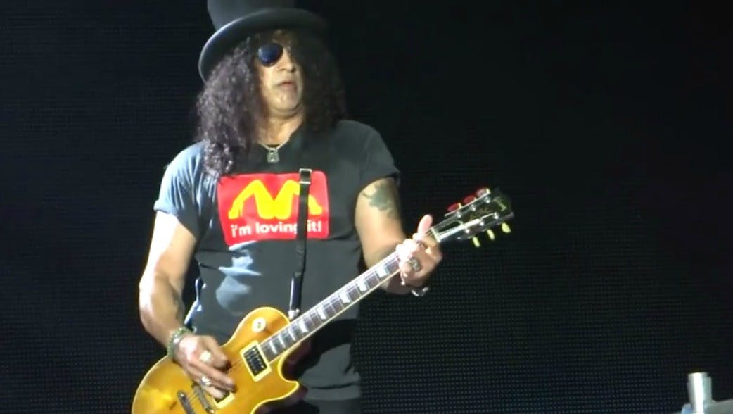
But this reminds us that there’s little question that McDonald’s coffee would be what Slash from Guns N’ Roses would drink to perk himself up in the morning.
Either way, we have a new goal for those who are artistically inclined with a dirty mind. Turn this cup’s design into something at which we can all snicker.
Internet, do your best and/or worst.
H/T Mashable


