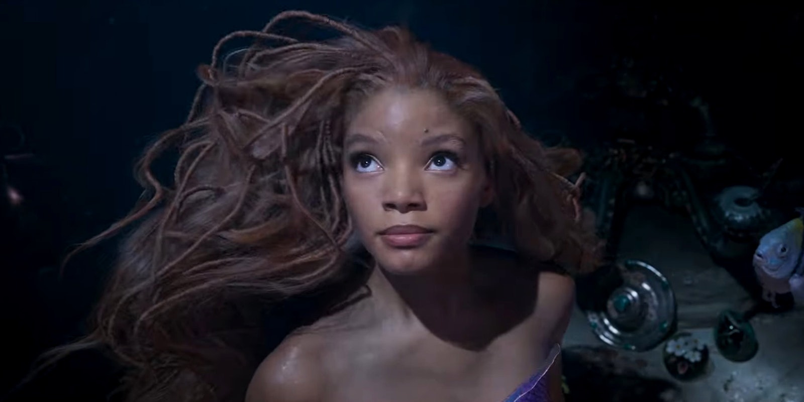
Disney‘s live-action remakes are not known for their aesthetic flare, but The Little Mermaid is already earning more criticism than most. Specifically, a lot of people are frustrated by the dim, flat lighting exhibited in its trailers.
These complaints are hardly unique to The Little Mermaid. American blockbusters are currently suffering from a plague of bad lighting, the most notorious example being the MCU. Despite being “brighter” than grim-and-gritty franchises like Batman, a lot of Marvel projects suffer from murky lighting and a lack of visual contrast. This trend is often blamed on low-quality CGI, with actors performing in front of a greenscreen (or the Volume) with no obvious real-life light sources, resulting in a bland, gloomy aesthetic.
The first Little Mermaid trailers attracted similar criticisms, although some Disney fans hit back with comparisons to the original cartoon, which does indeed include some dark scenes.
Most of the footage we’ve seen from this remake is undeniably low-contrast, sometimes to the extent that you can barely make out the characters’ faces—a particularly contentious issue in a film with a Black lead. There’s a long history of white filmmakers failing to light Black actors correctly, and some Little Mermaid fans are worried about director Rob Marshall and cinematographer Dion Beebe doing a disservice to actress Halle Bailey. These concerns reared their heads once again during the Oscars, where Disney premiered a new Little Mermaid trailer.
The reactions on Twitter emphasize how much The Little Mermaid‘s lighting has become a talking point unto itself, with commenters divided between criticizing the film’s palette (“Why is it impossible to see???“) and defending it on the grounds that many of these scenes are clearly set at nighttime.
The lighting discourse is so intense that many viewers arrived at this trailer with strong opinions already in place, leading to an interesting new divide: Some think Disney “fixed” the lighting in the new trailer (which supposedly includes more light and colorful scenes), while others continued to complain about it being too murky.
There’s a lot of love out there for The Little Mermaid and Halle Bailey, and clearly, some people think the lighting is just fine—especially in this new trailer. However, when you look at shots from this film besides older movies that used practical lighting effects and old-school lighting, you can see where the criticism is coming from.
Over the past five to ten years, audiences have gotten used to watching movies with minimal contrast and a soupy grey-brown palette, and the fact that some scenes are set at night really isn’t an excuse. Look at Tim Burton’s 30-year-old Batman films, for example: A pair of movies that use light and shadow in a vibrant, exciting manner, despite working with a gothic palette dominated by black costumes and scenery.
Contemporary blockbusters like The Little Mermaid and Ant-Man and the Wasp: Quantumania look very dull by comparison—and while we can blame greenscreen and digital color correction, CGI itself isn’t the defining problem. The real issue is a lack of care. After all, Avatar: The Way of Water just won an Oscar for its incredible underwater effects, with a luminous aesthetic that puts The Little Mermaid‘s trailer footage to shame.
Reflecting the mediocre reviews earned by other Disney live-action remakes, this lighting controversy is a symptom of a wider problem. Disney just isn’t motivated to make these films distinctive works of art, because audiences will flock to see them no matter what.


