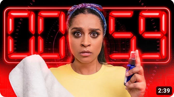
This story was originally published on Passionfruit.
As a creator, it can often feel like getting your content seen is half the battle. You put all that time and effort into your videos, but it ultimately doesn’t matter if people aren’t watching them. On a platform like YouTube, figuring out how to get clicks from strangers browsing content similar to yours is an imperative part of the process.
What kind of thumbnails get the most clicks?
Viewers are inundated with an endless stream of things to click on every time they visit YouTube. Even if they’re searching for something particular—like a specific wiring tutorial or cookie recipe—they’re likely to get dozens of results, if not more. So how do they choose which video to click?
Both titles and video thumbnails play a pivotal role in this process, as they are a potential viewer’s first introduction to your content as they scroll through the site.
Titles inform the user not only what your video is about, but in what style it’s presented. It’s the difference between “Canon EOS Rebel T7 Unboxing,” “Set Up Your Canon EOS Rebel T7 in 5 Minutes Or Less,” and “6 Tips For Shooting Professional Videos With Your Canon EOS Rebel T7.”
The video thumbnail, or the still image that serves as a preview for your video, works in tandem with the title. A good thumbnail provides visual clues as to what your video is about and a great thumbnail draws attention, enticing people to click on that video over all others on the screen.
Do thumbnails increase YouTube views?
YouTube says that a whopping 90% of the best-performing videos on the platform have custom thumbnails. And if that isn’t enough to convince you to care about thumbnails, keep in mind that having a higher click-through rate—the percentage of people who see your video on the site and actually click on it—means YouTube is more likely to recommend your video to even more viewers.
So even if you have a loyal audience through your subscribers or coming from other social media platforms, having a good thumbnail and title on hand to make an immediate first impression will help you grow your audience even more.
How do I make my thumbnail and title better?
Below, we’ll go through a list of specific strategies that will help you up your thumbnail and title game, but there are two key things for you to keep in mind before we get to that.
First, it’s important to research video content that’s similar to yours. If your channel is dedicated to make-up reviews, spend time both searching makeup-related keywords and browsing the channels of influencers whose content is similar to yours. Pay attention to which videos have more views, what catches your attention and makes you want to click, how their strategies evolved over time, and—important but often overlooked—what you think doesn’t work.
If you do this before you dive into creating thumbnails and titles, you’ll be starting from a place of understanding, rather than trying to course correct when you’re not sure what you’re doing is working. You can also screenshot thumbnails you like (or don’t like), save them together in a folder, and see what they have in common. If you get stuck at any point in your own work, you can always jump back in and browse more thumbnails and titles to help get unstuck.
The other thing to keep in mind before you start creating is how your thumbnail and title will work together. You may have a standout idea for a thumbnail and catchy wordplay for a title, and they may very well match your video separately, but if they contradict one another, potential viewers may get confused and scroll on to the next option.
How do you create click-worthy thumbnails?
So, what kind of video thumbnails get the most clicks? Of course, there’s no singular answer to that question, but there are a number of things you can do to make thumbnails that are clear, enticing, and sell your video to your potential audience in mere seconds.
1. The basics
First and foremost, it’s important to know the preferred specs for creating a YouTube thumbnail. Make yourself a template or keep this list handy so you can avoid time-consuming mistakes later.
- Size: Aim for your final thumbnail image to be 1280 x 720 pixels, but don’t go smaller than 640 pixels wide.
- Aspect ratio: Thumbnails with a 16:9 aspect ratio show up best on YouTube, which is important to keep in mind if you decide to go with a size other than 1280 x 720 pixels.
- File size: The image you upload to YouTube has to be less than 2MB.
- File format: Thumbnails have to be saved and uploaded as .jpg, .png, or .gif.
2. Choose a relevant image
More often than not, you’re going to want to grab a screenshot from your actual video. This makes things easier on you while also giving your viewers a literal preview of what to expect when they click.
Ideally, you’ll want to choose a frame that teases the subject matter as well. For instance, if your video is about car repair and opens with you talking about the car before showing you working on it, you’ll probably want to stick with a screenshot of the car.
You can also enlarge certain pieces of an image for emphasis, or mix and match stills, as with this before and after of a formerly damaged Prius:

3. Keep it simple
Think about all the places you see YouTube thumbnails—on a creator’s channel, in the search, on the sidebar. Sometimes, these can be tiny, especially if someone is browsing on mobile. A busy image can be too much to take in, whereas a simple image that gets the point across draws your viewer in right away, like this thumbnail from The Try Guys video “Keith Eats Everything At Taco Bell.”

They could have shown all the menu items dumped into a pile, and that would have been accurate, but this image draws enough attention to convince the viewer to glance at the title and get the full picture.
4. Use a clear image
For similar reasons, you want to make sure whatever images you use for your thumbnail are clear. If you’re centering your thumbnail around a screencap, that means making sure you are shooting video that is clear and well-lit—which you should be doing anyway.
5. Mix photos and graphics
Going back to the Try Guys video above, you probably noticed that they used a screencap from the video and pulled in the highly recognizable Taco Bell logo. Mixing photos with graphics doesn’t have to be super complicated, and looks very polished without requiring you to become a Photoshop pro.
6. Go with bold color combos
Choosing colors that complement one another but don’t blend together is an easy way to make your thumbnail pop. You can dive into color theory if you’d like, but it’s ultimately a lot simpler than that.
If you’re pulling a screencap straight from your video and just slapping a title across it, make sure the font is in a different color that sticks out from the rest of the image so that it’s easily viewable. If you’re putting in a little more effort and creating a graphic, the same concept applies. Choose a background color that makes your central image shine, and make sure the same can be said about any text overlaid across the image.

7. Choose images that evoke emotion
Even when we’re looking for information, YouTube videos are, at their core, a form of entertainment. The most successful videos on the platform feature a person’s face, and if that’s the route you plan to take, an image that betrays a big emotion—anger, fear, shock, joy (the bigger, the better!)—is more likely to get you more views.

Even if you aren’t featuring a person, your thumbnail can still encourage clicks by evoking emotion. Is your video about what to do when your dog ruins your favorite pair of shoes? An image of you looking sad or outraged might be the best bet, but a pair of limited edition sneakers chewed to pieces is likely going to strike a chord with the type of person interested in that video.
8. Think about brand consistency
If you’re just starting out don’t sweat this too much, but eventually, you may want to consider maintaining some sort of similarity between your thumbnails—either across the board or just among certain types of videos, if your content varies—to help your regular viewers easily identify your content.
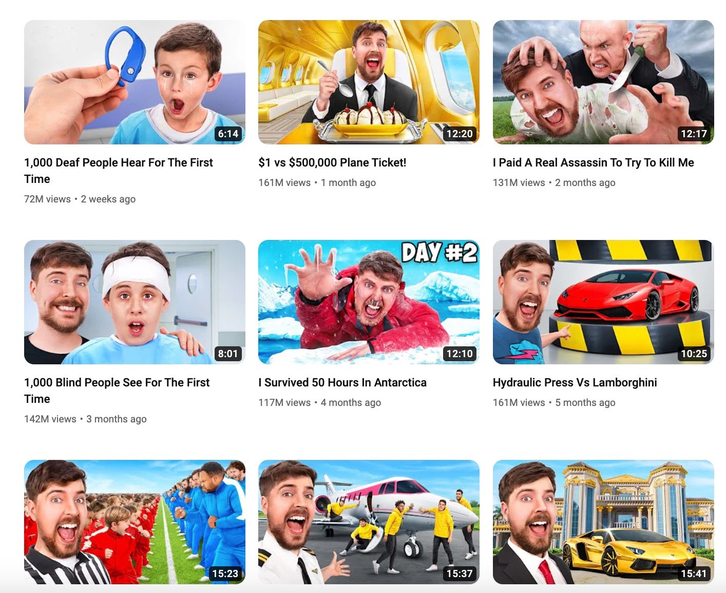
Check out MrBeast’s YouTube page, for example. Each thumbnail is tailored to the specific video, but they all feel like they belong on the same page.

9. Test out different strategies
YouTube doesn’t make you stick to a certain thumbnail once you’ve uploaded or chosen it. If a video isn’t performing as well as you expected, you can swap the thumbnail out for a different one and see if that helps. You can also try out different strategies on future thumbnails, or go back later and create some sort of brand consistency across all your videos.
But if a video is performing well, don’t change the thumbnail just for kicks—you did a good job, so enjoy your views and make note of what you think worked for next time!
10. Create a template
You don’t have to create a thumbnail from scratch for each and every video. If you’ve found something that works, or that you want to keep trying for a while, you can create a template and just swap out the images, colors, and text as you have new videos to upload.
And you can actually start out by using pre-existing templates, too. Canva has a wide variety of templates that you can use straight out of the gate, or customize to your liking.
How to brainstorm and optimize YouTube titles
It’s easy to gloss over coming up with a good title, instead of making the mistake of thinking a title just has to describe the video and nothing more. In truth, the best titles don’t just tell you what the video is about, but give a sense of what sort of creator you are—and that’s where the creativity comes in.
1. Keep it relevant
This sounds familiar, doesn’t it? Give your video a title that lets your audience know what they’re going to be watching. It may help to brainstorm a bunch of keywords related to your video, which will also be useful for the next tip…
2. Choose great keywords
If your video centers around your review of the latest Marvel movie, it stands to reason that you’re going to want the name of that Marvel movie in your title. Even if there’s something else you could write that would clue people in to what the video was about, you want your video to pop up in the search when people are looking for reviews for this specific title.
Fortunately, YouTube also allows you to add tags to your videos, which is where some of those extra keywords you brainstormed will come in handy—but don’t overdo it!
3. Create titles that evoke emotions
Here we are again, back with the emotions! How you approach this will depend heavily on what type of content you’re creating, but the first step is figuring out what you’re trying to sell your audience. And this doesn’t mean literally selling, but what do you think will draw them into your video, and what do you want them to take away from your content?
For example, if you post workout tutorials, you may talk about how something is for “beginners,” or will “change your life,” or is for “hardcore powerlifters.” If your videos are about dating, you might throw around the word “successful” or suggest tips will “save your relationship.”
One thing you want to make sure you do here is avoid a clickbait thumbnail—in other words, go back to #1 and keep your title relevant (and honest).
4. Don’t get too wordy
Your title can be up to 100 characters, but the most successful videos generally have titles that fall between 60-70 characters. Similarly, you usually don’t want to have a title that’s too short, although there are exceptions to every rule.
As with the thumbnails, don’t be afraid to try different strategies out and see what works best for you and your audience! Nailing these aspects of your YouTube channel is going to take some trial and error, but mastering them will help you grow your audience and also make it easier to adjust as new trends emerge, as you’ll already have the basics locked and loaded.


