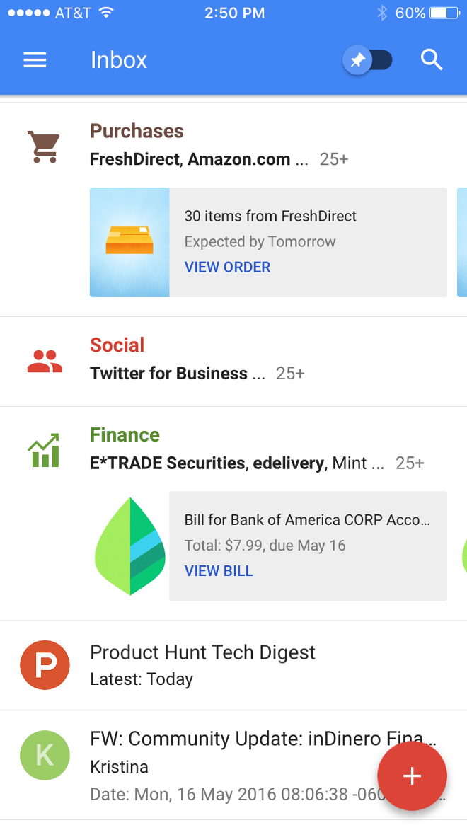
One of the things that’s fascinating to me right now is how Google has finally figured out how to pivot from the less than optimal performance of G+ by making Search and Gmail more actionable directly from the interface, rather than making you go to another app, or down at least one level, to get what you want.
Take Inbox—what’s great about this is how Google has moved actions from inside the email (for instance, you don’t have to open the email to confirm, say, a reservation, or watch a video, or see the top points of a newsletter) to the content stream. It’s a faster, more efficient way to interact, and by bringing the key points of the email content out of the email and straight into your email display stream, it has made Gmail a closer competitor to Facebook and Twitter. And because your email graph is different and in some ways more select than your Twitter/Facebook universe, this has the potential to become a really powerful network of its own.
Just at Facebook does with its Newsfeed algorithm, Google is sorting content here, but in a different way—by content type, rather than by expressed attention. That is, where Facebook shows you things based in part by your past history of interest in the things Facebook shows you, Google sorts things into buckets based on what kinds of things Google thinks they are.
As an information stream, this has some advantages over the Facebook algorithm, especially for work purposes—you never have to miss anything; everything is just sorted into places you can look at or ignore.
(I’d love a similar execution in the Facebook Newsfeed—show you everything, but in collapsed buckets, and allow you to choose what those buckets are. Right now, you can tell Facebook to make sure you never miss posts from certain sources, and that’s it. But what if you could, say, tell Facebook to sort things into self-defined categories—“pictures of children of people I used to kind of be friends with”—that you could always find if you wanted to? Facebook’s counterargument, to be sure, is that people already have too much to look at on Facebook, and they’re trying to show you the most relevant stuff, but a greater degree of control, even if it’s a feature used by only 5 percent of accounts, would really help make the Newsfeed more valuable to core users.)
Similarly, look at how Google is reworking its mobile search and shopping interface to answer Amazon:
Now you don’t have to go to the retailer until you’re ready to buy. You can easily see a future implementation that brings this straight into Inbox, and makes it an even more sticky space, and a competitor to your Facebook and Twitter feeds.
Mark Coatney is a digital media product and editorial consultant. Previously he ran digital for Al Jazeera America, media partnerships at Tumblr, and did a little bit of everything at Newsweek and Time magazine. Follow him on Twitter @mcoatney.
A version of this story originally appeared on Medium and has been reprinted with permission.


