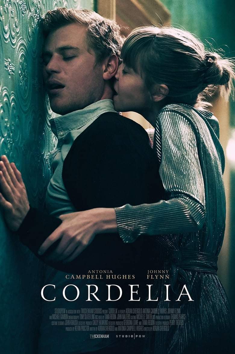
Congratulations are (kind of) in order for the movie Cordelia—its poster unexpectedly went viral this week.
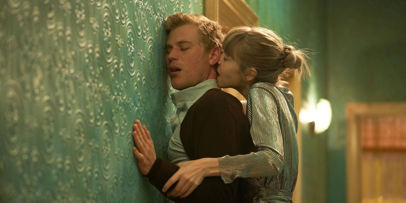
It depicts a man and a woman in an intense embrace, with the woman pushing the man up against a wall, kissing his neck. This pose immediately caught people’s attention because it felt like such a clear subversion of the typical gender roles in a straight romance movie, suggesting a sexy drama with a dominant female lead.
Posters for obscure indie movies rarely get much traction on social media, but Cordelia‘s poster garnered thousands of retweets after Twitter user @HarrietMould shared it with the caption, “I legit don’t think I’ve ever seen this pose this way round before.” Another key selling point was the presence of Johnny Flynn, who recently played Mr. Knightley in Jane Austen’s Emma, and starred in the romantic sitcom Lovesick. Flynn’s biggest roles have already cemented his image as a compelling romantic lead. And this poster pictures him being sensually pressed against a wall, prompting inevitable jokes about pegging.

At a glance, the poster also looks like it’s advertising a historical drama. The characters are actually wearing modern clothes, but several aesthetic choices conspire to make us think Cordelia is something along the lines of Phantom Thread or Atonement. The typeface on the title looks old-fashioned. The soft, subdued lighting resembles other historical movie posters. A lot of people even mistook Flynn’s outfit for a 19th-century costume, because he’s wearing what looks like a white stand-up collar.
But Cordelia isn’t historical, or even a romantic drama. It’s a horror thriller where Antonia Campbell Hughes plays a woman who is struggling with fear and paranoia after a traumatic event. She’s worried she’s being stalked, and Flynn plays her creepy neighbor. The trailer introduces a dark, unnerving tone that bears no resemblance to the assumptions people made from the poster.
Cordelia‘s poster doesn’t seem like an intentional bait-and-switch, and it’s not precisely false advertising. But it’s amazing how many people looked at it and made exactly the same wrong assumptions about the film. Movie posters are so formulaic that we subconciously recognize certain visual cues to signal certain ideas. A white background and red text means a mainstream comedy. Visually dark posters imply thematically dark stories. Action movies often depict a full-length shot of the hero with their back to the viewer. And so on.
Movie posters copy each other on purpose, because these familiar images tell consumers a lot of information at a single glance. And if you take a single glance at Cordelia‘s poster… you absolutely get the wrong message. You just don’t expect a horror story to be advertised by a photo of two people in a passionate embrace. That’s too bad for the many people who apparently wanted to see a Flynn femdom movie, but the real Cordelia trailer looks great as well. Just, you know, in a very different way.


