The biggest problem facing the world’s newest social network, Chime.in? Confusion.
The site is the brain child of UberMedia CEO Bill Gross — a Web innovator and the man behind some of the first online keyword advertising models. Chime.in is like Twitter on steroids, or maybe some kind of mutant offspring of Twitter, Google+ and Facebook. It’s a social network with features set to replace all social networks — and even social news sites like Reddit and Digg.
As with those sites, you can subscribe to interests or communities. A fan of Star Wars or DIY projects? There’s a community for you.
But, as with Twitter and Facebook, you can also follow people — actor Ashton Kutcher, for instance, seems to be the celebrity poster boy of the Chime.in launch. If you’re a fan, just hit the follow button.
All of this content — from the communities, people, and subjects you follow — appears in stream of posts (or “chimes”) that appear in your home page.
And that’s the problem. There’s just too much of everything. Too many colors. Too many boxes, too many images.
Too many options.
Take that Star Wars community, for instance. Chime.in gives five different content options in two different locations and four different tabs: “Chimes,” “Media,” “Links,” and “Polls.” And on the left column you have the option to join a “discussion” — apparently a kind of community live-chat.
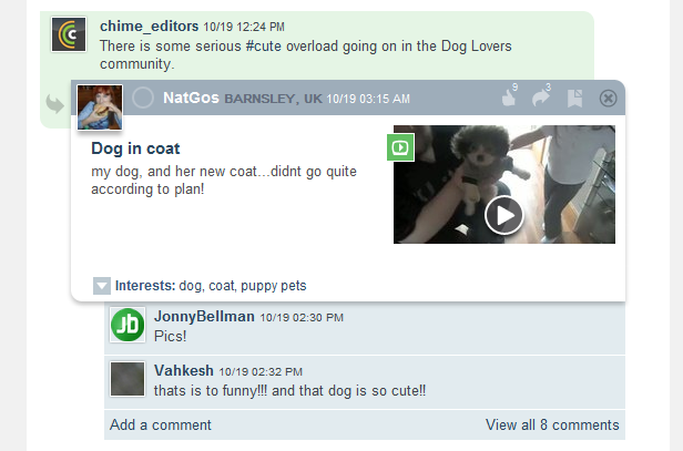
The user interface, in general, is a polyglot of clashing pastel colors and misshapen boxes. When you share someone else’s chime (“rechime?”), for instance, it will appear as a kind of bloated and distended appendage (see image).

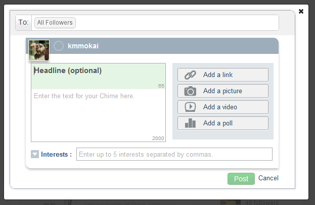
Even the box for composing a chime has eight different input fields.

That’s not to say Chime.in doesn’t have potential. The emphasis, clearly, is on interests rather than people. Personal networks are inherently limited in scope. By organizing chimes by subject matter, the site has the potential to build truly organic online communities — which will only be buffered by the company’s promised ad-sharing features set to launch in 2012.
Social networks like Twitter and Facebook, and social news sites like Reddit and Digg, were never really pretty. But they were, and largely still are, functional and simple. On the web simplicity drives conversations, and conversations drive communities.
Chime.in’s drive to be the all-in-one social network may ultimately leave it with nothing at all.


