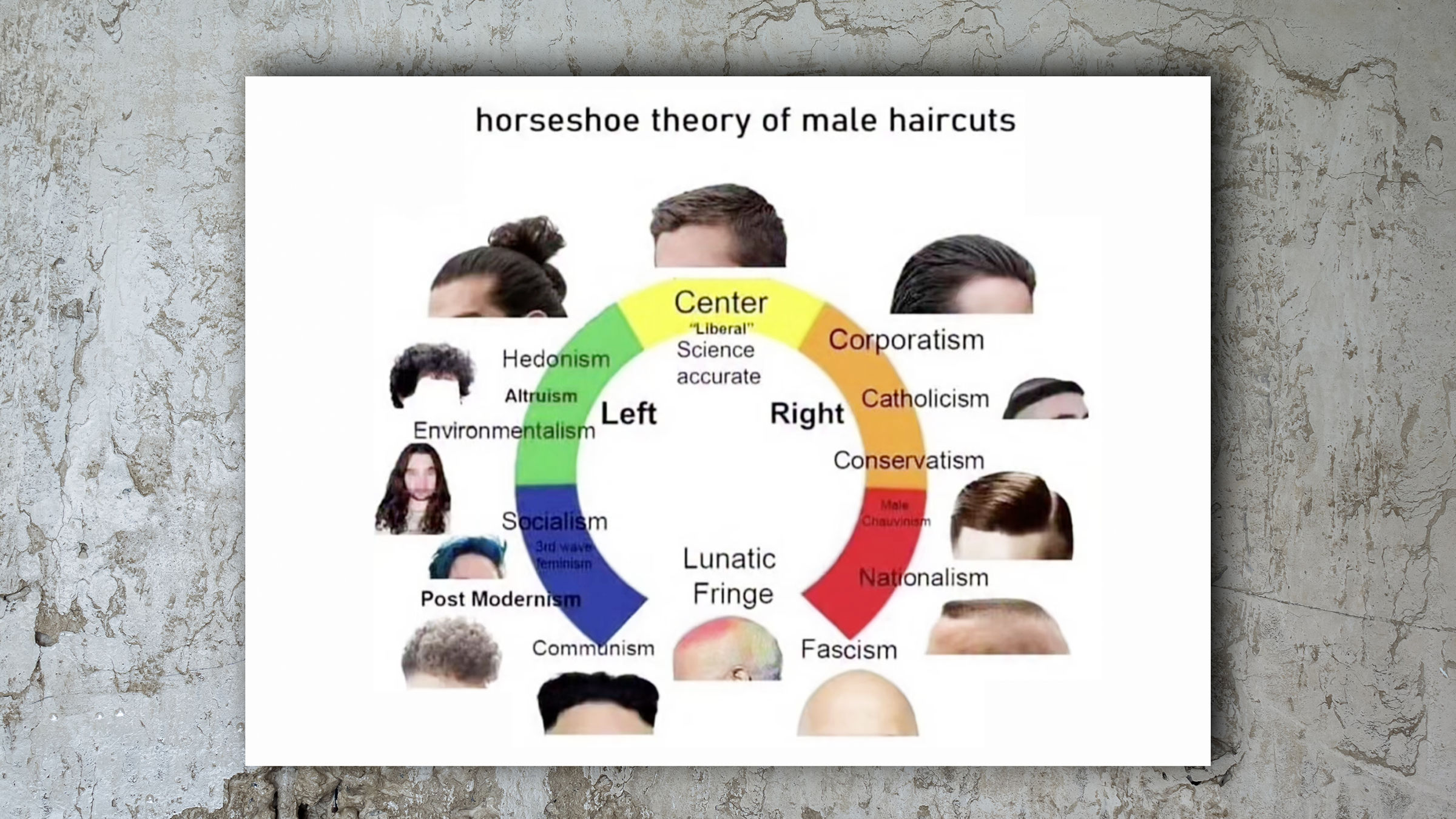
"Alignment charts" began life as a standardized way to describe a character's general moral disposition in role-playing games like Dungeons & Dragons. Where does this person (or elf or orc or whatever) fall along the axes of good and evil, lawful and chaotic? When people started assigning alignments to real people, characters from various fictional franchises, or even objects, alignment charts themselves became a meme. In 2018, they're more popular and more creative than ever.
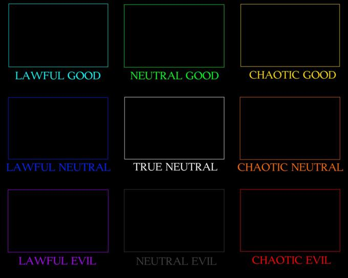
Circa 2012, the format for alignment chart memes was bog-standard D&D: nine squares, ranging from lawful good to chaotic evil, with true neutral at the center:
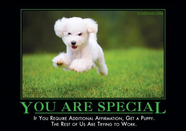
The visual design of the squares was borrowed from an even more dated meme, the "demotivational poster." Only '90s kids will remember this, but they looked something like this:
The same general alignment chart format is still in use today. Here are some successful examples from just the first two months of 2018:
Why this resurgence in alignment charts as a format? It's hard to quantify, but I have a theory that we can attribute it two factors:
- The resurgence of Dungeons & Dragons itself. D&D is no longer the sole province of a nerdy, purist, mostly white-male fanbase—thanks to factors like the streamlined Fifth Edition rules (released in 2014) and a boom in popular podcasts by D&D playgroups. The Adventure Zone, Critical Role, and Friends at the Table each have huge and loyal fandoms, and they've inspired scores of other "actual play" shows. That, in turn, has grown and diversified the audience for D&D itself. The Netflix show Stranger Things—which is full of D&D references—also probably helped the game grow in popularity over the last couple of years.
- It's in the nature of fandoms to rank and quantify characters and personalities. In Korean pop music fandom, people pick and promote a "bias"— a favorite member of their favorite group. Shows, movies, and games provide elaborate worldbuilding and huge casts for people to sort, rank, and categorize. There's a good argument that audiences are more discerning about worldbuilding and character development than at any time in the past.
In 2018, fans aren't content to sort characters into the traditional nine boxes, and memers aren't content to merely iterate on existing memes: creating new formats is the holy grail. As a result, we've seen more creative and playful versions of the alignment chart itself.
In 2017, internet artist Darius Kazemi subverted the alignment chart with his metatextual "alignment chart of alignment charts." He joked, "I've long maintained Chaotic Good is the most Lawful Neutral alignment." It was a big hit, racking up thousands of retweets, and it hinted at unexplored possibilities for the charts.
2017 also gave us the sandwich alignment chart, which defines people as purists or rebels based on which foods they'd consider "sandwiches":
The "rebel/purist" chart structure doesn't just work for sandwiches, either. It can apply to librarians:
Or "loli" anime, which features (and often sexualizes) young girl characters:
The meme that really broke alignment charts open, though, was January's "McDonald's alignment chart."
Instead of using the traditional 3-by-3 grid, it classifies characters based on who they would be in a John Mulaney joke about his dad taking the kids to McDonald's. The premise is that Mulaney's dad pulled the vanload of kids, who were cheering "McDonald's! McDonald's! McDonald's!" into the restaurant’s drive-thru, then he only ordered black coffee. For himself.
So, would the character align more with the unruly, impulse children, more with Mulaney's troll of a father, or more with a third option—"we have food at home?" There's a bit more complexity to this characterization than there is to the stodgy "lawful good."
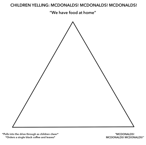
This led to other variations of the triangular alignment chart. In February, everyone was placing characters on the axes of angry, hungry, and horny. This tweet by @quendergeer seems to have started the trend:
It didn't take long for the chart itself to mutate in delightful ways, growing more complex with every attempt:
There's a reason "alignments" have endured in the popular imagination since the '70s: the possibilities are endless. Alignment charts are a perfect meme for casual participants and obsessives alike—you can make your own complex chart, or just declare your alignment on someone else's. You endlessly put people and things into boxes, which is something online fandoms are particularly effective at, or endlessly change and improve the shape of the boxes, discovering ever-finer ways of categorizing the world around us. The work, and the meme, will never be done.

