With its biggest update in more than two years, Instagram gifted IG addicts with five new filters—but there’s more to Instagram version 6.4 than meets the eye.
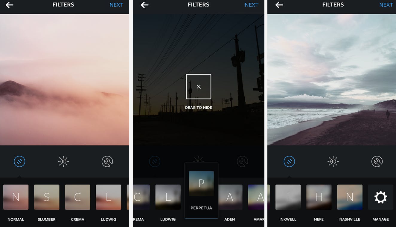
Beyond Slumber, Crema, Ludwig, Aden, and Perpetua—the first new filters since December 2012—here’s everything hidden under the hood of your favorite platform for sharing little square photos of cats.
Play god with your filters
Not only are there more filters to choose from, but you can now edit your filter drawer—and finally get rid of Hefe, once and for all. When you download the update, you might be surprised to see some of your filters missing, but Instagram hasn’t killed any off for good. Click and hold any filter and drag it to the middle of the screen to hide it. If you want it back, scroll all the way right and pop into the filter customization menu to craft a lineup of your favorite filters sans filler.
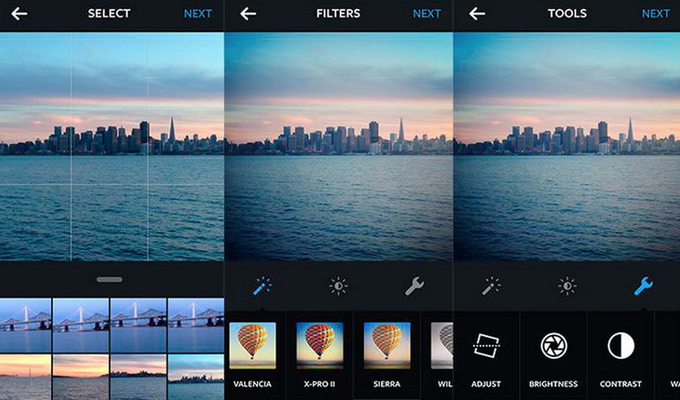
Goodbye, hot air balloon
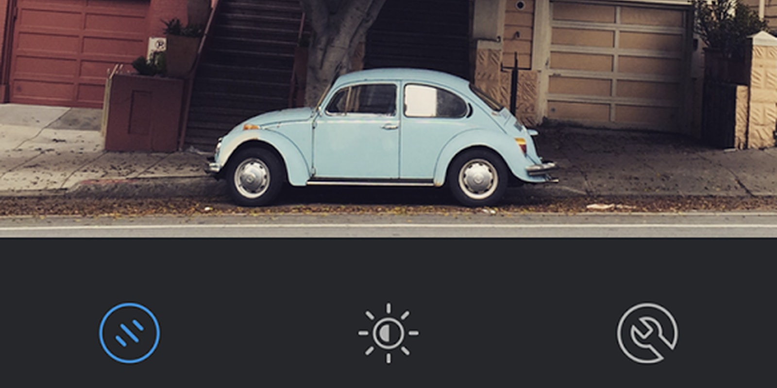
Before the hot air balloon, there was the Instagram tree. Before the tree, there was the pair of loafers. The new version of Instagram has done away with these icons altogether: Now when you edit your photos, you’ll see a tiny blurry preview of your very own image with the filter applied rather than the hot air balloon we’d come to know and feel mildly toward. The hot air balloon especially felt like the equivalent of a cheesy stock family photo that you’d find in a picture frame you scored at a garage sale. Really, I always preferred the IG tree, but the new tiles are modern and slick looking.
Realer real time
If you’re hooked enough on a social app, you shouldn’t be glued to the refresh button. In Instagram’s case, comments and likes now flow in organically in real time—no need to haunt that little refresh button in the upper right corner. The move ultimately makes Instagram not only less annoying, but gives it the feel of of other realtime messaging apps (and it’s still leagues better than Messenger). It might be all about sharing flatteringly-hued selfies, but Instagram feels more like a robust messaging app in its own right than ever.
Slow it down
If you were blown away by the slow motion capture camera that Apple introduced in the iPhone 5S, you were probably frustrated when you tried to share to Instagram. Due to the way Apple’s slo-mo capture worked—it actually slows down the 120fps source video to 30fps—sharing the slowed down video was only possible in Apple’s own software, Vimeo, Facebook, and YouTube. Workarounds were awkward and annoying (it’s 2014 and we’re still emailing ourselves stuff?) but now slow motion video uploads are supported straight from the iPhone to your Instagram followers.
It just looks better
This one is anecdotal and a little speculative, but when Instagram pushed its last major update (the one that added toggles for brightness, contrast, warmth, etc.) we observed a bit of a downtick in image upload quality when comparing an Instagram image to its original. I’ve reached out to Instagram for comment about this a few times, since it’s totally possible that the company tweaked some aspect of its image compression formula to improve performance or maybe by accident, but I swear on my Instagram following that photos look better again in version 6.4. The new filters are subtle and the older filters don’t make images look quite as blown out.
All told, we’re loving the new Instagram update. Quality looks better than ever, that stupid hot air balloon is gone, and instant commenting gives us less reason than ever to rely on standalone messaging apps or, god forbid, Facebook itself.
Screenshot via Instagram


