Anti-Facebook rhetoric is never stronger than when a mysterious new network quietly surfaces and manages to capture a niche audience by storm (so long as that niche audience is extremely Internet-engaged; guess what, we are!).
Within the last week, Ello has become a haven for LGBTQ users, the especially tech-tuned in (the Internet media seems to have joined en masse), and the just plain curious. If you were lucky enough to snag an invite (don’t buy them on eBay, please) before Ello froze them due to high demand, you probably hit your invite link, logged in, and then paused.
Now what?
Ello is a very different network than Facebook, and not just because you can choose whatever name you want, post porn GIFs to your loin’s content, and use it without seeing a single ad. It’s a different design than we’re used to: minimal, tiny, maybe even unintuitive. But it’s really, really pretty. Pretty, and sort of broken. Not to be cliche, but Ello is a bit of a beautiful mess.
Happily, it’s one that’s fun to make sense of.
Wait, where is my profile?
Once you’re in, first stop is your profile. Now it’s time to come up with a really defining, clever username (or do whatever you want; I went with @mollym, so I set the bar low here). Then you can determine privacy settings. Ello’s whole “thing” is that it’s more interested in letting you determine how much you want to share, but there are only on-off toggles here, so things are (like in the rest of Ello) sparse. Let people outside of Ello see your profile, or don’t. Allow comments on your posts, or don’t. Let Ello gather information about your activity, or don’t.
There are a few other on-off toggles for notifications, and an easy-to-find profile delete option.
Here’s where I struggled, and a great example of the platform’s no-hand-holding policy: Your profile picture. You won’t find an upload prompt, and clicking on the empty avatar space does exactly nothing. You have to drag-and-drop a photo into the appropriate space… which, actually, didn’t work for me the first three times. Then, though, it did! (Don’t worry, it adjusts.)
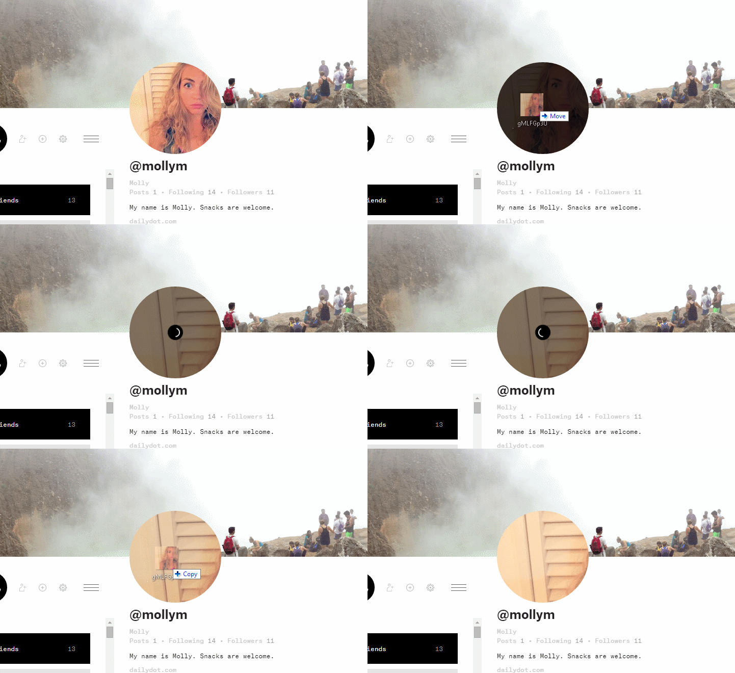
For your cover photo, you go through the same drag-and-drop process, just with a much larger photo. There’s also a tiny upload button, but good luck finding it.
Making friends
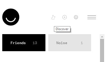
The biggest problem with Ello is finding everyone else on Ello. Honestly, I’ve fended better by just asking who wants an invite code, because that automatically requires them to become my friend. Another teeny tiny button (are you sensing a theme here?) that looks like it wants you to add friends is actually the discover people icon. And it’s OK… but not great. It seems like an unorganized scroll of random users. You can search, but because people don’t have to use their actual names, you may very well come up empty. (But don’t worry: Better people-finding is on the list!)
Share and share alike
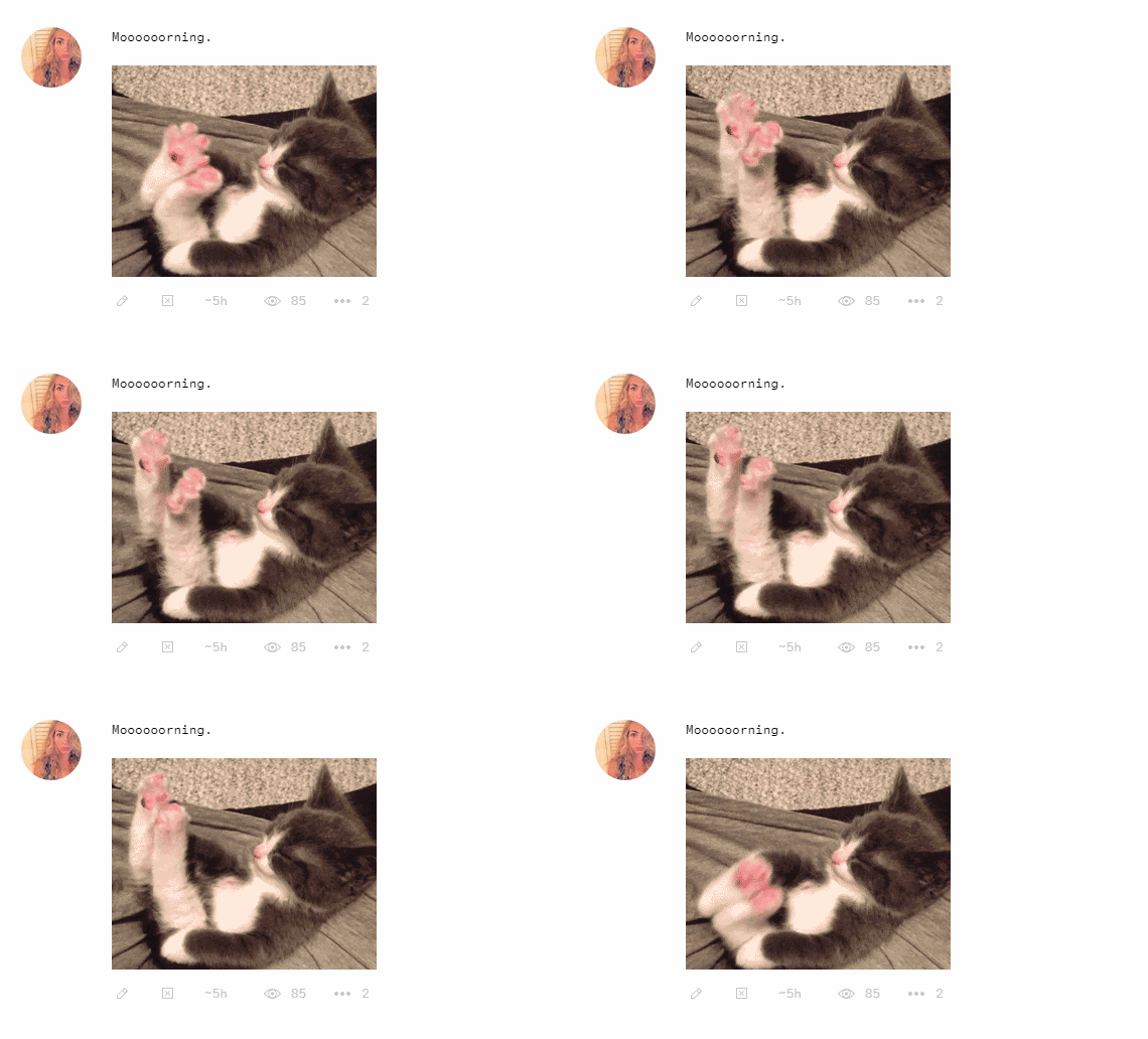
This is the best part of Ello. You can post anything. Really, anything. It’s without the word count limitations of Twitter and the image structure of Facebook. You want to share a GIF? Go ahead: Just upload it to your post like anything else, no crazy work-around required. You will, of course, have to look for the (again) very small, neutral-colored, textless upload icon—but once you find it, you’re good to go. NSFW content, mini-opuses (like Kickstarter creator Andy Baio’s very well-put critique of holding Ello accountable), whatever, it’s all welcome.
Right now, I’m seeing a lot of GIFs, links, insidey commentary, and bikes. (FYI, Ello’s creator is a bike maker and enthusiast.) But I’m only seeing that because of who I follow. Obviously, your feed will be different than mine.
The largest division in your feed is between Friends and Noise: You can be friends with someone and add them to the Noise column, so you don’t see their posts in the regular Friends feed.
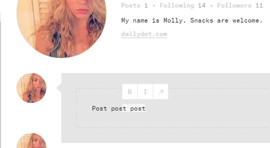
Also, here’s a fun thing you might not notice: If you highlight text in your post box before you send it, you can bold, italicize, or add a link from there.
Ello isn’t perfect. Per the above link, there are inherent issues with the model it’s trying to create. And as “anti-Facebook” as it’s been labeled, it will be hard-pressed to stay that way. Beyond that, though, are the various issues within the site itself: Features are hard to find, and right now invitations are frozen, which feels like a “too big, too fast” problem.
But worry about that later. Right now, Ello is a fun antidote to social media sameness.
Screenshot via Ello

