Facebook recently rolled out a new profile design, to much ado—even though it was relatively minor, especially compared to what it was supposed to look like.
As with every redesign, things are in different places and some stuff doesn’t look the same, which naturally amounts to an Internet-wide hissy fit. But before you post a ranting status update about it, just look a little harder.
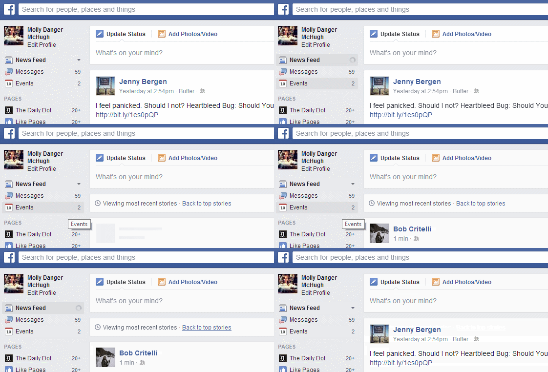
Case in point: the “Most Recent” News Feed view. You can let Facebook dictate your News Feed (the default “Top Choices”) or you can choose the “Most Recent” option, which puts things in chronological order. (Well, not exactly, but closer to it.) It used to be on the far right of the middle section of the page. Now… it’s not.
But since the News Feed is where you spend most of your time, you’re going to want to know where this is. So here you go.

H/T Matthew Keys/Twitter | Photo via mkhmarketing/Flickr (CC BY 2.0)


