The Apple Watch debuted earlier this year, and like the iPhone in 2007 and iPad in 2010, the wearable was hugely hyped and launched to a wide range of opinions. Some, like myself, loved it, while others were decidedly underwhelmed. This fall, Apple will launch the second edition of its watchOS software, and if you’re an early adopter, there’s a lot to look forward to.
Note: All testing was done on an Apple Watch Sport running watchOS 2 beta 3. The software appears to be feature complete, though as always, things can change prior to public release.
New watch faces
I love eye candy and so do you, so let’s start with the most visually impressive thing about the update, shall we? WatchOS 2’s new watch faces, Time-Lapse and Photo, are features that the device absolutely should have had when it launched. In fact, there’s a good chance these two visually stunning additions to watchOS were initially slated to debut alongside the watch, but were pushed back for one reason or another, but now you’ll finally get your hands on them.
You’re going to love them.
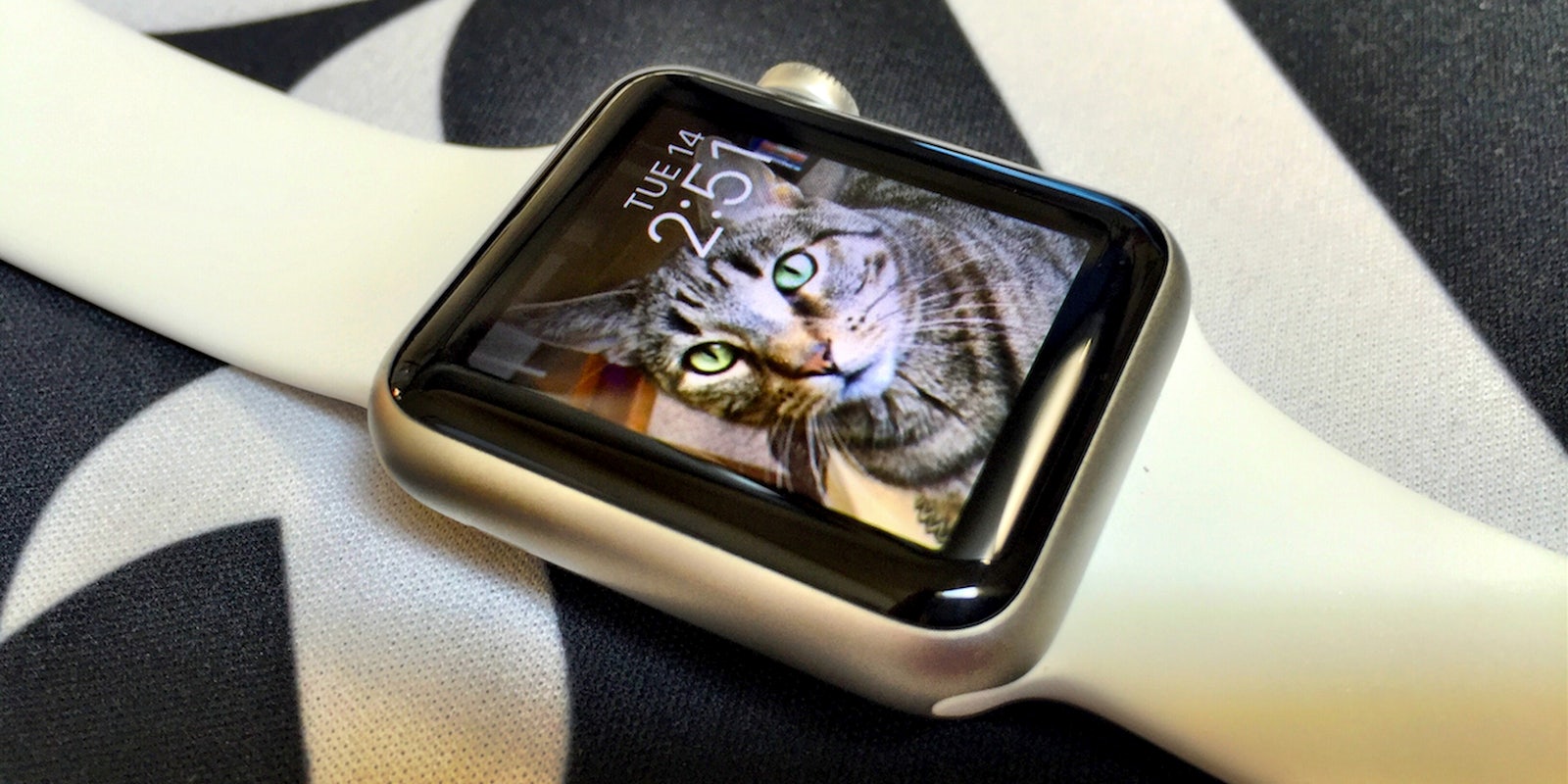
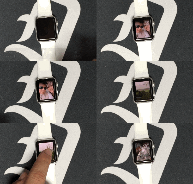
As slick as photos look on such a tiny, high-resolution display, actually going to the photos app on your wrist and swiping through images isn’t all that enjoyable, and certainly not something you’d want to do on a regular basis. The Photo watch face lets you select either a single image or an album, with the latter selecting a new image to display each time you wake the watch display. Alternatively, you can tap on the screen to cycle through the photos in whichever album you selected.
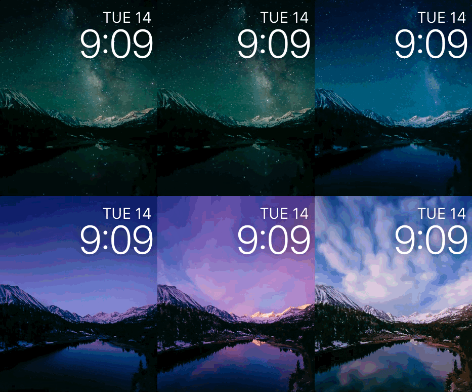
If you’re a fan of the Motion watch face, which features animations of fancy flowers, butterflies, and jellyfish, the Time-Lapse face is likely going to be your new favorite. Using looped clips of about 30 seconds, Apple has crafted some seriously stunning animations for the pint-sized watch display.
Watching New York City or Shanghai change from day to night right on your wrist is just plain cool. The video is so sharp and vibrant that it’s just fun to watch.
Even my wife, who had been having a hard time being impressed with anything she’s seen from any of the half dozen or so smartwatches I’ve shown her, let out a short laugh when she saw it in action. “Ok, that’s pretty cool,” she said, smiling. That’s a lofty endorsement, coming from her.
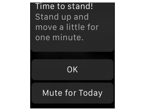
Mute for Today
Drool-worthy bits aside, watchOS 2 is a largely convenience-minded update, adding a few small tweaks and softening some of the rougher edges in the user experience.
One of the smallest changes that will no doubt receive a ton of praise is the addition of a timed mute option for certain notifications. Now, if your watch is repeatedly bugging you to get up and “move a little for one minute,” as it so often loves to do, you can either tap “OK” to dismiss the alert as usual, or select the new “Mute for Today” option, which will prevent the same notification from popping up again until the following day.
I often find myself receiving the “Stand up!” alert at times when I just can’t, either because I’m doing something that takes priority or because I simply don’t want to at that particular moment. I’m all for my watch doing its best to make me more healthy—and to be honest I’ve found myself on the bike trail a lot more often thanks to Apple’s gamification of my daily exercise and movement goals—but we all have days where we don’t want anything, least of all a watch, telling us to get off the couch. The temporary mute option is the perfect solution, and a great addition.
Nightstand Mode
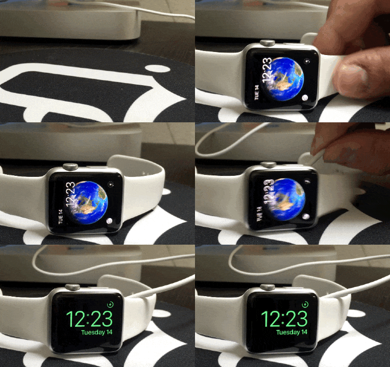
Nightstand Mode is another small inclusion that increases the amount of use you can get out of your Apple Watch when it’s not actually on your wrist. with watchOS 2, whenever you remove your watch and lay it on its side with the power adapter connected, Nightstand Mode will activate.
It’s a simple, oversized green digital clock which brightens gradually when you’re approaching an alarm. It’s a lot like the desktop clock feature on the Moto 360, and falls into that same “could have been a day one feature” column as the photo watch face, but it’s nice that it’s here.
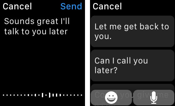
Allowing replies to text messages but not to email in watchOS was an curious decision on Apple’s part, but thankfully the option arrives in watchOS 2.
Siri is the real star of the show here. Telling Siri how you want to reply works quite well, assuming the background noise is at or below a dull roar. It’s quick, accurate, and most importantly, convenient.
You also have the option of using canned text responses, just as you can with text messages, though in practice these sound stilted and impersonal. They might be ok for the occasional stale, professional response to something of little importance, but they won’t cut it if you want to sound like anything other than a robot.
Time Travel
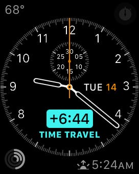
If you’re the type that wakes up with a million things on your daily to-do list, Time Travel could help you plan your day, though it’s very clearly still in its earliest functional form. In testing the feature—which lets you scroll the digital crown to get a preview of your day, including calendar alerts, weather changes, and even the charge level of your electric Volkswagen if you happen to have one—I found it to be of limited value most of the time.
Scrolling forward to see how the temperature changed according to the current forecast is always welcome, though even this only seems to update occasionally, offering what turned out to be, at best, an extremely rough estimate.
If you have a dozen appointments on your calendar each and every day, and if you happen to own an electric VW (I own a Volkswagen, but it’s not electric. So close!) you’ll likely find it a good deal more useful than someone like myself.
Performance
Given that the software remains in its beta state, it’s not worth diving too far into how this pre-release version of watchOS 2 actually performs. However, I will say that after a single reboot after a curious post-install crash, the watch feels at least as responsive as it did in while running watchOS 1.0.1. That’s a good sign.
In terms of battery life which, again, may change as optimizations and other changes are made prior to release, the only noticeable change for better or worse was a drop in longevity while using the Time-Lapse watch faces. That wasn’t entirely unexpected, considering such a visually impressive feat is undoubtedly more taxing on the device than a static image would be, but it was definitely a noticeable change, cutting the watch’s off-charger time by at least a couple of hours.
Do you want one yet?
If you didn’t want an Apple Watch before, watchOS 2 isn’t likely going to convince you that you need one. The changes Apple has made here are meaningful and fun, but they’ll likely do more to help early adopters validate their purchase than bringing any naysayers into the fold.
Using watchOS 1.0.1 as the baseline, watchOS 2 feels more like a 1.5—not a quite a full second release, but a really, really solid 1.5.
Photo via Mike Wehner

