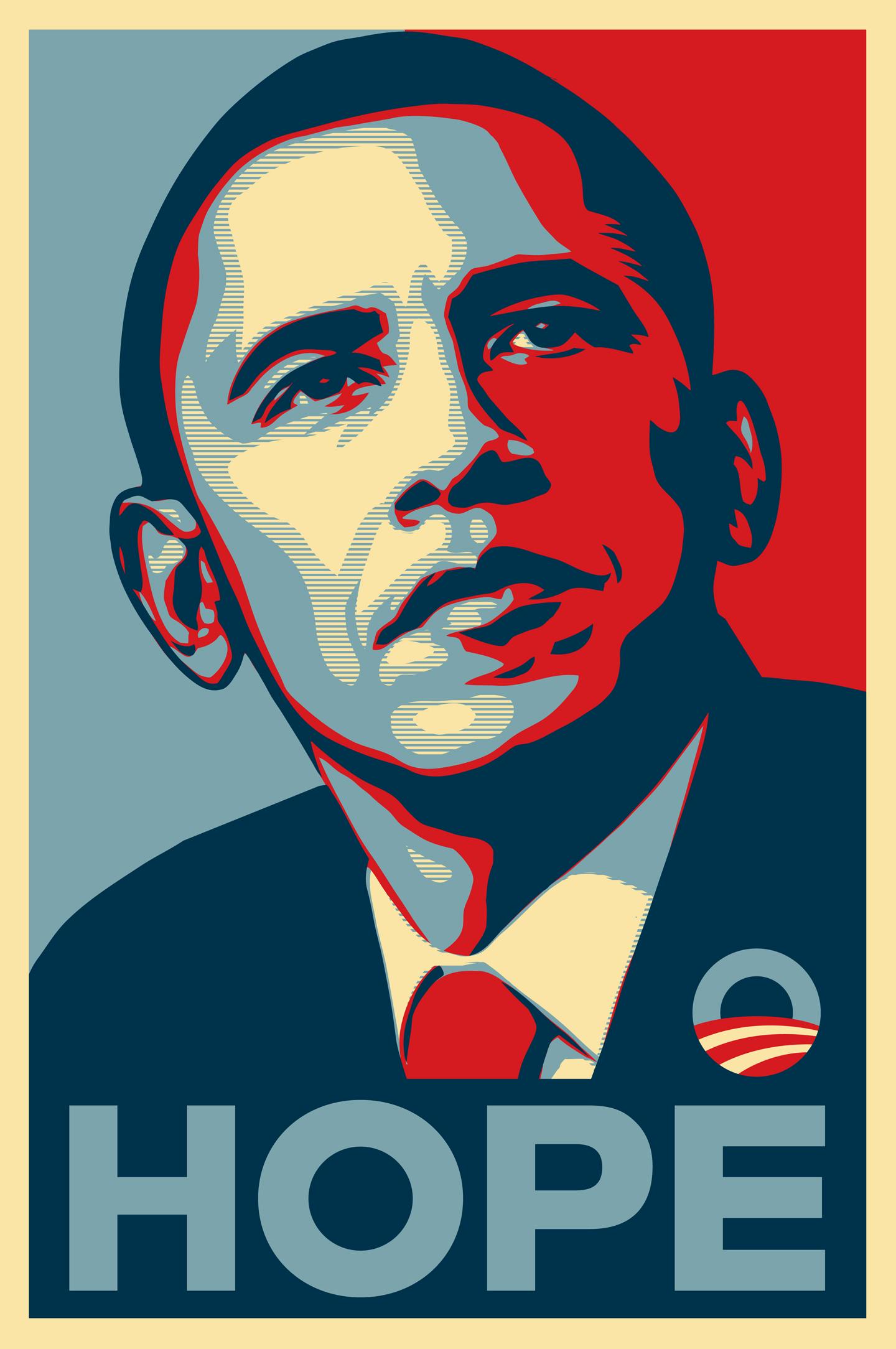
It’s easy to recall President Obama’s iconic pictographs from his 2008 campaign. Designed by street artist Shepard Fairey, the quad-colored portraits impressed with the words “Hope,” “Change,” and “Progress,” and stood for a grassroots movement seeking an alternative direction against a chain of homogenous leadership. On Friday, redditor and London-based graphic designer Aled Lewis unveiled what some Reddit users are now calling Democratic candidate Bernie Sanders’ “Hope” poster.
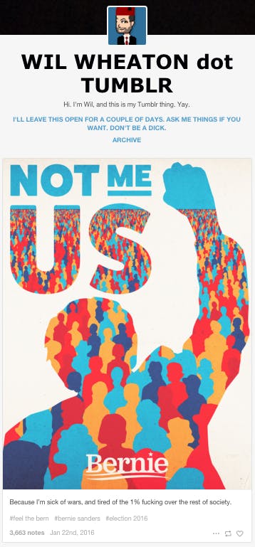
Not Me. Us.
The copy “Not Me, Us.” comes from Sanders’ rally on Jan. 8 in Cedar Rapids, Iowa. “Who is the stronger candidate?” Sanders asked the audience. They began chanting his name, to which he replied, “Not me. Us.”
The design, which was posted in the community /r/SandersForPresident, has since garnered more than 4,800 upvotes and 700 comments on the site, with 778,000-plus views on Imgur. Though redditors gave slight critique about design, users commented on the thread with overwhelming support for the poster, asking for printed T-shirts and resized images for social media use.
“I’ve been looking for our version of Obama’s hope poster and honestly I think this could be it. Really well done,” commented Reddit user kylerschelling.
“And after looking at it again, I really do think this is our ‘Hope’ poster. It summarizes the campaign visually and textually, with gorgeous flat graphics,” another user, AbuseTheForce, commented.
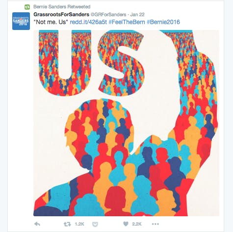
Sanders’ campaign Twitter account even retweeted the design that was originally posted from @GrassrootsForSanders. The design has also been posted on Tumblr by Star Trek: The Next Generation actor Wil Wheaton.
On Facebook, London graphic designer Aled Lewis posted the illustration with a short description, writing, “I’m a Brit, but #Bernie is leading a robust, honest counter-corporate movement that would have implications around the world.”
Lewis said despite not being able to vote for Sanders, he identifies as a supporter for the politician’s views on issues such as income inequality, the living wage, and social justice. “…Bernie doesn’t trade in narrow nationalistic issues, and he projects a vision of an America that can lead the world by [its] own example, [by] treating all people with dignity and providing them with opportunity,” Lewis told the Daily Dot via email.
For the design, Lewis said he decided to focus on Bernie’s silhouette in order to capture the spirit of his message, “Not me, Us,” rather than his exact image. “The theme of Bernie’s campaign is one of empowerment. Reminding people that in a democracy, in large enough numbers, they hold all the cards,” Lewis said. “…It occurred to me to make Bernie the ‘window’ through which the people can be seen and heard.”
Since the design’s informal endorsement by the /r/SandersForPresident community, Lewis has created a Flickr album of resized posters, wallpapers, profile covers, and profile pictures for Sanders supporters to use on social media, free to download.
While Lewis is “flattered,” to have his illustration compared to Fairey’s, Lewis doesn’t expect his work to have as deep of a lasting impression on pop culture. “I can’t vote or donate money to Bernie’s campaign so to some extent, making this poster was my way of contributing,” Lewis said. “Bernie has called upon millions to ‘stand up together,’ and this is what I have drawn. I want Bernie supporters to feel as though they are part of this crowd, and for those who aren’t, to want to be a part of it.”
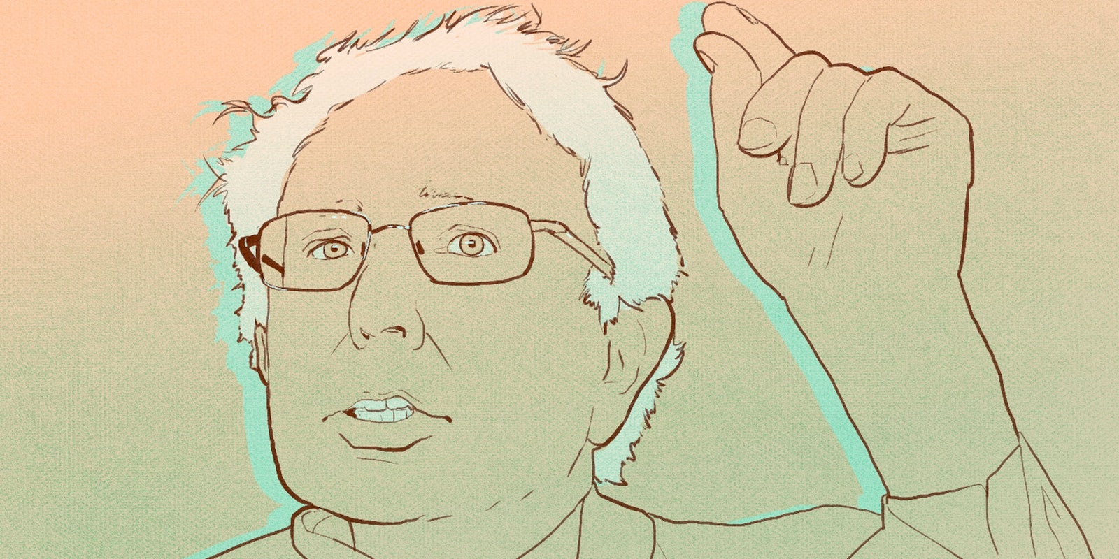
Illustration by Max Fleishman


