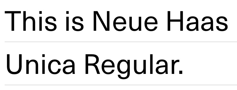
Rarely does a new font achieve celebrity status on the Internet. But that’s exactly what happened on Wednesday with the release of a font called Neue Haas Unica, which now has font-lovers and nerds excited about glyphs and ligatures for the first time since Helvetica got its own documentary.
The full suite of Neue Haas Unica font styles is currently on sale for $99. Monotype, the typeface company that owns the font, lets users download one of the font’s nine styles—the thin version—for free.
So why all the hoopla?
Neue Haas Unica is descended from a font that had nearly attained the status of urban legend before its revival this week. The original Haas Unica font, long relegated to the annals of font history, was designed by a team of experts to expound upon the idea of Helvetica.
Unica was a careful synthesis of three different fonts—Helvetica, Univers, and Akzidenz Grotesk. It was supposed to usher in a new era of typeface design for the Haas Foundry, which commissioned it in 1977. However, by the time the font finally debuted in 1980, it was mired in legal disputes, and it quickly vanished from popular use.
Fast forward three decades, when type designer Toshi Omagari decided to revive and reboot the lost Haas Unica. Omagari rethought the original design, updated it to make it compatible with digital typography, and more legible in smaller point sizes. He also expanded the number of font faces to a grand total of nine, ranging from Ultra Light to Extra Black.
The result is a font that has even casual typography enthusiasts swooning.
https://twitter.com/hrbrmstr/status/586153446732075008
https://twitter.com/4debbiekennedy/status/586213463401205762
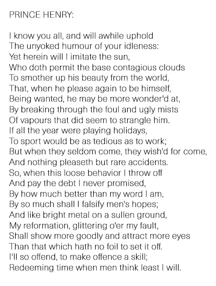
So what does the font look like in action? We decided to try out our free download of Neue Haas Unica Thin on one of our favorite Shakespearean passages, from 1 Henry IV, to see if it’s worth the hype.
Well, there you have it. The graceful elegance of Unica’s smooth curves and soothing lines definitely makes us want to cast off our lack of ambition, ascend to our rightful place as rulers of our domains, and maybe even invade France.
Even if you don’t like Helvetica, you should be able to appreciate the wonders of a font that’s been repeatedly described as “badass.”
Maybe this is the brave new font that will finally get the world to stop using Arial.
Photo via Ian Muttoo/Flickr (CC BY SA 2.0)


