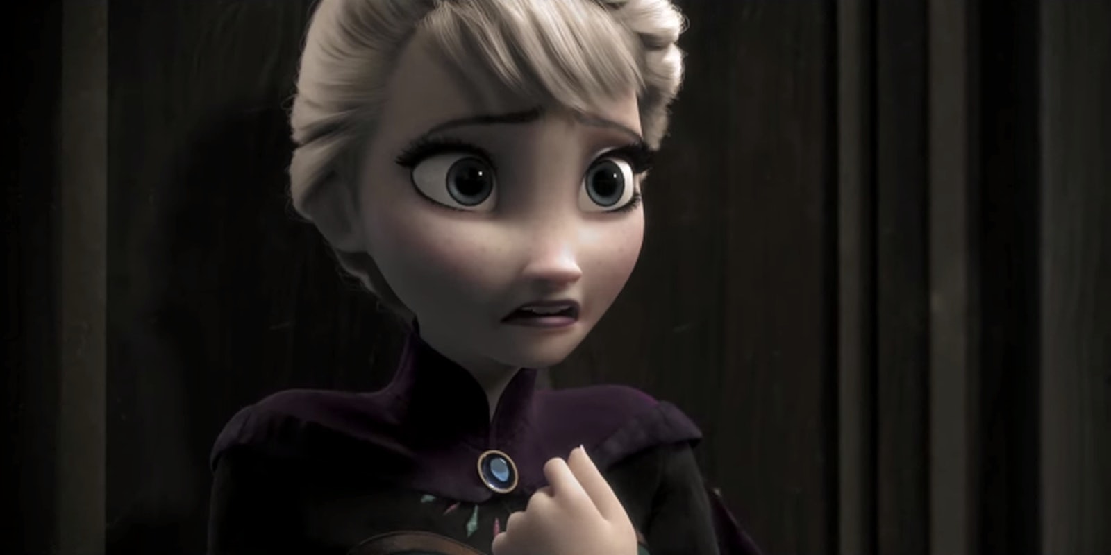
Some aspects of Frozen are already scary for its young audience, but now there’s plenty of horror for the adults.
A change in music and toning down the colors in the animation turns it from a fairly optimistic movie full of songs and quotes we’re still exchanging six months later to something a lot more horrifying. Elsa’s got her gift, but she can’t control it, and things in Arendelle are becoming a lot more dangerous. Nobody will want to build a snowman come next winter, but it looks just as entertaining as the original.
And one of the best parts? The viral “Let It Go” is nowhere to be found.
But if there’s someone who’s become the go-to of creepy and beloved animated classics, it’s Tim Burton. Thanks to a Japanese artist named Yoko, we now have a good idea how our favorite Frozen characters would look like with that Burtonesque feel to them.
It’s a lot different from what we’re used to seeing, but it’s left us wondering what Burton would’ve done had he actually gotten his hands on Frozen.
ティムバ風ゆきだるまつくーろ〜♪ pic.twitter.com/neogrm7dDZ
— よこ (@yokoney) May 5, 2014
アナ雪で #ティムバ風 pic.twitter.com/Vb8SeJmay6
— よこ (@yokoney) May 6, 2014
エルサ #ティムバ風 pic.twitter.com/oSnRG145H7
— よこ (@yokoney) May 6, 2014
Photo via Bobby Burns/YouTube


