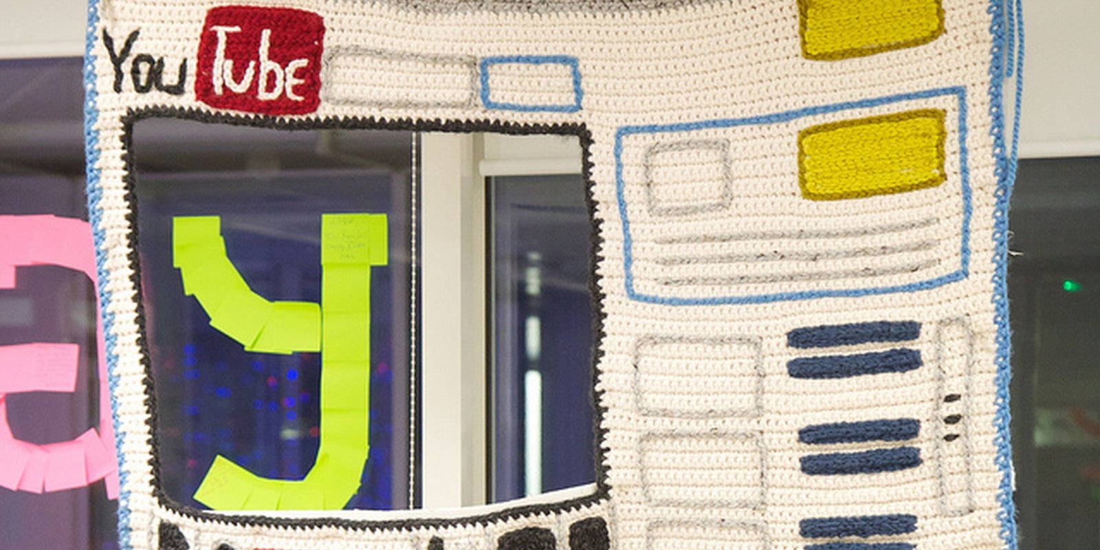
YouTube has a new homepage layout that’s being trumpeted by media outlets from Wired to TechCrunch.
The update, which rolled out worldwide at 4:30 p.m. Eastern Time on Thursday, was designed to emphasize YouTube channels, allowing users to easily select and subscribe to their favorites. Coupled with a streamlined process for sharing on Facebook and integration with Google+, the social network owned, like YouTube, by Google, the change was intended to help foster a more social, interactive experience.
A black navigation bar on the left encourages users to log in with a big button and presents a list of categories. Recent and popular videos, including Lady Gaga’s latest music video and rapper Mac Lethal, featured yesterday in the Daily Dot, take up the center column. On the right, there are “Recommended” videos. An ad with a playable video embedded stands on top of the page.
So advertisers and certain content creators may be happy. But YouTubers, the people who spend hours on the site daily as a replacement for TV, aren’t nearly as excited.
YouTube actually implemented some of the new homepage features and layouts at various points this year, and each change was met with heavy criticism from the community, with the consensus being less-than-positive. Even the new YouTube layouts were turned into a Downfall parody video.
So it’s not surprising that the latest upgrade to the homepage layout has been equally contested.
“I come home, sit in my chair, and type in youtube dot com. And it wasn’t like yesterday. Oh no, now everything is all crunched up in the middle, all confusing and everything,” says YouTuber RobyCtv, in his vlog uploaded yesterday.
RobyCtv runs through all the issues he has with the layout in the rant, “The New Home Page and Channel Frustrates Me !!!,” and he’s not alone in his frustration.
YouTube celebrity Phillip DeFranco, who noticed his fans “freaking out” about the new changes to layouts and the homepage, decided to make an eight-minute tutorial video.
“Calm down. You’re not going to leave, really. You’re like, I’m gonna go to vimeo,” DeFranco says, impersonating a frustrated YouTuber. “So, I am going to try and hold your hand through the very scary changes.”
YouTubers have taken to complaining about the new layout in comment threads and on Twitter. Some don’t like the colors, others say it’s too much like Facebook. Quite a few admitted to getting lost on the homepage, including YouTube celebrity Kingsley. (YouTube did post an updated user manual.)
Others wondered why there weren’t more YouTube Partner features, and some simply admitted they don’t like change.
There were some positive reactions on YouTube, however.
Dave Mosher called it “interesting.” Aaron Espinoza tweeted that it’s “far easier to use than I anticipated and it is cleaner than I thought it’d be.”
In a series of tweets to the Daily Dot, Ben Hughes, an avid user since 2008, applauded the effort.
“I honestly enjoy the new layout. YouTube is trying their best to improve general AND hardcore user experience, which is paramount to their continued success as far as curated content goes,” wrote Hughes.
“They’re making the right steps moving forward in a well prioritized fashion.”
Photo by Marcin Wichery


