Wikipedia is in trouble. Forget about widely reported problems like the editor exodus and the embarrassing gender imbalance. As Wikipedia senior designer Brandon Harris will tell you, the biggest problem with the free encyclopedia that anyone can edit is that it’s stuck a decade in the past.
The design is functional but dated (and a little ugly). And the clunky user interface causes newbies to flee in confusion.
Harris has a solution. Called the Athena Project, it will radically reinvent how users work with Wikipedia by fixing the design and—most controversially—injecting the site with a healthy dose of what looks suspiciously like social networking.
Casual Wikipedia users probably know Harris (and especially his chestnut locks) best as the other face of Wikipedia’s fundraising drive last year. But aside from outshining Wikipedia founder Jimmy Wales in the quest for donations, Harris is a full-time staffer at Wikipedia. His ambitious proposal would recast Wikipedia through a series of code-named projects (Agora, Echo, Flow, etc.) that add up to a cleaner, easier to use site that pulls users in through Facebook-style notifications, a robust user profile, and a far more intuitive workflow.
“The software is a barrier and it is dragging you down,” Harris wrote at the Signpost, Wikipedia’s community-edited newspaper.
Though Harris attempted to preemptively parry accusations that the redesign would turn Wikipedia into the Facebook of online encyclopedias, that didn’t stop from criticisms piling on.
“I don’t want someone deciding what my userpage should look like, especially not what it should look like across all Wikimedia projects,” Wikipedian Yngvadottir, wrote, adding that he or she reacted with “considerable alarm” to the proposal.
Others, meanwhile, implored those in charge for an “opt out” feature.
“Wikipedia shouldn’t become like Facebook,” Wikipedian Toa Nidhiki05 wrote, “and, if it does, it should at least give editors that like the current layout the option to avoid the new one (as opposed to Facebook which forced Timeline down everyone’s throats).”
For Harris, the redesign’s social elements have less to do with changing Wikipedia into a social network than they do with using new technology to improve collaboration.
“The fear that Wikipedia will turn into a social networking site is one I hear fairly often. However, I don’t see that as a real threat: there’s a distinction between becoming a social network and having modern software to support the building of an encyclopedia.”
—Brandon Harris
Besides, as Harris notes, Wikipedia’s research shows the site’s poor user-to-user interface is the biggest hurdle for new users. Wikipedia may not be a social network, but it does depend on social interaction to succeed.
And from an outsider’s perspective, the redesign certainly makes the site look friendlier. Check out the mock-up images below.
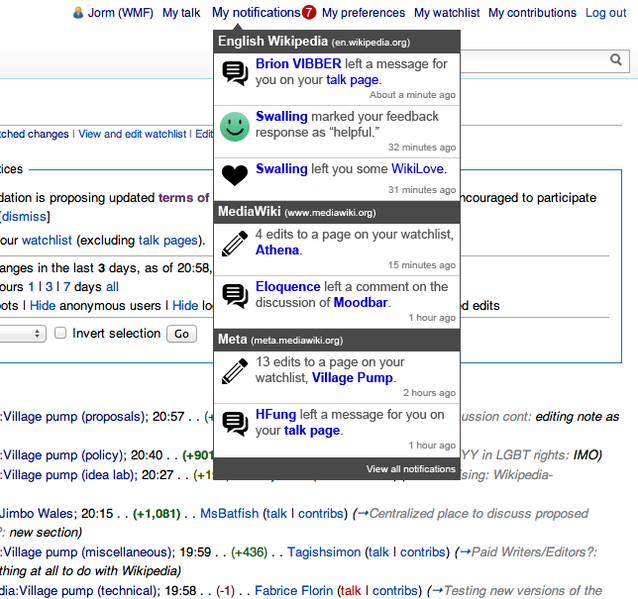
1) Echo
Harris’s proposal for a real-time notification system.

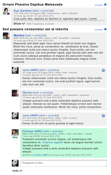
2) Flow
A reworked “user talk” page.

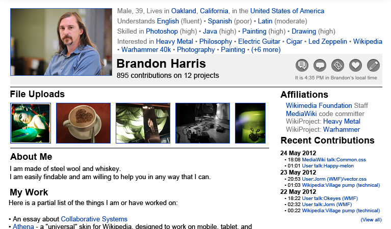
3) Global profile
The new user page that, according to Harris, “focuses on your contributions and how you are bound to the projects.”

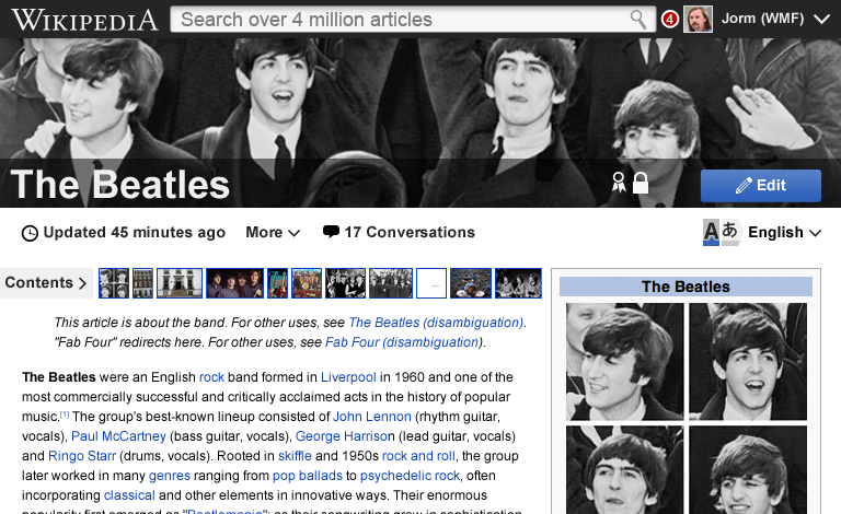
4) The Athena skin
The end result of the user interface makeover.

Photos via Wikipedia


