The science of information visualization just keeps getting more and more gorgeous. Thanks to advances in technology and graphic design, infographics, those swank charts and pictographs that illustrate the logic of the world we live in, are more beautiful and more information-filled than ever.
The 2013 Winners of the Kantar Information is Beautiful awards have a lot to say, but the fun part is in how they say it. This year saw winners in the fields of science, history, literature, and entertainment make their way into the shortlist of contenders. The infographic maker Infogram, which allows anyone to make stylish infographics, also got a nod for excellence as a tool for general use. If you’re looking for some inspiration for sprucing up your next bar chart, here are a few of our favorites:
If you’ve ever wanted to be able to explain the complexities of the world’s most controversial currency, this short intro video covers everything, from stocks to the Silk Road, and does it in style.
The 39 Stats: Hitchcock’s Obsessions in Numbers

Photo via Wikipedia
This epic infographic done for The Guardian goes through the iconic director’s filmography and attempts to summarize his many themes, character and plot devices, and patterns in a brilliant infographic that pays homage to the famous Saul Bass title sequences for such classics as Vertigo and North by Northwest.
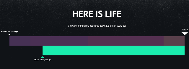
This simple yet enthralling interactive graphic shows that sometimes when presenting information, minimal design yields maximum effect. We’ve all seen simple line charts that attempt to illustrate the profundity of the age of the earth and/or universe; but watching years and echelons unfold before your eyes in these smooth graphic transitions almost makes realizing your own relative insignificance a pleasurable experience.

Screengrab via Here is Today
Visualizing Global Economic Relations
A description of the amount of money exported yearly between five of the world’s biggest industrial nations would probably bore you to tears in any other context. But in this smart interactive spider-web, comparisons and contrasts are interesting and easy to see—like the fact that China exports nearly 4 times more in goods and services to the U.S. than the U.S. does to China.
Also, it’s pretty cool to watch the countries rearrange themselves when you change their order
Kurzgesagt is a team of self-professed German designers “and nerdfighters :D” with a single mission: Short videos, explaining stuff. Like, for example, the universe as we know it:
Speaking of man’s vast insignificance…
Politicians’ Salaries vs Income Inequality
Ever wanted statistics for your hunch that lawmakers make way more than they should? Thanks to this intriguing infograph, it’s easy to see the connection between politics and wealth. Done by a group of Middle Eastern researchers, the infograph depicts the correlation between high salaries and income gaps in a brilliantly simple way: the higher the salary, the higher the politician; the larger the income gap, the larger their expanding waistline.
As you can see, sometimes how you get your information can be as interesting as the information itself—and in some cases, a lot more beautiful.
Screengrab via Vimeo


