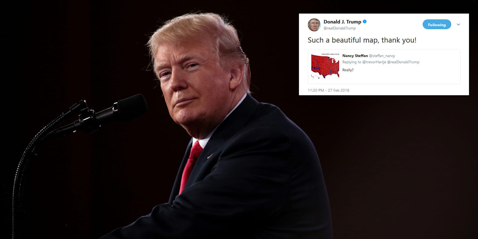
President Donald Trump retweeted a supporter on Tuesday night who shared a map showing county-by-county results for the 2016 election that many people are spotting errors in.
Trump called the incorrect map “beautiful” in his retweet, but as many have pointed out, the map does not show accurate results from the 2016 election and appears to have been changed to favor the president.
The wrong map was shared by Twitter user @steffan_nancy, who used it to try and rebuff an insult made by another person during an argument under one of Trump’s tweets from Tuesday.
Here’s a look at the map posted by @steffan_nancy that was eventually retweeted by the president:
https://twitter.com/steffan_nancy/status/968578927005351936
And here is an accurate county-by-county map of the 2016 election results.
https://twitter.com/ddale8/status/968721617022062597/photo/1
I shouldn’t actually vouch for a Breitbart map, though it was done by a Michigan professor. Here’s a better county map that appeared in The Economist. This concludes tonight’s tweeting of maps. pic.twitter.com/PQAcZZgepw
— Daniel Dale (@ddale8) February 28, 2018
The map shared by @steffan_nancy and later the president changes several counties that went for Hillary Clinton instead of Trump, such as one in northwestern Nevada, among others.
People were quick to point out that just because there is more red on both maps doesn’t necessarily mean that more people voted, or support, the president. While it does look striking, a map using geography to chart support doesn’t make much sense considering population density.
Trump has been known to be fond of maps of the 2016 election. In August last year, he retweeted an account that published a map of the election and he reportedly handed out printed electoral college maps during an interview with Reuters last April. A framed photo of the election results was also spotted in the West Wing last May.
But Tuesday’s retweet was just another moment for people to mock Trump for his continued sharing of election maps.
The president has retweeted a fake map that incorrectly displays county-level 2016 results. This falsified version turns a bunch of Clinton counties red. pic.twitter.com/iOeO8zUVKO
— Daniel Dale (@ddale8) February 28, 2018
https://twitter.com/JamesFallows/status/968713198785449984
https://twitter.com/passantino/status/968704757928898560
https://twitter.com/albertocairo/status/968823058332110848
https://twitter.com/Auriandra/status/968818543021223937


