After joining Ravelry in 2009, Countess Ablaze found a hobby that led to a career in selling yarn. But the Countess said when the platform overhauled its site on June 16, the new design caused her to have a seizure. She calls the redesign a “nightmare” for autistic people to look at.
“I suspect for me it was the glaring white, sensory overload of a lot of colours, flickering and high contrast black lines,” the Countess wrote on her blog. “I can’t speculate anymore than this and now I’ve had one seizure (I’ve been seizure free since Nov 2018) I’m at higher risk for another.”
The Countess was unable to speak with the Daily Dot due to health reasons.
But she isn’t alone. At least eight Ravelry users say they’ve had seizures from the site’s design. Many more say they’ve had severe migraines or vertigo from the moving graphics and stark color contrasts, according to multiple posts on Instagram and Twitter, where people are using the hashtag #ravelryaccessibility.
The redesign has been met with widespread criticism and allegations that the platform didn’t test for standards of accessibility before its unveiling. Ravelry did not return multiple requests for comment from the Daily Dot but posted updates on its site addressing the issue, which were met with further criticism from users.
What is Ravelry?
Ravelry is a social networking site for fiber arts like knitting and crocheting. The site was founded in 2007 and has 9 million registered users, with 1 million of those active monthly, according to Ravelry’s self-reported statistics.
Ravelry hosts forums about fiber arts and functions as a marketplace for users to sell patterns. In February, Ravelry reported almost $2 million in sales for creators.
The site is “the online center of the knitting world,” according to Vox, and is managed by a team of six people. Last summer, Ravelry made a splash in mainstream headlines after banning content that supported President Donald Trump.
The website accessibility conundrum
While Ravelry users and other disabled activists maintain that internet accessibility is a right, the vague laws surrounding website accessibility may prevent Ravelry from facing legal repercussions.
Within the court system, websites are commonly referred to as “places of public accommodation,” according to a Medium post by Kris Rivenburgh, an attorney and web accessibility consultant. This means websites are required to be accessible under Title III of the Americans with Disabilities Act.
A set of standards called the Web Content Accessibility Guidelines is widely used by courts to determine if a website is accessible. But there aren’t any explicit laws detailing what accessibility for websites means in practice—despite users’ increased risk of seizures or other physical reactions when the guidelines aren’t followed.
This means it can be more difficult for businesses to be held legally liable, and the process to accountability doesn’t start until someone sues.
“The more commercial in nature your website is, the more you become open season for serial ADA lawsuit filers,” Rivenburgh wrote.
Humans of Ravelry speak out
Armed with social media and Ravelry forums, users are sharing their own experiences and speaking up against the redesign.
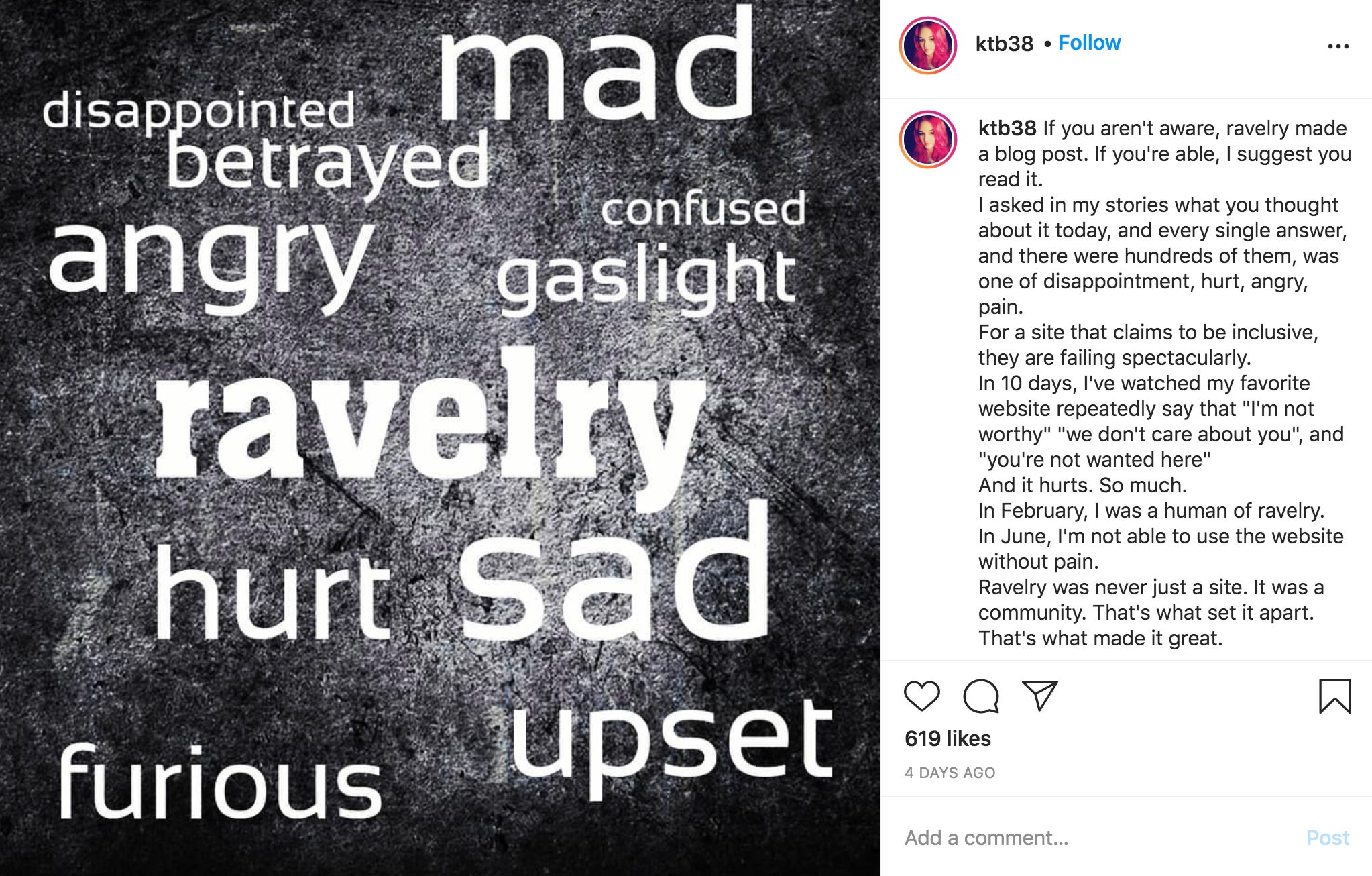
“In February, I was a human of ravelry,” @ktb38, who has used the site for 13 years, posted on Instagram. “In June, I’m not able to use the website without pain.”

Ravelry user Sylvie J. created a petition on June 27 asking Ravelry to hire an accessibility expert so users can access the site safely. As of the time of publishing, the petition had over 1,000 signatures.
“I and many others want to be part of the Ravelry story, we want to belong. We have loved it and want to live it again,” Sylvie wrote in the petition.
Twitter user @winged also noted the lack of accessibility is particularly harmful because “fiber arts are so prominent a hobby in disabled communities.” Many users sell patterns on the site as a form of income, meaning lack of access can impact their finances.
Ravelry user C. Rogers said in an emailed interview with the Daily Dot that she’s felt headaches coming on after using the site for more than 10 minutes and that she understands people’s anger about the redesign.
However, Rogers also said Ravelry is a historically inclusive organization. She noted that while disabled users shouldn’t have to push this hard for accessibility, she is confident that Ravelry will fix the issue.
“I do feel Ravelry will eventually fix things but it’s going to take a lot of pushing on the part of Ravelers to make it happen,” Rogers said in the email. “Ravelry’s redesign was on more than one person and it’s going to take more than one person to fix it.”
What’s next?
After the redesign was unveiled on June 16, the Ravelry team posted twice on its homepage. On June 19, a lengthy blog described how the team picked new colors and icons. On June 26, a post called “Ravelry’s New Look: a Check-in” addressed readability and accessibility.
“For those of you who are having issues with the New Ravelry design, we’re truly sorry that aspects of the site are not usable for you,” the June 26 post read. “Your experience on Ravelry matters so much to us, and we’re working hard to make our site work as well as possible for all of you.”
According to the post, a feedback form is now available, and the team is considering users’ suggestions. The site also said it will allow users to change back to the old version of the website and will give six months’ notice before retiring the old format.
But according to a blog post from Wip Insanity and a tweet from @sdeutsh, the toggle doesn’t return to the original format.
“The option to ‘switch back’ to the old site does not actually revert back to the old site as it was, but the new site with the old site’s skin on top (eg issues of contrast persist, causing vertigo for someone like myself),” @sdeutsh tweeted.
The user also tweeted on June 27 that her attempts to talk about accessibility on Ravelry itself were removed by the platform.
“I posted a thread on @ravelry just now that breaks down the problems with the survey allegedly addressing issues with the new design,” @sdeutsh tweeted, along with screenshots of the incident. “Since then the post was archived and locked, and when I posted to call them out on doing so to accessibility threads, they deleted both posts.”
Ravelry tweeted its June 26 post, and many users responded that the response was disappointing. Twitter user @DillsFTW reiterated that accessibility guidelines “have been around for years.”
“Not managing to implement basic accessibility tells me that it was not included in your overall goals for this redesign,” the user wrote.
Now, the Countess and other Ravelry users are distancing themselves from the platform. Some are pledging to no longer direct customers to the site, while others will no longer post patterns there altogether.
“Accessibility should be at the forethought of a website. I don’t know how ravelry can fix this, but I’d like to ask that until the issues can be fixed, that classic ravelry be the default,“ @ktb38 wrote on Instagram. “I believe in accessibility … I can not in good conscience be silent when so many people are in pain, and when they feel so alone because they just lost their social network.”
READ MORE:
- Disabled man dies after being denied coronavirus treatment
- These racist memes say coronavirus masks will lead to burqas
- What Domino’s Pizza got wrong about internet accessibility
- The games industry is broken. Burn it down and rebuild
Correction: An earlier version of this piece misspelled C. Rogers’ last name.


