For a brief moment earlier this year, LiveJournal, the early blogging community that paved the way for modern social media platforms, was stunningly relevant in the U.S. once again. A member of its enormous Eastern European audience was posting breathtaking photos of the Kiev revolution, and those of us who hadn’t logged into our LJ accounts in years—except to occasionally prevent it from deleting one of our old accounts—were reminded of the vibrant community we lost.
The days of LiveJournal’s thriving English-language community aren’t that far behind us. Just a few years ago, any update LJ made would incur a flood of feedback on its main news account. As late as 2012, before LJ all but abandoned its U.S. offices, the LJ community was still desperate to keep the site from evolving away from the Internet hometown we loved.
Last week, however, as LJ rolled out a major overhaul of its UI without any fanfare or English-facing public announcement, it seemed there was no one left even to complain. Apart from a few angry comments on an older news post demanding to know why LJ didn’t even bother to prepare users for the change, the change has barely elicited more than a shrug from LJ’s once passionately-invested community of users.

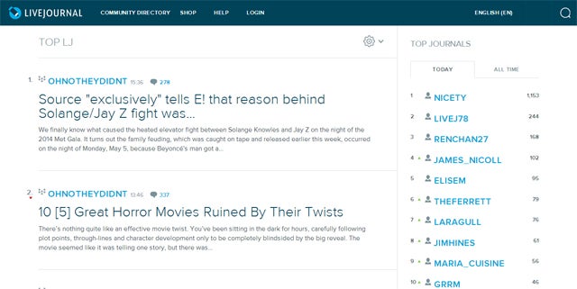
LiveJournal’s most recent rollout significantly lightens the text and background color while widening the default layout and hiding many of the icons and navigational cues throughout the site. Here’s how the LiveJournal home page looked last Wednesday…

…and how it looked after the update:

While it’s admittedly a cleaner, more mobile-friendly look, the redesign unfortunately hides important parts of the navigation. Most of the main navigational tools, which used to be in the main navbar, are scattered all over the place:
- The logout function is now tucked away under the dropdown menu under “my blog.”
- The friends view is still on the main navigation—but that means you can’t see it from the main LiveJournal.com page. You can only get to it from going to “my blog” and then chosing your profile from the dropdown menu, clicking on it, going to your profile page, and then clicking “Friends Feed.” Seriously.
- Meanwhile, your own blog is not available from the main menu on your profile. To see it you need to click the words “My Blog” or your username from the drop-down menu.
- A few tools are now inexplicably accessible only through the new “Statistics” sidebar, which is otherwise functionally useless unless you really like seeing your comment count go up from all those readers you no longer have because they left LJ for Tumblr two years ago. These include your access to Memories (LJ’s antiquated but hefty system for bookmarking old posts), Photos, and Userpics.
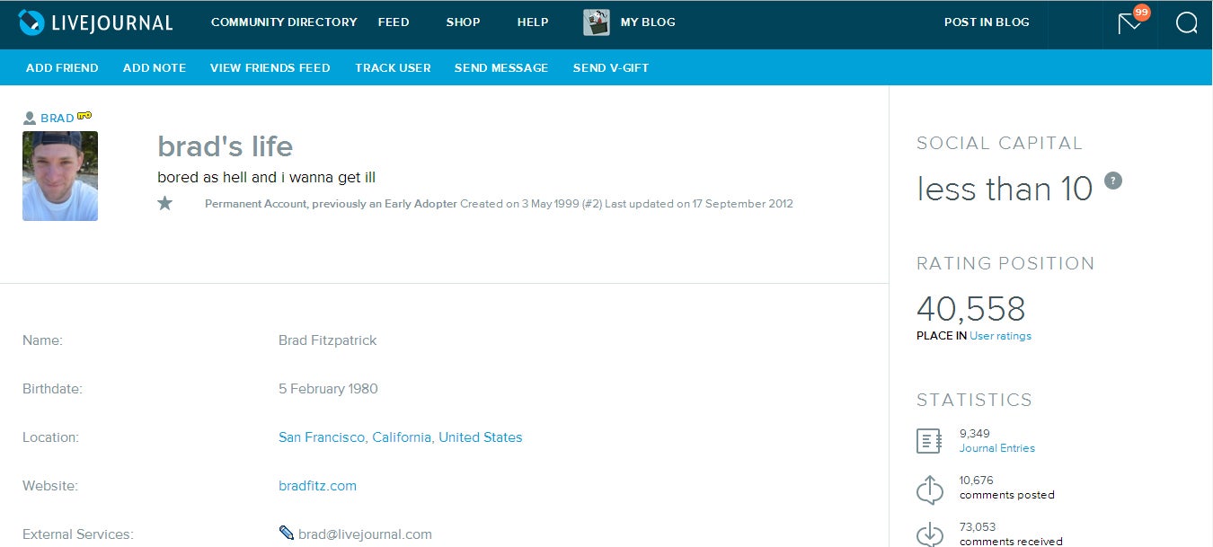
The new design also, somewhat perplexingly, makes “Social Capital”—a mysterious popularity ranking system based on what seems to be overall level of popularity combined with recent activity—the most prominent thing about any LJ user’s profile. Brad Fitzpatrick, LJ’s creator, is probably the oldest, and by far one of the most popular users on the site. But because his last actual post was made in 2012, he has a social capital of “less than 10,” whatever that means.

Although the “social capital” function has been around for a while, its new prominence ironically highlights LJ’s absent community (at least for those who’ve chosen not to opt-out of it; everything LiveJournal does is opt-out rather than opt-in these days.) Once-thriving accounts like Brad’s sit dormant and inactive. The “less than 10” isn’t really about social capital; it’s about the steady decline and forced diaspora of LJ’s userbase. Its once diverse community, particularly welcoming to fandom, is silent, most having relocated to Tumblr, while LJ’s only arguably mainstream community, popular gossip site Oh No They Didn’t, now draws the bulk of participation and activity for the entire English-language portion of the website.
Other once-central communities have steadily been driven away by LiveJournal’s own changing culture. The former staple community Fandom Secrets announced its departure to the warmer fandom-friendly climate of LJ clone Dreamwidth in 2012. Other major parts of the LJ community like Crack Van eventually followed.
When LJ’s parent company SUP merged with Russian media conglomerate Rambler last year without any attention from the English portion of the website, it seemed to solidify the increasingly silent divide between the website’s cultural community. Site support seems to have suffered in the process. Earlier this month one of the last major bastions of fandom anonymous meme culture, Failfandom_anon, said goodbye and moved to Dreamwidth after its members spent weeks unable to use the site. LJ’s code testing, presumably in anticipation of this new design rollout, was crippling the server on which the community was located.
But despite the weeks of testing, the new update has severely limited functionality. Despite numerous attempts, I was unable to get the Friends page to load by clicking on it directly, both in Chrome or Firefox. Forcing the page to open in a new tab using the Control/Apple key or right-click function was successful, but this trick might be beyond the technical knowledge of many users.
Not only that, but a question from the aptly-named LJ user forcryinoutloud about how to revert back to the old interface returned this bizarre response from LJ’s skeleton crew support team, as relayed by another LJ user, infinitepryde:
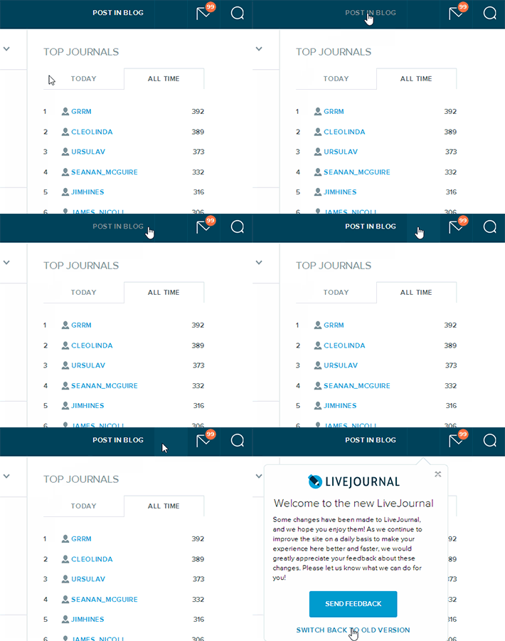
If you go to the Livejournal homepage and look at the top bar in the new UI, you should be able to click on the (blank?) space between “Post in blog” and the message icon. This should give you a menu that includes the option to revert.
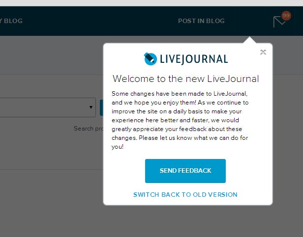
Incredibly, it’s true. There’s an invisible easter egg link to the Support contact form lurking hidden in the top right corner of the LJ menu. Visiting the link directly won’t help, but if you click on the space at the top right corner, it activates the new “welcome” button, shown above, instead of the link. This gives you the option to switch back to the old UI:

Speaking to the Daily Dot by email, LiveJournal’s newly-appointed CEO Katya Akudovich noted that the recent release is a beta version. She also said that the new rollout was just the beginning:
We value opinions of users tremendously and really want to get as much feedback as possible.
Users will be able to switch back to the old design in the next two weeks. On June 1st, after responding to all the feedback and possible adding/fixing certain things, we will roll out final version.
We will also roll out our beautiful and easy to use Android app.
On June 15th we will roll out iOS version.
While LJ users seemed to appreciate the aesthetic changes to the design, the decrease in functionality and the lack of transparency was a source of frustration. Longtime LJ user Sam Starbuck, who is currently one of the site’s active power users, stated that he wasn’t sure catering to the dwindling English-language audience was a priority for the site—and wasn’t sure it mattered anyway.
I don’t think a new look with the same functionality is going to get them anywhere. It seems like the reason people made the jump [from LJ to Tumblr] is that the most commonly-used functions (posting images, sharing other peoples’ content) is easier on Tumblr.
It might be easy to assume that LiveJournal has joined its English users in consigning itself to the past—something so far removed from the emerging cultures of platforms like Tumblr, Wattpad, and Pinterest that it doesn’t even try to compete. Then again, given Russia’s harsh political climate, perhaps they simply have bigger problems. Ever since the tense 2011 Russian elections and Putin’s return to power, blog sites including LJ and VK have experienced crippling, allegedly government-orchestrated denial of service attacks. They’ve also faced political takeovers, and, of course, the problems of maintaining stable Internet infrastructure during a revolution.
Nevertheless, Akudovich was confident, speaking of the beta stage as one of many changes to come:
In general, this new design is only the first step in our renewal of the world’s first social media network. While maintaining everything LiveJournal originally stood for, 2014 will mark a new chapter in our quest for ever-better functionality and usability. We will soon launch a lot of brand new services and the best mobile experience, making LJ a true dominant force in social media all over the world.
They have their work cut out for them. In January, when LJ user Ilya Varlamov went to the trouble of translating his Russian LJ post about the Ukraine uprising into English after realizing that U.S. and European media outlets were desperate for on-the-street information about what was happening in Kiev. The world seemed a bit smaller, and LiveJournal seemed one of the necessary bridges that kept it that way.
But after this rollout, it’s hard not to wonder if that bridge is shakier than ever.
Disclosure: The reporter is a longtime LiveJournal user whose blog was featured in LiveJournal’s 2007 10-year anniversary anthology as “an example of fandom at its best.” She currently has a social capital of less than 10.
Illustration by Jason Reed


