If you spend time at parks and green spaces, public transportation stations, or business parks, you probably look at hostile architecture more often than you realize. To the untrained eye, a collection of stones in the ground, a planter with spikes along its perimeter, or a “leaning” bench may all just look like creative design choices. But often, they are choices made to keep homeless people out of sight.
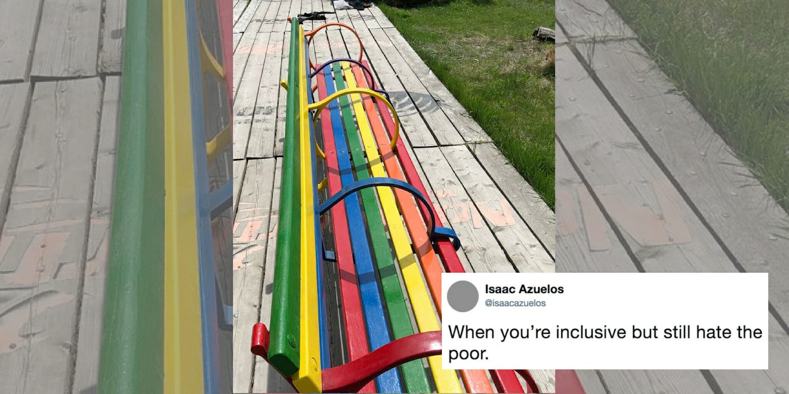
Take the photo of this wooden bench tweeted out by Isaac Azuelos from Calgary in Alberta, Canada—it’s at least 20 feet long and painted like a rainbow, each plank and rail in a different color, often taken as a symbol of LGTBQ pride. However, the entire bench is divided up into four sections by the two armrests on each end, plus three in the middle, making it more difficult for someone to use the bench to lay down.
Sharing the photo on the platform, Azuelos pointed out how the bench hypocritcally exhibits hostile architecture: “When you’re inclusive but still hate the poor.”
When you’re inclusive but still hate the poor. pic.twitter.com/WB1kTuxXkb
— Isaac Azuelos (@isaacazuelos) May 12, 2018
The tweet received more than 75,000 likes and 21,000 retweets. As such, a Twitter account for the location of the bench reached out to Azuelos to set the record straight. According to the Calgary dance collective non-profit Springboard Performance, the bench at its containR art park was not intended to “institute or uphold the principles of hostile or exclusionary design,” but was a gift to the park from city workers for one specific elderly patron who walks by the park daily.
“As it was a much appreciated gift, we embraced the opportunity to provide more seating of any kind on site,” the account wrote to Azuelos in a direct message. Azuelos then shared a screenshot of the conversation, having written back to the non-profit that he didn’t “blame the donors for providing a hostile bench since it’s not a widely known issue. But it’d be cool to use this as an opportunity for positive change.”
The space reached out to me with some more information about the bench. pic.twitter.com/ICg3r2ANro
— Isaac Azuelos (@isaacazuelos) May 13, 2018
Azuelos then went on to provide more photos of hostile architecture spaces throughout Calgary.
“Here are a few more (less ironic) examples of the same sort of exclusionary design from around my [neighborhood],” Azuelos wrote. “Most of these are deliberate choices by the city.”
Here are a few more (less ironic) examples of the same sort of exclusionary design from around my neighbourhood. Most of these are deliberate choices by the city. pic.twitter.com/fqEtbAHI0y
— Isaac Azuelos (@isaacazuelos) May 14, 2018
Some defended the practice, saying hostile architecture encourages people without homes to seek shelters and food banks, and that homeless people “cause problems” and therefore shouldn’t be encouraged to be out in public. However, hostile architecture is just another example of local governments telling their homeless community that they’re the “problem,” and that they should just be kept out of sight. Additionally, efforts made to stop homeless people from laying down sometimes affect people with disabilities, such as the installation of “leaning” benches requiring people to stand over traditional benches that allow people to sit.
https://twitter.com/PrincessPruK/status/995742223152005120
Others shared hostilely architected benches from their own cities; in Boulder, Colorado, short, rounded dividers separate benches into single seats. Santa Monica, California decided to remove benches from bus stops altogether in place of single chairs.
https://twitter.com/Uncollaborative/status/995683738636902400
— Nancy (@Uncollaborative) May 13, 2018
https://twitter.com/markgelband/status/995681252404441088
https://twitter.com/hometownsyd/status/995882948376199170
— Teresa (@teresaw_) May 14, 2018
https://twitter.com/B_Chantele/status/995771807524446213
https://twitter.com/umknicken/status/995934148115292161
Some tried to provide insight, such as one public space designer who wrote that more people are likely to sit on the bench with dividers than if they weren’t separated from someone else sharing the bench.
https://twitter.com/fingers_chicken/status/995732514160377857
https://twitter.com/fingers_chicken/status/995733588447514624
They’re to stop homeless people sleeping on them.
— Ringwraith (@Snowwraith) May 13, 2018
Even if they’re billed as “anti-skateboard” that’s very much not their real purpose.
Twitter threads aside, there’s another way that people are attempting to change minds about the way public spaces are created. U.K.-based artist Stuart Semple has created a sticker series to call out this design decision for what it is—a “design crime.”
“Hostile design is design that intends to restrict freedom or somehow control a human being—be that homeless people, a skater or everyday humans congregating to enjoy themselves,” Semple told art publication Hyperallergic in February. “The danger of hostile design is it’s so insidious. It’s so quiet, so camouflaged, that unless you know what it is, you accept it. And that blind acceptance makes things grow and spread.”


