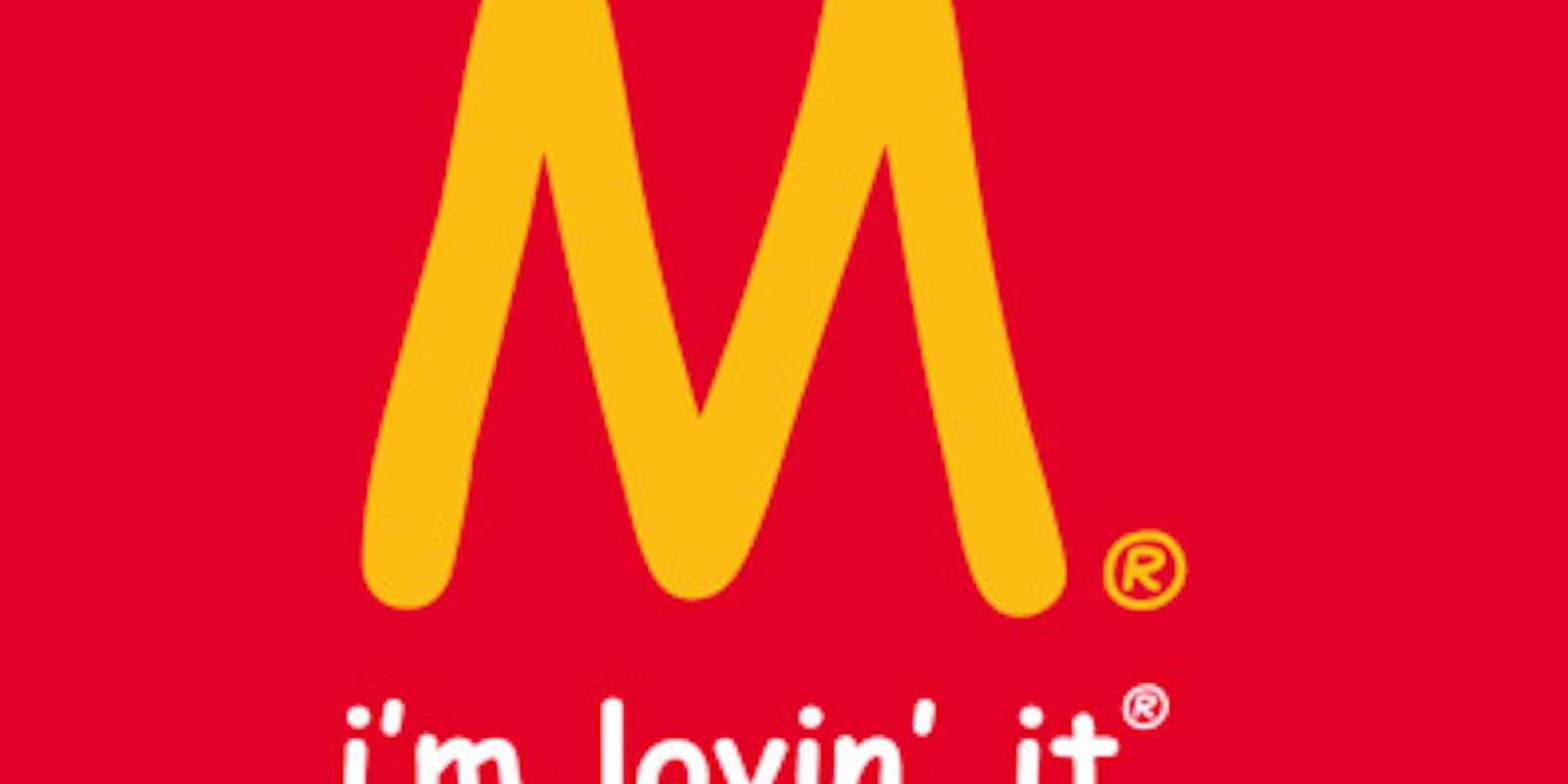
Of all the things that divide us as a human race, I thought there was one thing on which we could all agree: The font Comic Sans is the worst thing ever. Just look at it—or don’t; it’s terribly ugly and makes my eyes water.
But it turns out that there are some defenders of the scribbly font over at the Comic Sans Project, a new Tumblr that reimagines popular logos with the nauseating font.
“We are the Comic Sans defenders,” reads the site’s terrifying description. “We fear no fonts and we will make the whole world Comic Sans.”
The signature McDonald’s arches have already been replaced with an “M” in a Comic Sans font that would make anyone’s heart ache—and not from the calories of a Big Mac. They also revamped the classy Louis Vuitton logo to look like something Snooki from Jersey Shore created as an art project.
Our favorite might be Microsoft’s infamous “blue screen of death,” which is now covered with Comic Sans, an act that almost alleviates the pain of seeing your 20-page report being decimated thanks to Microsoft’s unstable operating system.
The plan is to enable submissions so readers can submit their own interpretations. But consider yourself warned: The person who does the Daily Dot’s logo in Comic Sans will face a fiery punishment of being the target of a Hater column.


