Twitter today unveiled a new design coming to its iOS and Android apps, TweetDeck, and Twitter Lite.
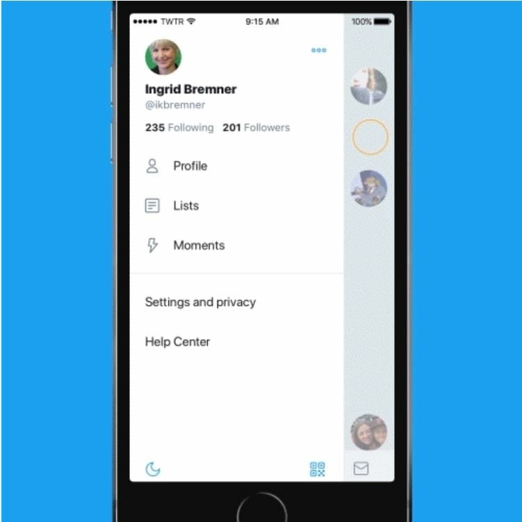
The biggest change is the addition of a new side navigation menu that includes profile, additional accounts, settings, and privacy tabs, to the upper left-hand corner of the iOS app. Twitter says this will help reduce clutter and speed up browsing. It already updated the Android version with the new design last year.

Another significant change to the iOS app adds support for the Safari browser. The social network says articles and websites will now open in Safari’s viewer, letting you access accounts you are logged into straight from the app.
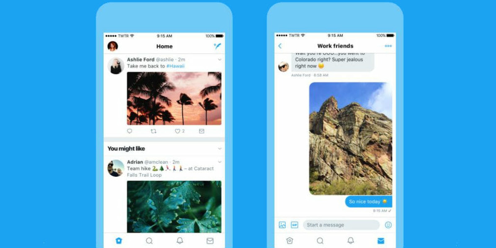
Tweets on smartphones and Tweetdeck will now update instantly with replies, retweets, and “like” counts, so you can follow conversations as they happen live. It was only a matter of time before the platform brought real-time communication to the rest of its features.
A few smaller changes you’ll notice include more consistent typography, bolder headlines, and rounded profile photos. Icons will also be less confusing. Twitter explained some people thought the reply icon, an arrow, meant delete or go back to a previous page. The new icon is a speech bubble.
“Today, with lots of feedback and ideas from you, we’re refreshing our product too and making it feel lighter, faster, and easier to use,” said Grace Kim, Twitter’s head of user research and design. “We listened closely and kept what you love. And for the things you didn’t, we took a new approach to fix and make better.”
The new design will start rolling out Thursday, so look out for a free app update in the coming days or weeks. Twitter said it will announce more design changes soon.


