Change is scary, but don’t tell that to Twitter. The microblogging network has barrelled ahead with major digital renovations this year, most notably when it rolled out a Facebook-style profile. Aside from its big facelift, Twitter continually tests new features on groups of users; you never quite know what Twitter you’re going to get when you open the app or website.
This week, Twitter is tweaking and experimenting even more than usual. Users are reporting a new Twitter font, moving from Helvetica Nue to Gotham Narrow Ssm. I know, right?!
Some users aren’t happy, since everyone knows the Internet hates change.
EW WHAT IS WITH THIS NEW FONT TWITTER ITS A NO FROM ME
— shawn!! (@2secsofnarry) May 30, 2014
WHY DID U CHANGE THE FONT TWITTER WTF
— FaZe HugZ / Mick (@FaZeHugZ) May 30, 2014
the twitter font changed I am not comfortable with this
— pey (@kurtcoobain) May 30, 2014
But the font has won a few new fans:
I love this new font. Please don’t change it, Twitter. Please don’t break my heart anew.
— Samantha Shannon (@say_shannon) May 30, 2014
And the detractors have won enemies:
All these people complaining about the twitter dot com font and outing themselves as basic
— Rusty Foster (@rustyk5) May 30, 2014
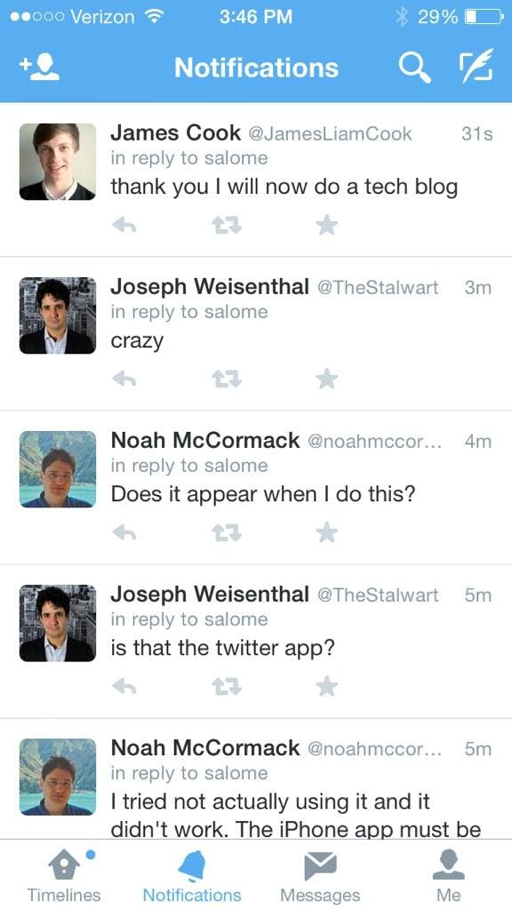
In addition to changing its font, some users are reporting that Twitter continues to test removing the @ reply. My esteemed colleague saw this test on his phone. Instead of the @ reply, there’s simply text that indicates a conversation is going on.

And Twitter’s weird foray into hosting GIFs and then not hosting GIFs makes me suspect the team has more in store planned for everyone’s favorite looping video format.
In conclusion: Twitter might look a little different and your notifications might seem wonky and who knows if any of this is sticking around! Happy Friday!
Illustration via Jason Lee


