Tumblr began rolling out a major site-wide update on Wednesday that has predictably startled and amused its user base—and led to plenty of jokes about the XKit Guy.
The changes, which started appearing on users’ dashboards on Wednesday afternoon, center around a major overhaul of the posting interface. For one thing, text in a post now instantly transforms into the “final” version, anticipating the way it will actually look on the dashboard. In addition, the formatting layout itself has undergone a major change.
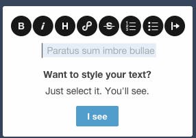
Instead of the older interface, which put most of the formatting options at the top of the window, the options are dispersed. Now, in order to access the formatting options, the user needs to highlight the relevant text, and a pop-up bar of options appears. Here’s Tumblr’s helpful pop-up tutorial:
The buttons include all of the standard formatting abilities, along with the new ability to create subheadings in the post. Users can also embed their photos, GIFs, and videos directly into the post; no need to select “photo post” or “video post” beforehand. This is a big change from before, when you couldn’t, for example, upload a photo into the text of a photo post. (You had to upload it elsewhere and embed it via URL with a different photo option.)
Now, not only can you can embed photos, but you can also add section breaks to your text. Oh, and accessing the webcam “selfie” function is even easier than before.
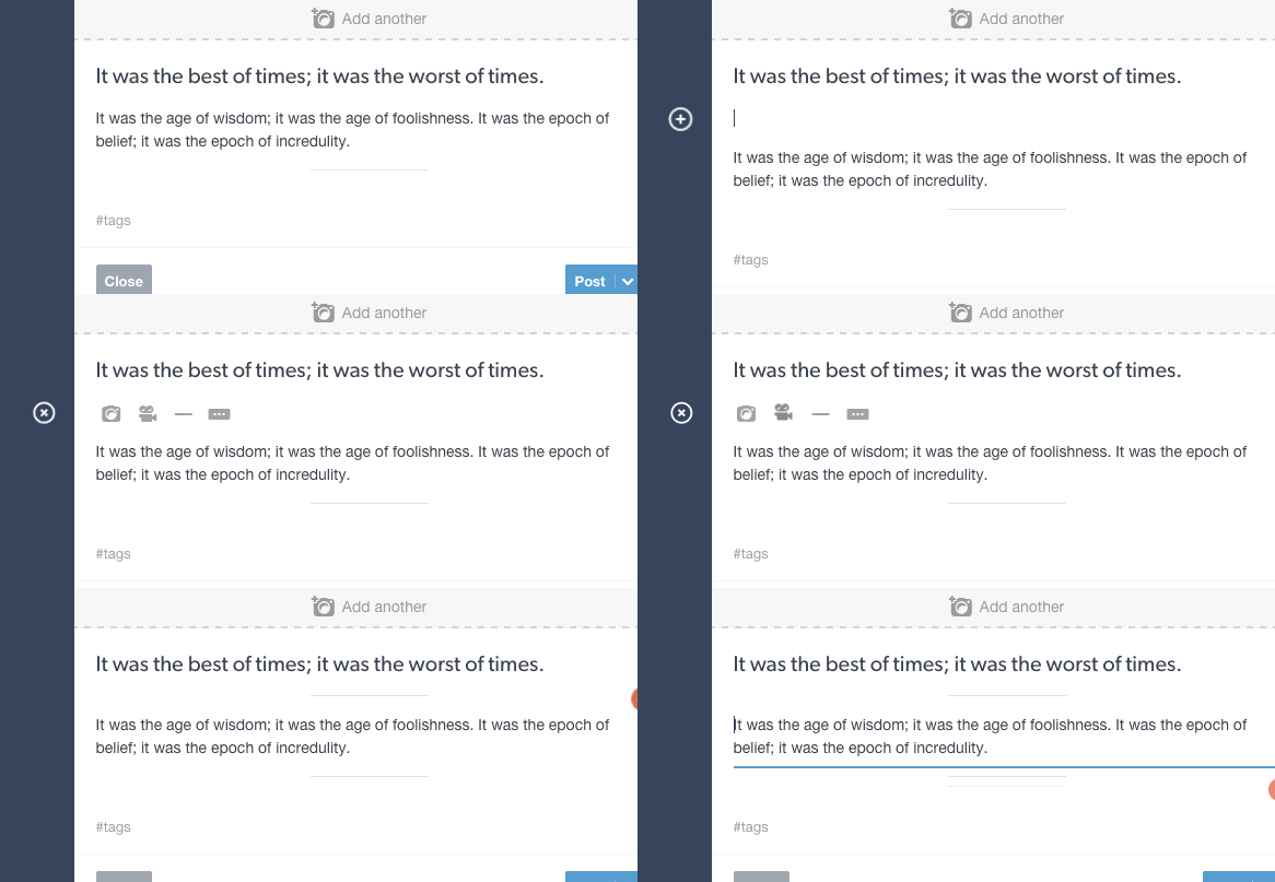
To access the embed features, click anywhere in the post and then click the little plus sign that pops up to your left. From there you’ll be able to add a photo, video, section break, or “read more” divider, like so:
The Tumblr staff blog also promised users that even more features will appear in the days to come—specifically, in their own words, “real crafty shit.” While we can’t begin to speculate on what that might involve, it seems clear that Tumblr’s goal with these changes is to give users more flexibility in how their posts display.
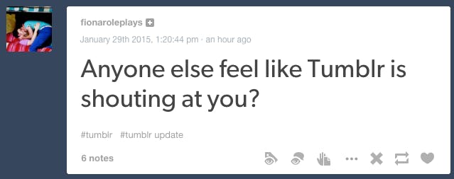
In particular, the new features allow users to display their longread text posts in stylish, Medium-like formats—a great way to build up the less visual side of Tumblr, a site famous for GIFs and photo sets. The staff announcement does call text “the queen of post types,” which might explain why the subject header on all posts is now a lot bigger.
Like, a lot:
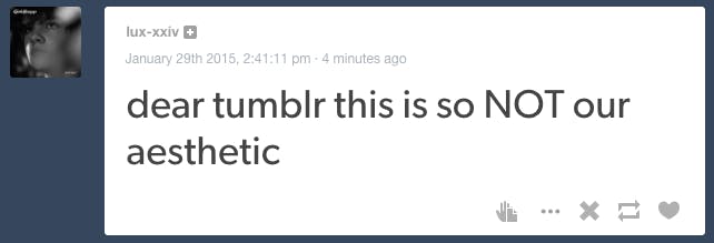
Needless to say, the changes have elicited backlash from users angry at the way their usual posting habits have been disrupted. Users are also upset that the option to format a text post in HTML is now harder to access, as it has been relegated to an option under a settings wheel for each post.
Additionally, when embedding a photo in a text post, you can no longer choose whether to embed a url from another website—a method that was previously the only available shortcut for this function. With Tumblr now natively supporting photos in text posts, it seems the staff decided to eliminate this workaround.
Meanwhile, the site update has led to some frustrating inconsistencies. Any HTML links that you manually create in a quote post are fine, unless you edit the post, at which point they disappear, and you have to re-add them. Yikes!
Users of foreign languages have reported glitches in the way parts of the post layout are displayed in their language. And many users are reporting that the “post” button and the “cancel” button—which obviously do entirely opposite things to your post—have been reversed on their updated dashboard, leading users to accidentally cancel posts when they want to publish them instead.
Regardless, other users have reported that the update improved their browser performance, and that sentiment seems widespread. We honestly like the clean, minimalist feel and the easy-to-manipulate formatting. Hopefully, most of the issues are just bugs that will work themselves out in the days to come, and we’ll be left with the cleaner and shinier—albeit more disgruntled—dashboard of the future.
Illustration by Max Fleishman

