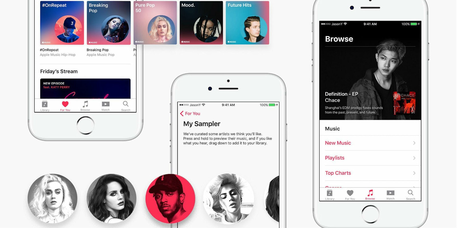
A graphic design student at Northwestern created a gorgeous redesign of Apple Music that is sure to make it a contender against Spotify and Google Music. If only Apple hadn’t rejected him just three months earlier.
Jason Yuan wrote about his application to Apple and subsequent Apple Music project in a post on Medium earlier this week. He says he applied and interviewed for a graphic design job at Apple Music, but received a “very kind letter” from the Cupertino giant saying it wanted to see “more growth and training.”
Yuan was frustrated. He took the company’s criticism to heart, and spent the next three months creating an iOS app “that Apple deserves.” His creation blends “designer intuition” with Apple’s signature design principles to create an interface that feels less cluttered and more dynamic.
Here is how Yuan showed Apple how it can improve, just months after it told him to.
Redesigning Apple Music
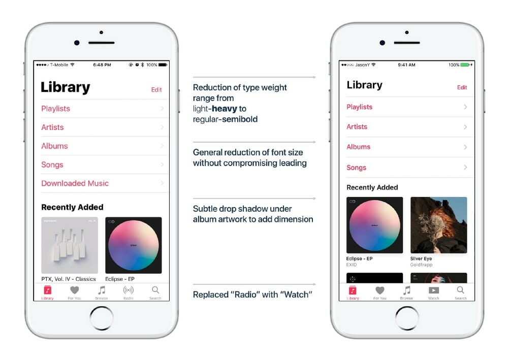
First is a redesigned user interface, or the homepage of Apple Music. As you can see, Yuan maximized white space and made some subtle changes to the font.
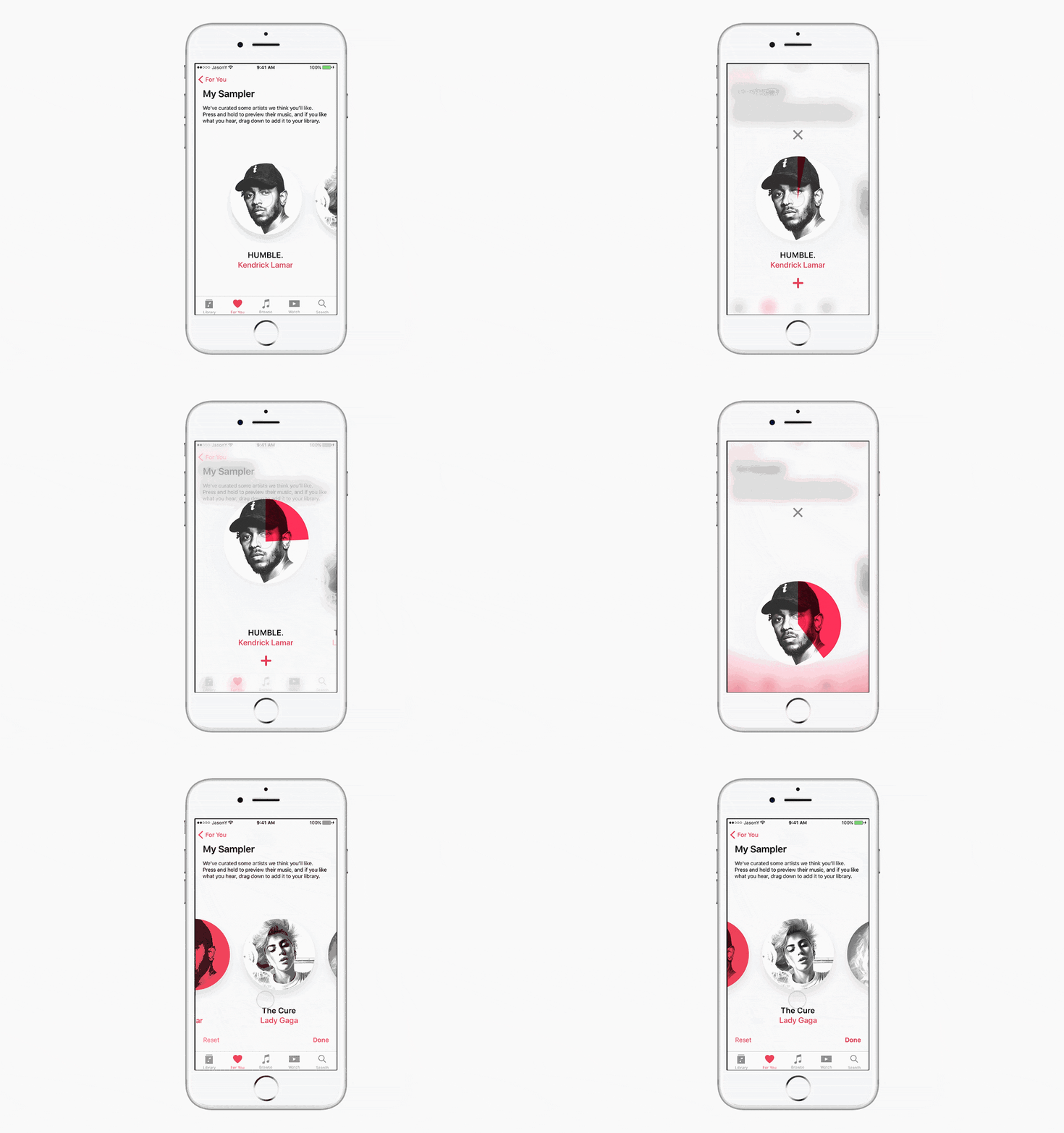
Next up is a feature called “My Sampler,” which lets users cycle through 15-second clips of curated songs to determine if they want to add them to their library. It’s a pretty nifty idea, but sounds a bit like judging a book by its cover.
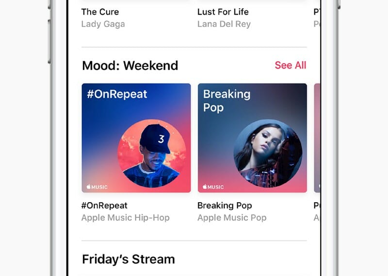
Yuan also took it upon himself to craft a new brand identity for Apple throughout his app. Inspired by the iPod clickwheel, Yuan put artist’s photos inside a circular motif.

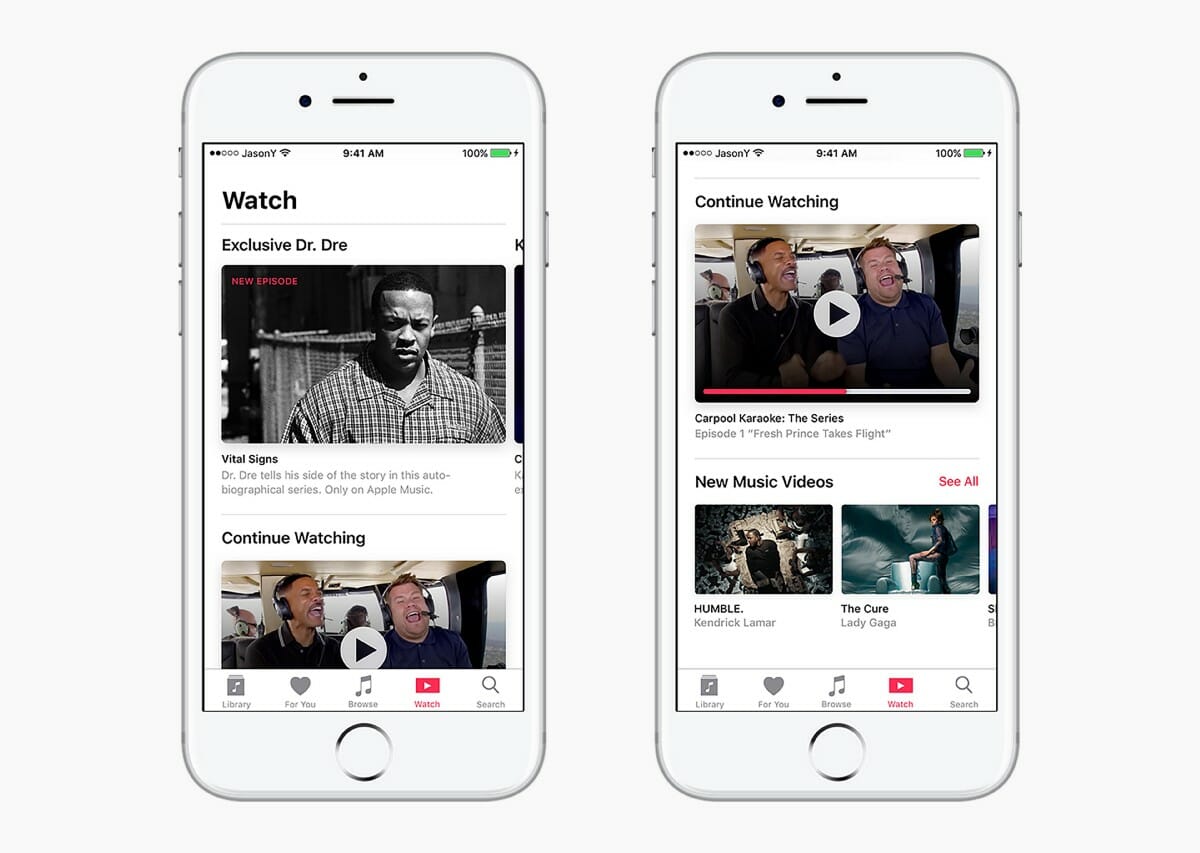
He also added a new “Watch” section for the video content coming to Apple Music.
And the search feature got a welcome overhaul. Here is the old design:
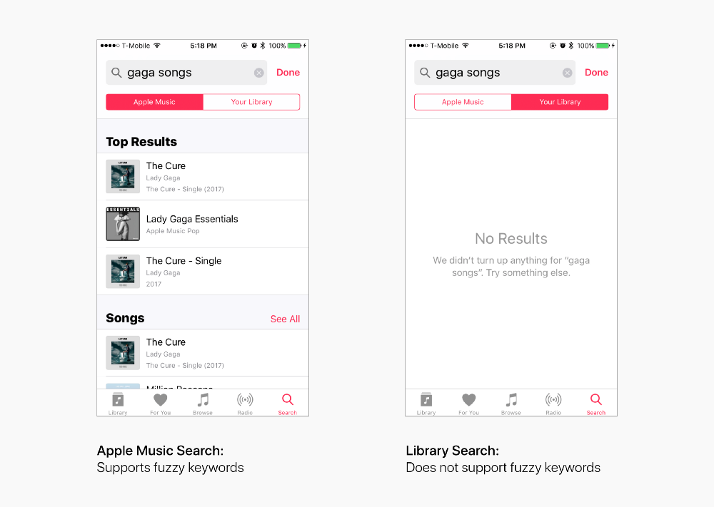
Here is Yuan’s redesigned version:
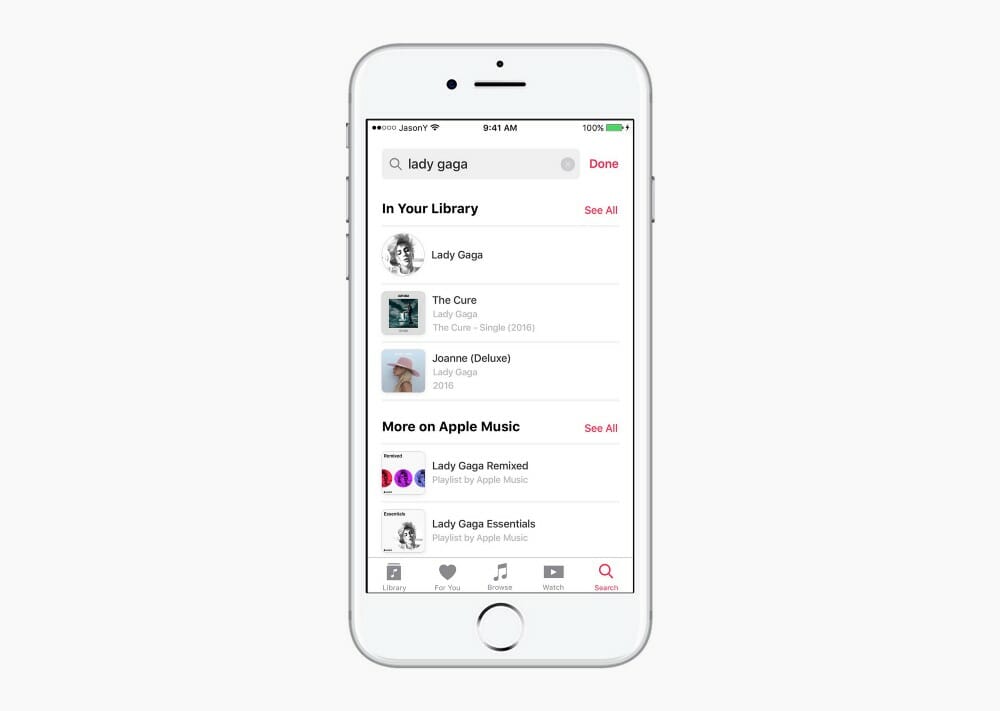
You can head on over to his Medium post to see all of the changes.
While we give Yuan props for bouncing back from a tough rejection, we have to point out that he almost certainly would have been better off showing his efforts during the application process, not after.
Let’s hope he re-applies soon.
H/T the Next Web

