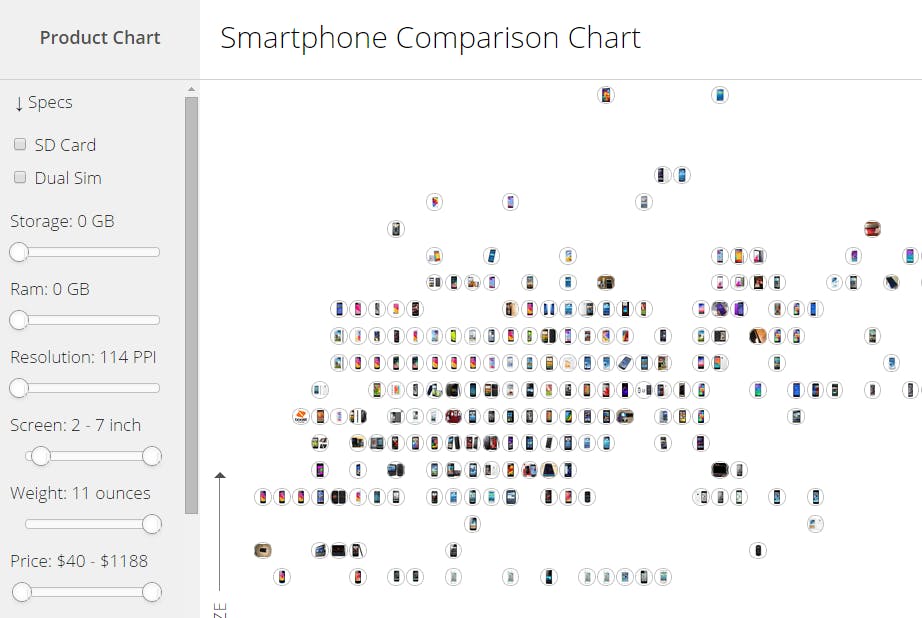
If you’re shopping for a smartphone, you probably care about a handful things—screen size, storage, and price, for example—while any other features are likely just icing on the cake. Product Chart’s interactive smartphone comparison tool is built with that basic principle in mind, acting like a giant filter to weed out all the phones that simply don’t meet your core criteria.
Using a lengthy list of filter options, you tell the site exactly what you’re looking for in a phone. Specify your desired storage size, memory, weight, screen resolution, screen size, and ultimately price, and the chart spits out all the phones that meet your needs.
From there you can click on each phone’s icon to highlight your top picks or dismiss those that just don’t catch your eye. If you happen to be a bit of a fanboy of a certain brand—don’t worry, we all have our allegiances, even if they’re secret—you can even specify which brands to include in your culling.
The really cool thing is that, as you change your criteria, you can actually watch the phones appear and disappear from your pool of potential picks, which really puts your various requirements into perspective.
Is an extra inch of screen size really worth tossing half of your would-be smartphones into the digital trash? If your distrust of a company like Samsung or Apple cuts out their phones and leaves only a handful of options, this tool will make it all too clear. Perhaps it’s time to put your old grudges behind you?
Product Chart’s interactive tool is a clean, beautifully designed resource for everyday shoppers and gadget fanatics alike, but there’s one serious problem: It’s a huge time sink. It’s absurd how much fun it is to play around with different filter options and browse the results.
If there’s one piece of advice that you should take very seriously about this awesome chart, it’s this: Don’t use it if you’re trying to get any actual work done. You’ll thank us later.
Photo via Janitors/Flickr (CC 2.0)


