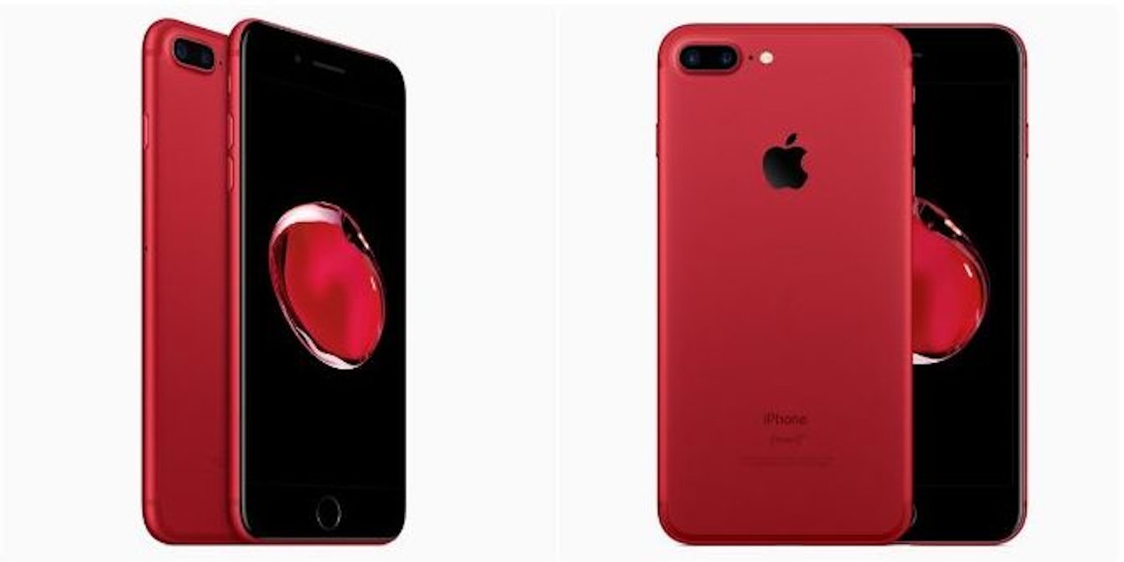
Apple launched a vibrant new red iPhone 7 and 7 Plus yesterday, but images of the new device have some people questioning whether the company fully committed to the new paint job.
The limited-edition phone isn’t as red as it could be, and it’s really stressing people out. Many critics have taken to Twitter, saying they would have purchased the phone if it had a black front instead of a white one.
I would get the red iPhone 7 if it had a headphone jack and the front part was black instead of white
— Luey RIF (@Luey_RIF) March 22, 2017
Just gonna say, the red iPhone 7 NEEDS a black bezel instead of a white one. What was Apple thinking?!?
— Connor Erickson (@erickson_view) March 22, 2017
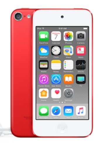
But Apple’s decision shouldn’t come as a surprise. Not only do all the other iPhone 7 colors (besides matte and jet black) come with a white bezel, but Apple has shown its fondness of the white on red combination over the years, placing it on just about every (RED) iPod it has ever released.

Of course, smartphones have taken on the responsibility of being an accessory to our day-to-day lives, and even the slightest oversight leaves room for scrutiny.
Benjamin Geskin, who makes renders based on rumors and leaks, gives us a peek at what a red-and-black version might have looked like:
iPhone 7 (RED) with black front.#iPhoneRED #iPhone7RED pic.twitter.com/wferyEcBwl
— Ben Geskin (@BenGeskin) March 21, 2017
It’s definitely gorgeous, but you could argue it looks less “Apple.”
Let’s see how it compares to the previous design with a Drake meme as our judge.
Thank @Apple #iPhoneRED #iPhone7RED pic.twitter.com/JTBTjl9Qar
— László (@laszlotuss) March 22, 2017
My complaints about the white bezel are much more about utility than fashion. A black border around your screen provides contrast so the colors can really pop out of the phone. That is what you are seeing in each of these renders. Notice how the creator used a black screen for the black front so the screen disappears into the body of the phone and allows the contrasting red image to float effortlessly on top.
That effect isn’t present in the white render because a strange gray border is visible between the front panel and the background of the screen. The image on top is also mostly white, which doesn’t contrast as nicely as the red on black. Now imagine the render with the black front featured a white screen. Now we’re comparing Apples to Apples (sorry, couldn’t resist).
Regardless, the new red iPhone 7 is a breath of fresh air from the muted tones Apple has traditionally offered, without deviating from the company’s storied design language. Most importantly, no aesthetic disagreements should distract from what RED is really about—providing support for HIV/AIDS programs around the world.


