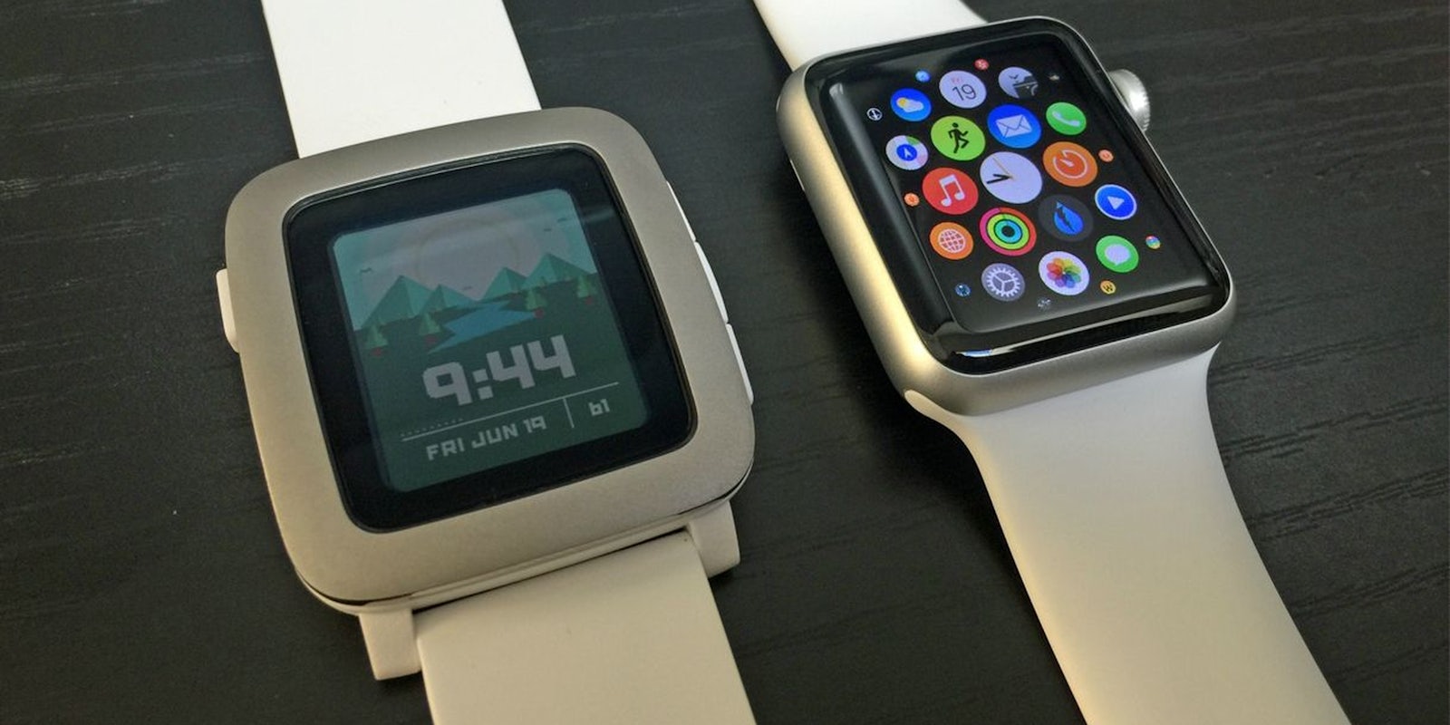
Apple Watch or Pebble Time? If you’re going by the hype surrounding the debut of a new wearable, these are the undisputed leaders—the Pebble Time because the original Pebble is still so beloved, and the Apple Watch because, well, it’s Apple—but the question itself might not actually be so difficult to answer.
The Pebble was the first smartwatch I ever owned, and I think that’s true for many of the backers of the company’s original Kickstarter campaign. The project was a huge success, set a Kickstarter record, and cemented the company’s position as a trendsetter.
In the same way that I loved my Kyocera flip phone as a teenager simply because it was the first phone I could call my own, I found it easy to look past any shortcomings the Pebble might have had and become an instant fanboy. It had customizable watchfaces, a battery that lasted forever, and it buzzed when I got a tweet. How could I not love it?
But you never really know how good something is until you have something to compare it to.
Eventually my early adopter itch pushed me to try other wearables, and I’ve had brief affairs with the Gear S, Moto 360, Pebble Steel, Microsoft Band, and most recently the Apple Watch.
Looking back now I can see where there was plenty of room for improvement on the Pebble. Its vibration was overzealous, its plastic covering seemed to attract scuffs like a magnet, and it did little more than notify me of things happening on my smartphone, rather than acting like a stand-in for smaller tasks.
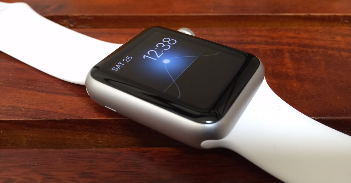
When the Apple Watch arrived on April 24 I went through the motions of setting up, letting it automatically sync with my apps, and—if I’m being totally honest—blow me away with its gorgeous display. Since that day, I have removed it dutifully every evening, placed it on its charger near my bathroom sink, and equipped it again each morning.
Whether it’s the less obnoxious haptic notifications, the way it seems to make all my favorite apps just a little bit better, or its ability to actually push me up off the couch and onto my bike just to complete some colorful circles, the Apple Watch has slid effortlessly into my routine. It’s the first time a wearable has been able to crack my general distaste for watches—even moreso than the original Pebble—and I can honestly say I’m glad Apple found a way to pull it off.
Hoping for lightning to strike twice, the Pebble Time also debuted on Kickstarter. It didn’t have to, of course, as Pebble could have easily rode its early success onto the next iteration, but it made for a neat story and certainly allowed the company to capitalize on some free advertising. As I did with the original Pebble, I ordered a Pebble Time almost immediately.
Not long ago, the Time finally found its way to my front door, and despite being fully on board the Apple Watch train, I let my nostalgia for my early days with the Pebble ramp up my expectations. The Pebble, but more powerful, with a color screen and funky animated menus? Yes, please.
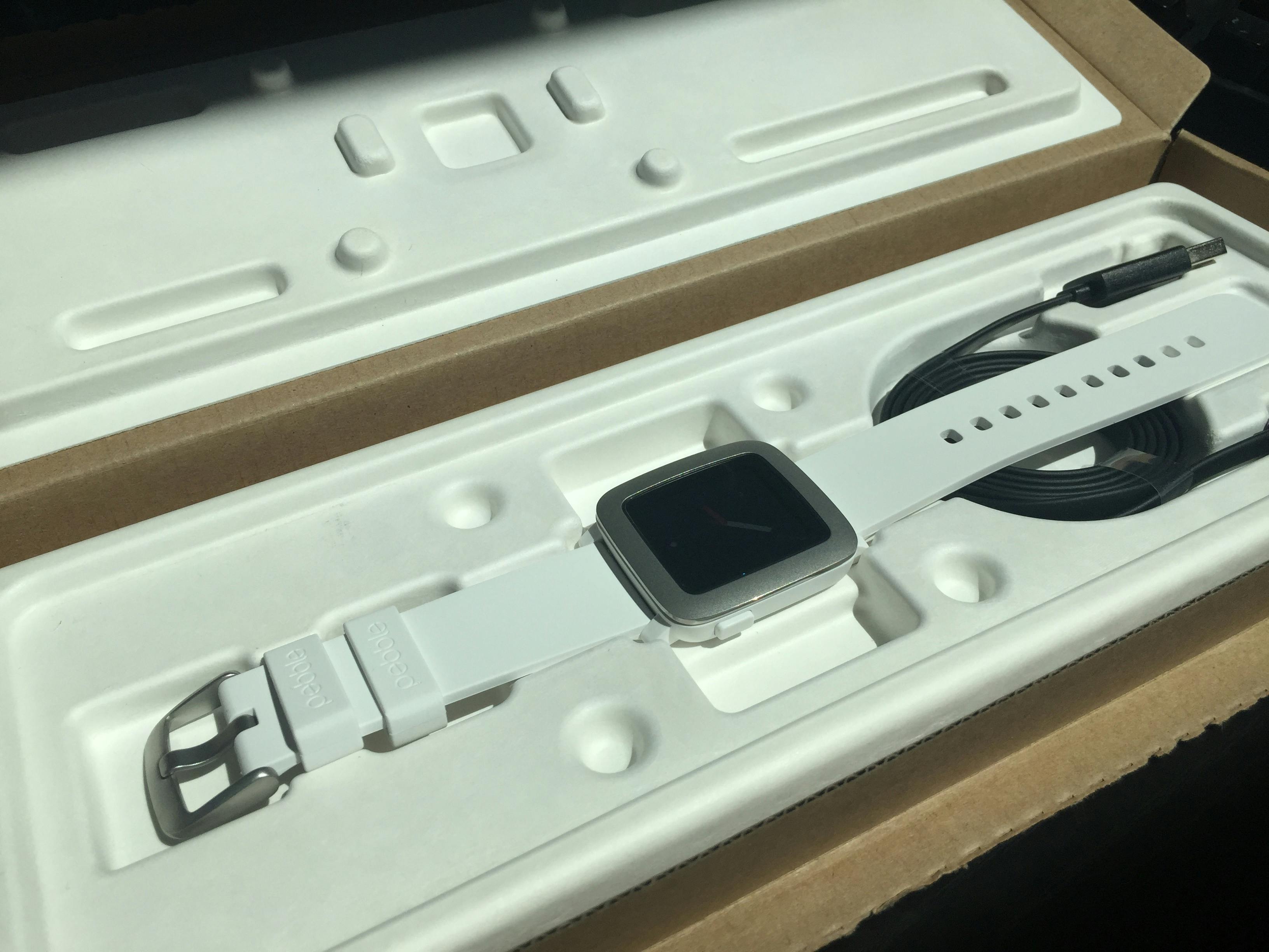
My optimism was quickly dashed. The Pebble Time felt clunky right from the start, from the “case” which pulls double duty as a cardboard shipping box, to the absolutely obnoxious Bluetooth pairing process, it reminded me of all of the things I had to overlook with the original Pebble, only this time I had a history of smartwatches to instantly compare it to.
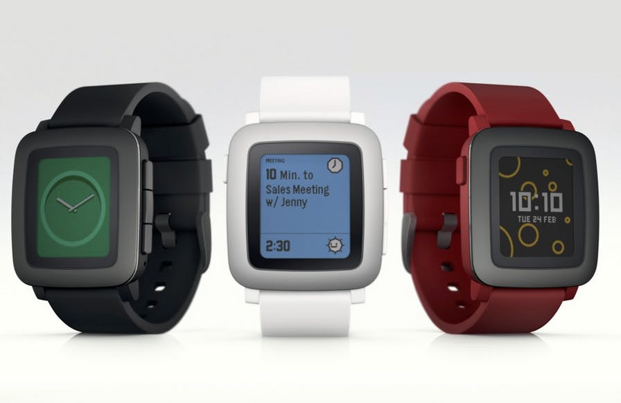
The Time has a color screen, but the washed-out palette and low contrast pale in comparison to the Moto, Apple Watch, and Microsoft Band.
The Time has charming little animations as you switch between screens, but they’re easily bested by WatchOS and Android Wear.
The Time syncs with various workout apps, weather apps, and commerce apps, but so does almost every other wearable these days.
When you compare it to the original Pebble and Pebble Steel, the Pebble Time is undoubtedly the next step. It’s better than its predecessor in every way, but it’s not better than many other smartwatch options, least of all the Apple Watch.
The Apple Watch does everything the Pebble Time does—short of lasting for 7 days without a recharge—and it does it better. The setup is effortless when compared with the Time, notifications are faster to check and dismiss, and the wealth of input options on the Apple Watch make navigation quicker on the whole.
The Pebble Time still feels like a starter device—a beginner-level smartwatch that would have wowed all comers had it launched at the time the Pebble Steel came out, but now falls short when compared to devices that are only marginally more expensive.
A Pebble Time Steel—the closest you can come to an Apple Watch Sport without actually buying one—will be priced at $299 when it launches at retail in the coming weeks. The Apple Watch Sport starts at $349. That’s far too narrow of a margin for two devices that are worlds apart in capability and function.
Unless a 2-day battery life is a serious deal breaker for you—and as I’ve found out, it really shouldn’t be—the only thing the Time seems to have going for it is its name. At $199, the plastic-bodied, Pebble Time seems to have more of a reason to exist, if only as a toy-like budget alternative for smartwatch virgins not ready to take a side in the Apple vs. Android Wear war.
The Apple Watch may not have seemed like a clear winner the moment it launched, but as its competition repeatedly comes up short, it seems more and more like the king of the hill.
Photo via Mike Wehner


