No matter what browser you use, the basics of your browser remain the same. You know where the tabs are, and how to search. There haven’t been many great innovations in web browsers since the launch of Chrome in 2008.
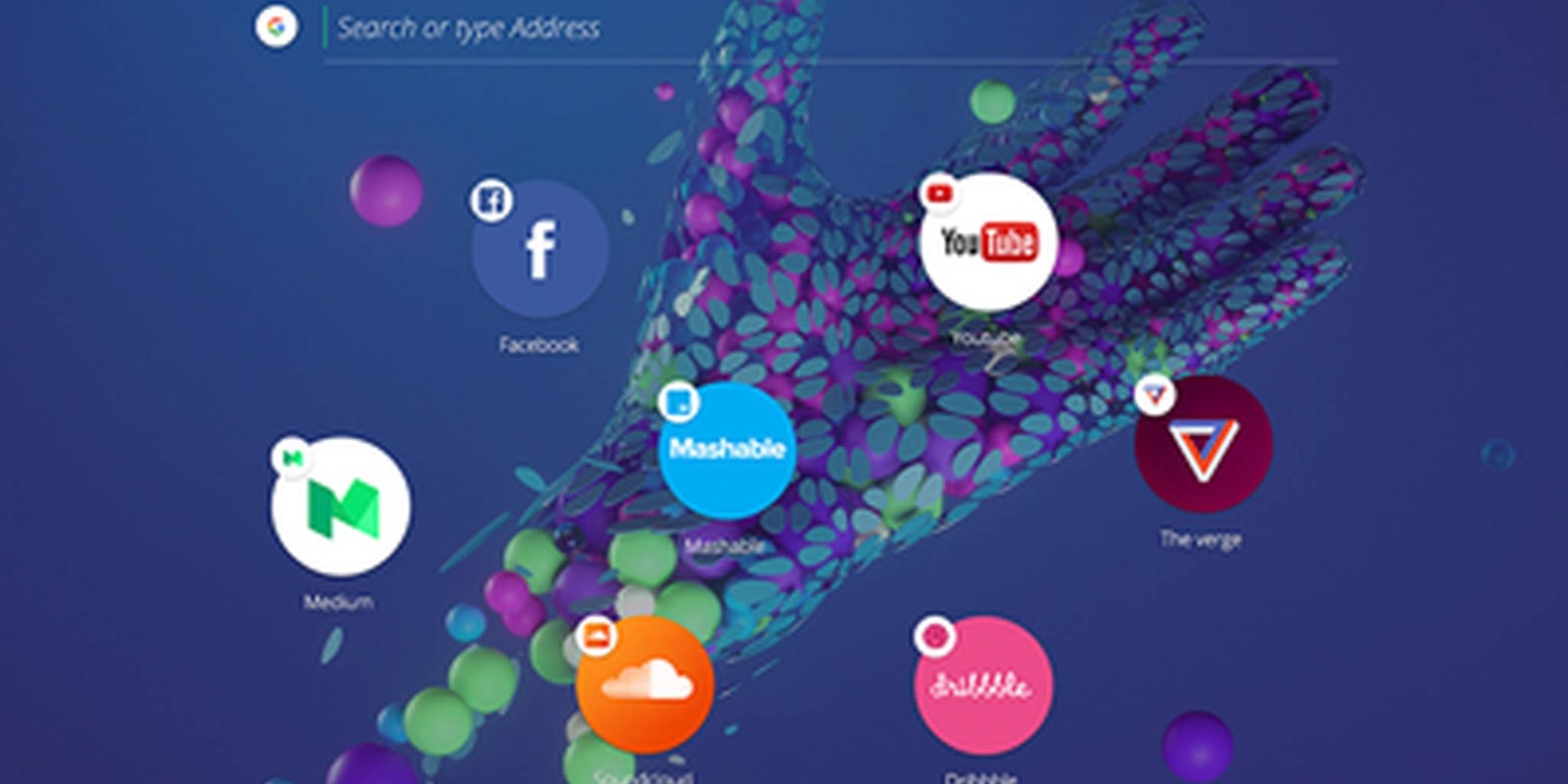
Opera is hoping to change that with the launch of its new experimental browser Opera Neon, a modern reimagining of a classic idea.
Opera Neon has no task or bookmarks bars, and it places your tabs in bubbles on the right, instead of the top of your screen. On the left side of the screen is a sidebar that contains tools like an easy screenshot taker and audio and video playback controls. You can also quickly access your recent downloads from the sidebar.
Upon opening Neon, you’ll see a home screen with your standard URL box replaced with a space to either search or enter an address. While it took a minute to get used to the minimalist design of Neon, we quickly caught on. It’s a simple, clean interface that gives you the options to do what you want without cluttering your screen with menus and bars.
On of its most oddly useful features is the ability to do a split-screen view similar to iOS. You open two different browser tabs side by side in the same window, rather than have to juggle two different windows to reference content. Neon is obviously still very much a concept browser, something Opera itself would be quick to note. However, the company plans on expanding and improving on the browser during the spring.
There are still a few missing features that will keep you from making the switch, like plug-in support, but there are strong ideas here worth taking a look at. We can’t wait to see where Neon goes next. This is a great start on a good idea.
You can download Opera Neon for free right here.


