The new Twitter profile layout is now available to all users. These new profiles, with header images that closely resemble Facebook’s profile page design, allow users to “pin” their best tweets towards the top of the page. They also make tweets that have many retweets and favs larger, in an attempt to highlight the best content. And every user now has two separate feeds on their profile, one of tweets and one with both tweets and @-replies.
What brave new world that has such gigantic profile pictures in it? Your world. These new Twitter profiles bastardize background images into glorified cover photos, but you might as well acclimatize to the new Twitter world order sooner rather than later, right?
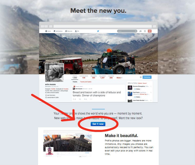
Here’s how to turn on your new Twitter profile: Go to the new Twitter profile page and click the small “Get it now” button.

That’s it! Now you have the new profile. But these profiles look different than the old ones. Your tiled background image may be distorted; your profile picture is now larger and more prominent. Adjustments might be necessary to keep your profile game on point.
Your background photo gets transferred to your cover photo, but this might make it look awful. Images are resized automatically, but to avoid stretched out images, you’ll want to shoot for an image that’s wider than it is long, ideally 1500 pixels wide by 500 pixels tall. For profile pictures, go for 400 x 400.
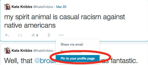
To pin a tweet to the top of your profile, you can select one you’ve already written, or compose a new one. In the bottom right-hand corner, there are three dots that represent more options. Click on that, and the third option will let you pin the tweet at the top of the page.

Not into the new profile? Not everyone is.
@twitter NO ONE LIKES THEM OLD IS BETTER I MEAN THE NEW ONE LOOKS LIKE FACEBOOK
— 无畏 / ifb (@alltoomurs) April 22, 2014
There are a few differences worth noting: For starters, your background image (the screen-to-screen, usually tiled photo) is gone when you’re looking at your actually page; when you see your feed, it will show up, but when you go to your profile proper (or anyone else’s) it’s missing.
Also, if you switch over, say goodbye to your animated avatar. Twitter’s been trying to clean those out for ages now, and the new profile is just the latest mechanism to get rid of the GIFs.
You’ll notice that some of your tweets (and others’) are larger when you’re looking at the new profile. Their size depends on how popular they are, how many favs and RTs they got.
Speaking of favs… it’s really, really obvious how much you use them now. They have their own tab on your new profile.
You might want to hold off on switching if you take a look at your Favorite box and notice that now it’s going to be very clear to anyone who checks your page that you are a reckless fav slut. Time to go on a spring fav cleaning.
Photo via Flickr/borosjuli | Remix by Jason Reed (CC BY 2.0)


