After being plagued by in-app detours to its new spin-off app Swarm—now the home of Foursquare’s iconic check-ins—my expectations for the new Foursquare ranged somewhere between “none” and like total meh. Foursquare users are a strange lot, quintessential creatures of habit, both by nature and in action.
Old Foursquare rewarded your refusal to try the new falafel place (the old one will always be best) with a funny non-thing called Mayorships. In my tenure as a Foursquare denizen, I’ve held exactly three Mayorships, one to an above average Mexican restaurant a block away from my old apartment in Oakland and two more again to places roughly one block from my house. (Full disclosure: One was a waffle cart.)
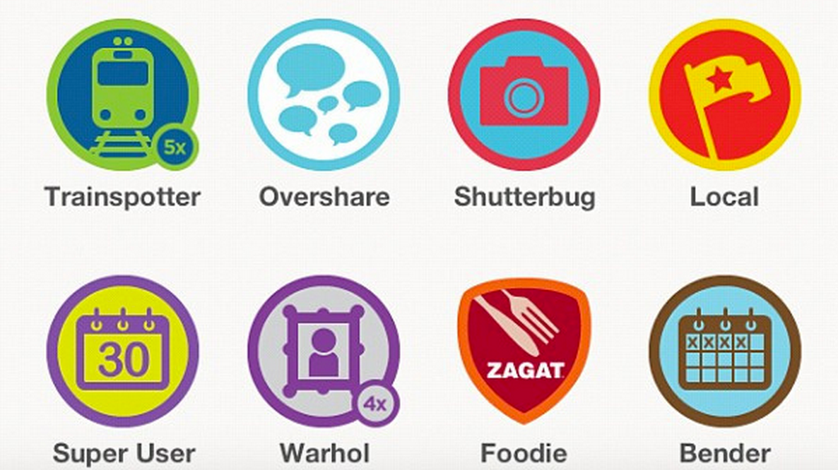
Unlike most social apps, Foursquare historically isn’t really about friends, though you can play it that way. It was decidedly inward looking, doling out accolades for things done repeatedly. Visit a bunch of coffee shops and you’d unlock a new tier of coffee shop visiting, a meaningless distinction that was somehow deeply satisfying. I certainly wasn’t interested in anyone else’s “Fresh Brew” badge.

I have 750 check-ins, kind of a shockingly low number for how much time I feel like I’ve spent on the app. I was slow to join Foursquare, only hopping aboard around 2010. Since then, I developed a policy of only using Foursquare when I was out of town. After moving to Portland from the Bay Area, it felt like too small a city for the app to do anything other than make me worry that strangers would triangulate the position of my home and kill me in my sleep. But traveling for work and tech events, Foursquare was incredibly useful. At South by Southwest, I’d hop on to see where my friends and colleagues were charging their devices and stuffing their faces with barbecue. In socially dense settings, Foursquare was the signal to the noise of reality.
Now, the aptly named Swarm will host the check-in habits of Foursquare devotees, who are mostly personally aggrieved by the company’s decision to make a different thing. The Foursquare power users I know are almost all poured from the same strange human cocktail recipe, half bleeding edge early adopter, half creature of obsessive habit. Pattern makers. Completionists. It’s no surprise that a collection of folks who get off on unlocking the level three “Hot Tamale” badge over enchiladas might be a little averse to change. But are they are dying breed?

To its credit, Foursquare developed plenty of badges to reward new experiences and exploration, stuff to get users like me out of our one block comfort zones.
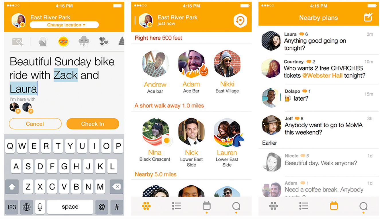
I don’t know what I think about the new apps yet, really. My initial impression of Swarm is net-negative: the UI looks nice, but the prompts to download the companion app from the core app were far too aggressive. Besides that, I think it took a decent bite out of my battery life. Swarm is a creamsicle-colored thing bearing little resemblance to everyone’s beloved habit ticker of yore.
So far, new Foursquare looks gorgeous and appears to offer an intelligent local discovery system, which I think is what’s supposed to be happening. Compulsive check-ins for the sake of check-ins might not have much of a space in today’s social media landscape. For me, a system emphasizing my friend’s reviews and experiences is far more compelling than a running tally of where I’ve been over the course of the last three years. In that way, new Foursquare doesn’t look that different.
Still, check-ins live on. They live in Swarm. Much like Facebook’s unpopular bait and switch technique that teleports users to its dedicated Messenger app, Swarm doesn’t have a proper reason to exist on its own. But right now, single-serving apps are in. They’re more clickable and perhaps more suited to our attention spans on mobile. More importantly, a less noisy interface might be a better, blanker canvas for ad-based streams of mobile revenue.
There’s an argument that the psychology of the app just works better that way. On desktop, services are sprawling things that litter entire windows with menus and buttons and portals to secondary features. On a mobile homescreen, an app’s logo becomes a transcendent representation of its function. Apple ships iOS with a handful of these. We open them to calendar, to clock, to compass, or to music note.
Facebook peered across the fence and saw Snapchat—an app that does one weird thing—taking off. Foursquare went the same route with Swarm, relegating the maybe outmoded gesture of checking in to its own app. Today’s mobile cohort is busy whispering anonymously and shooting off messages programmed to vanish, making playful efforts to disappear when they’re not swinging the other way, pouring their hearts and selfies out on YouTube and Instagram.
Checking in arguably have had its heyday around 2010 and just doesn’t resonate with the folks defining mobile software—whether by consuming or creating—right now. (If the masses actually wanted to check in, wouldn’t they be doing it on Facebook?) Ambient location failed to take off, so apps skipped on to a weird new generation in which we’re pleasantly adrift in a calm bay of willful forgetfulness—but we won’t tell you exactly where.
Image via Foursquare


