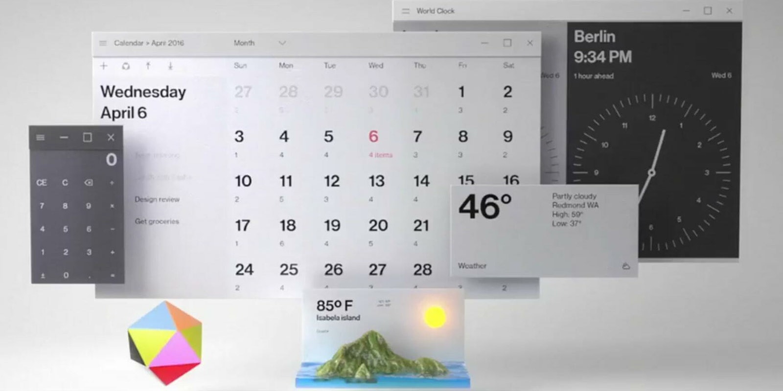
Microsoft on Thursday took the wraps off its new Fluent Design System for Windows during day two of the Microsoft Build Conference. Fluent is a set of design elements that will start appearing across all of the company’s products and devices. It is the successor to the Metro interface, which appeared with its “live tiles” on Windows 8, Xbox One, and Windows Phone.
Introducing the Microsoft Fluent Design System! Draw the right focus to the right thing at the right time. #MSBuild pic.twitter.com/tzHRAb4Pm0
— Windows Developer (@windowsdev) May 11, 2017
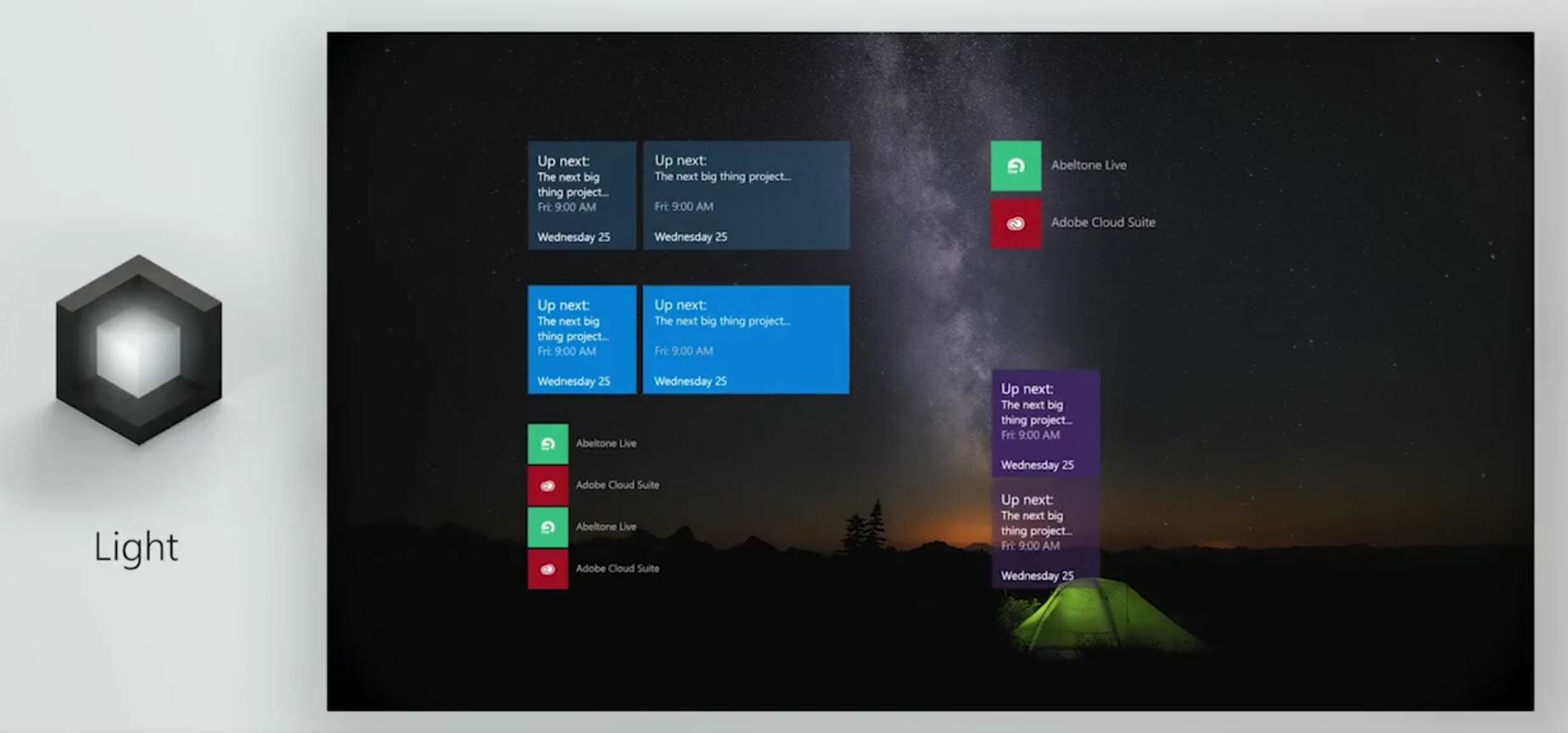
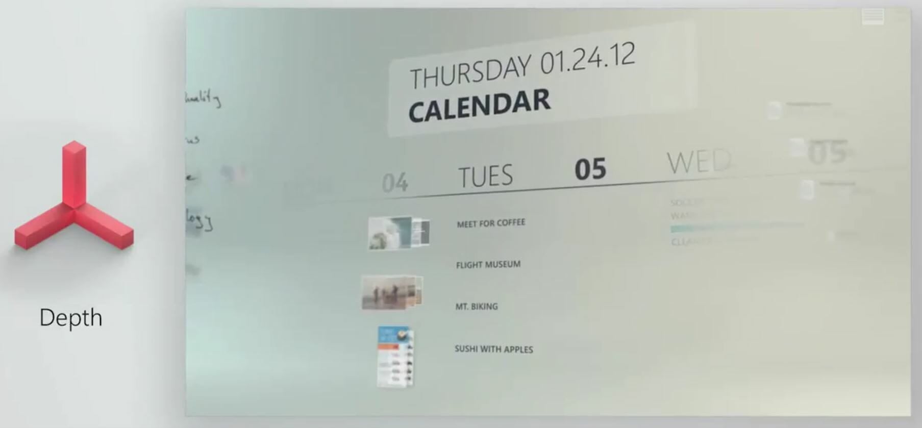
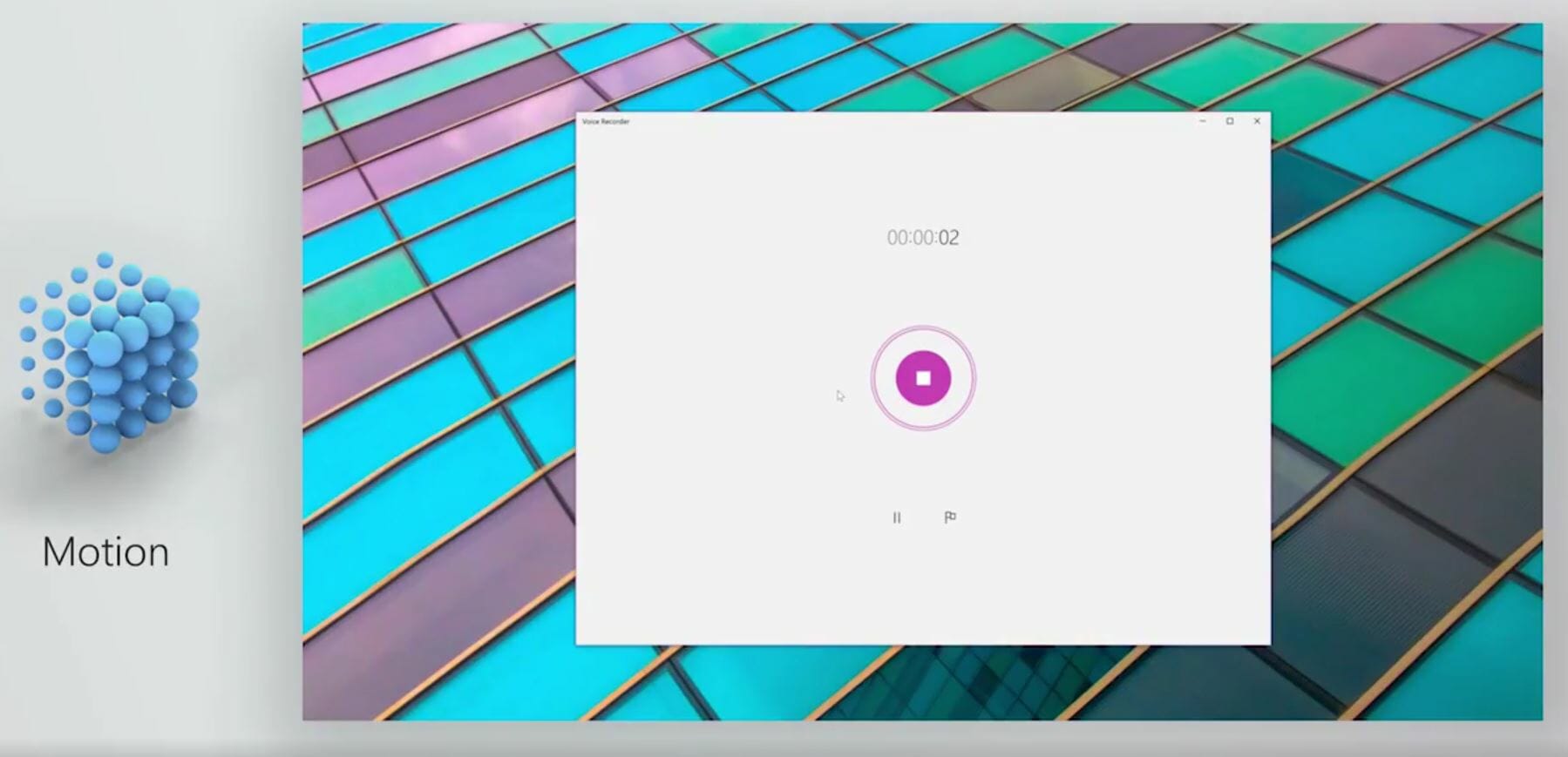
The new design language focuses on five key areas: light, depth, motion, material, and scale. The VP of Windows Developer Platform at Microsoft told TechCrunch that the company wanted to build a system that would help developers write more “delightful” applications with layers and animation. The design system works in both 2D and 3D, which means we should expect to see some of the same elements in future HoloLens interfaces and applications.
Light
Depth
Motion
Material
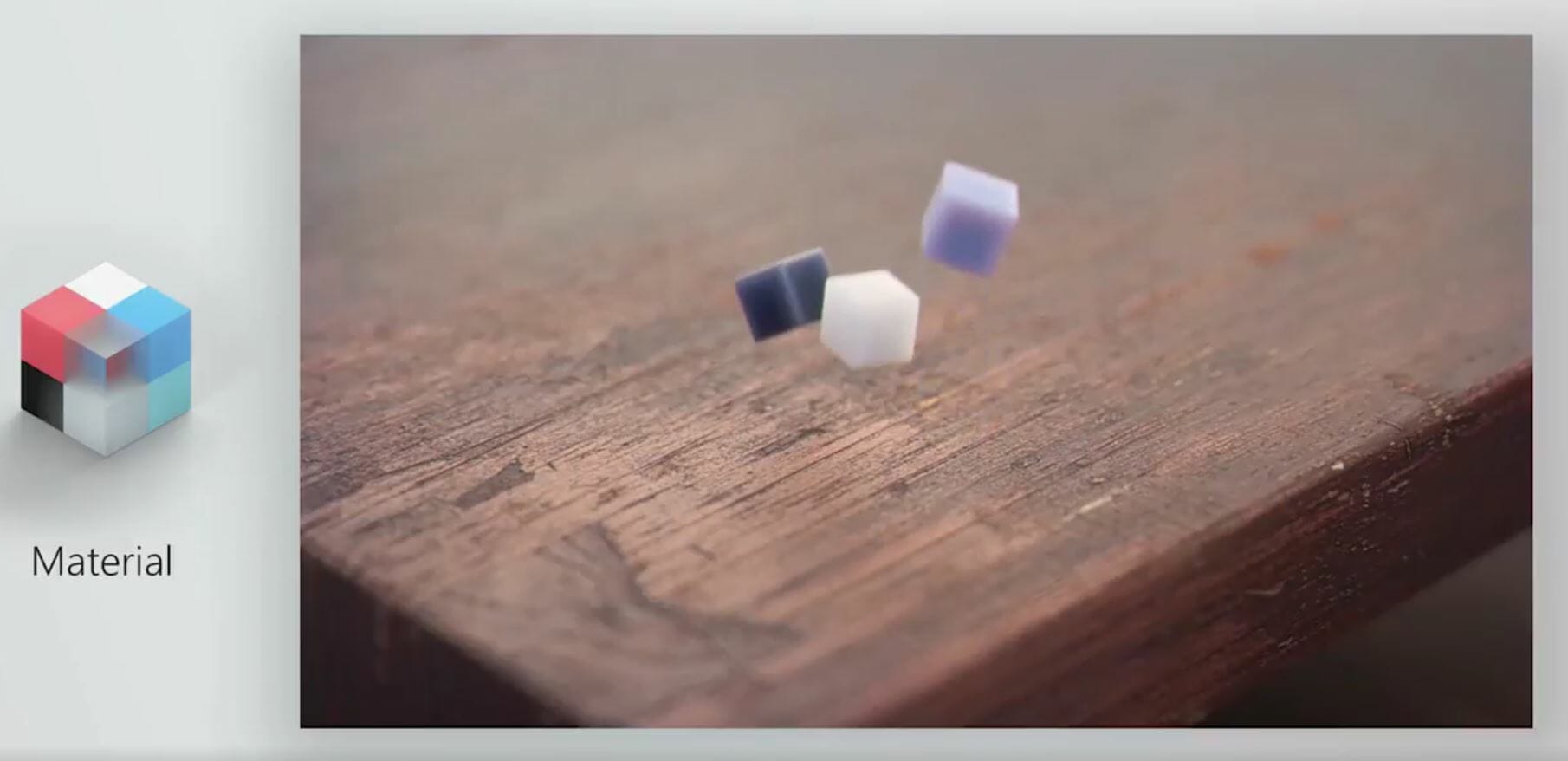
Scale
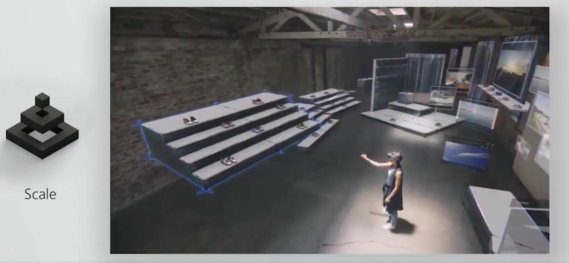
Early impressions seem positive. A number of people have taken to social media to voice their excitement on the redesign:
https://twitter.com/itsmichaelwest/status/862771479875690496
https://twitter.com/Rigaku_Ryoho/status/862738113017380865
https://twitter.com/eshwarnag/status/862767338868711425
The new design language will slowly start showing up across Microsoft platforms in the next couple of years. A few Windows 10 apps are already updated with the new look, but you’ll probably have to wait for the next Fall Creators update before it takes off.

