A map that you can’t read is more likely to get you lost than to your destination, so Google is sprucing up its Maps service to make it easier to find the places you want to go.
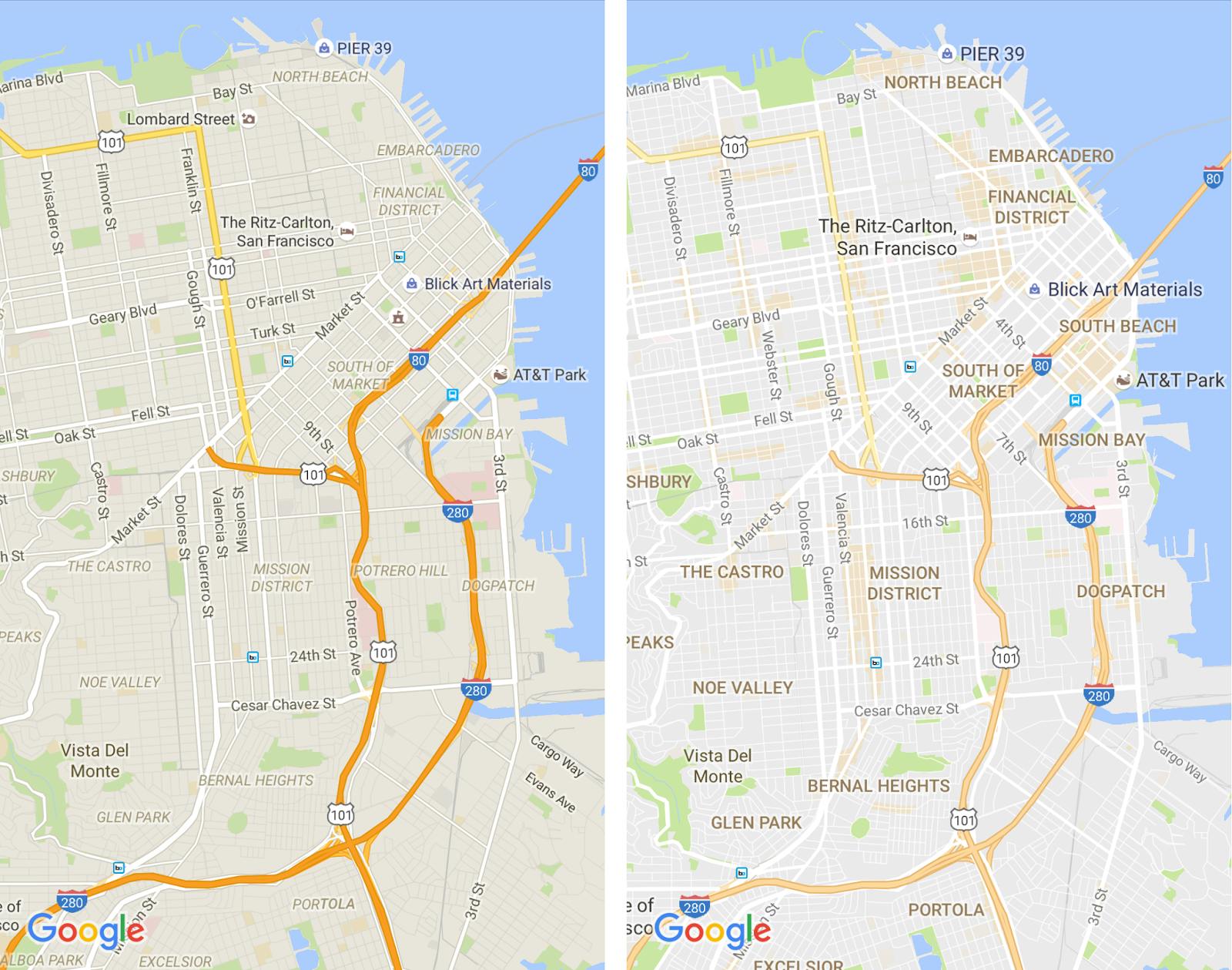
An update to the iOS, Android, and web version of Google Maps was announced on Monday with the goal of added clarity to the service. The company has done away with a number of unnecessary flairs and tweaked the typography while adding new methods of highlighting points of interest.
Gone from Google Maps are road outlines, which Google determined to be too much of a distraction from the surrounding area. This, combined with the dulling of the highlights on main drags makes it easier to see other actionable information like traffic notifications and transit updates.
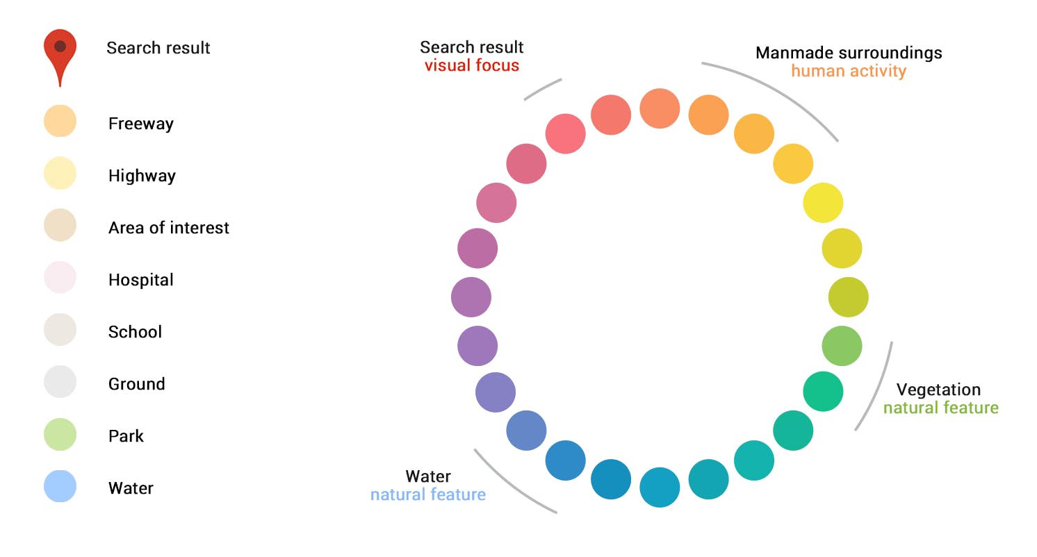
With the cleaner—and frankly rather dull—overall look to the landscape, Google has also applied what it calls a “subtle” color scheme designed to help differentiate parts of the map without creating a cluttered look with clashing, bright colors.
The color scheme will use shades of colors to associate different items on the map. Blues will correlate to natural water features, and green will represent natural vegetation. Human-made objects get shades of orange and yellow, while areas of visual focus will appear in variations of red and purple.
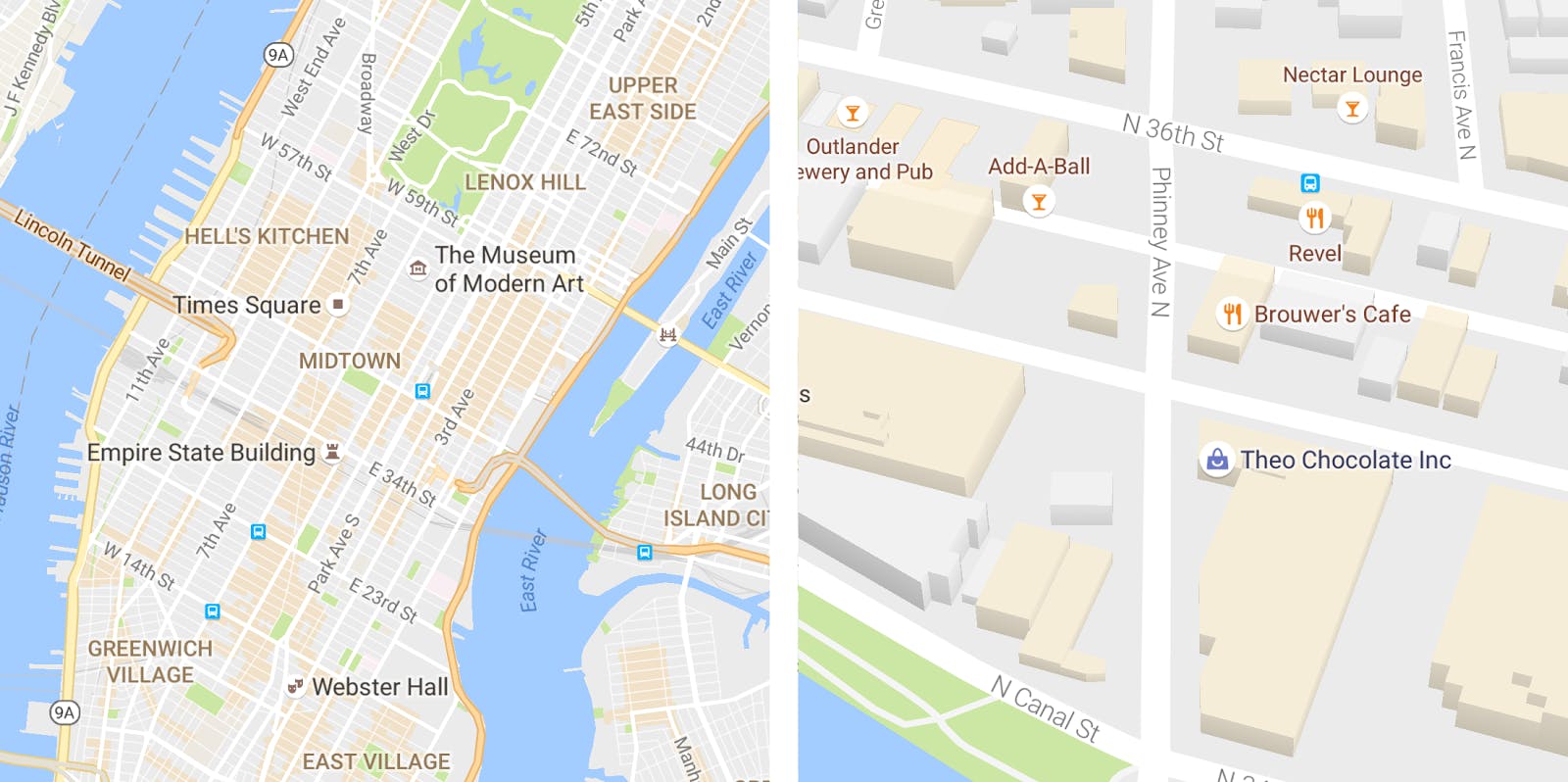
The colors appear to be part of a new effort by Google to highlight points on the map rather than the roads that lead there. By zooming in on an area that is shaded orange, users will see details about venues housed in the highlighted part of the map.
Areas of interest are determined by an algorithmic process that focuses on areas with high concentrations of popular stops like restaurants, bars, and shops. Google combines the computer-generated suggestions with human curation in high-density areas like New York City to ensure active areas are given extra emphasis.


