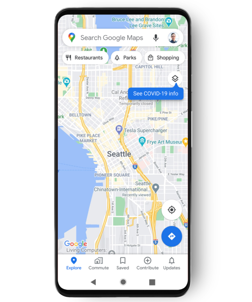
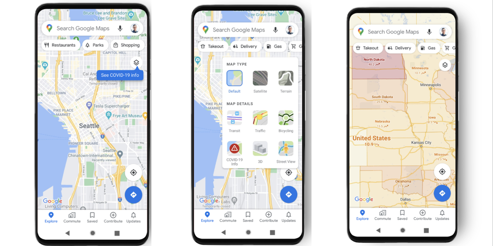
Google announced a new feature that will show coronavirus hotspots directly on Google Maps.
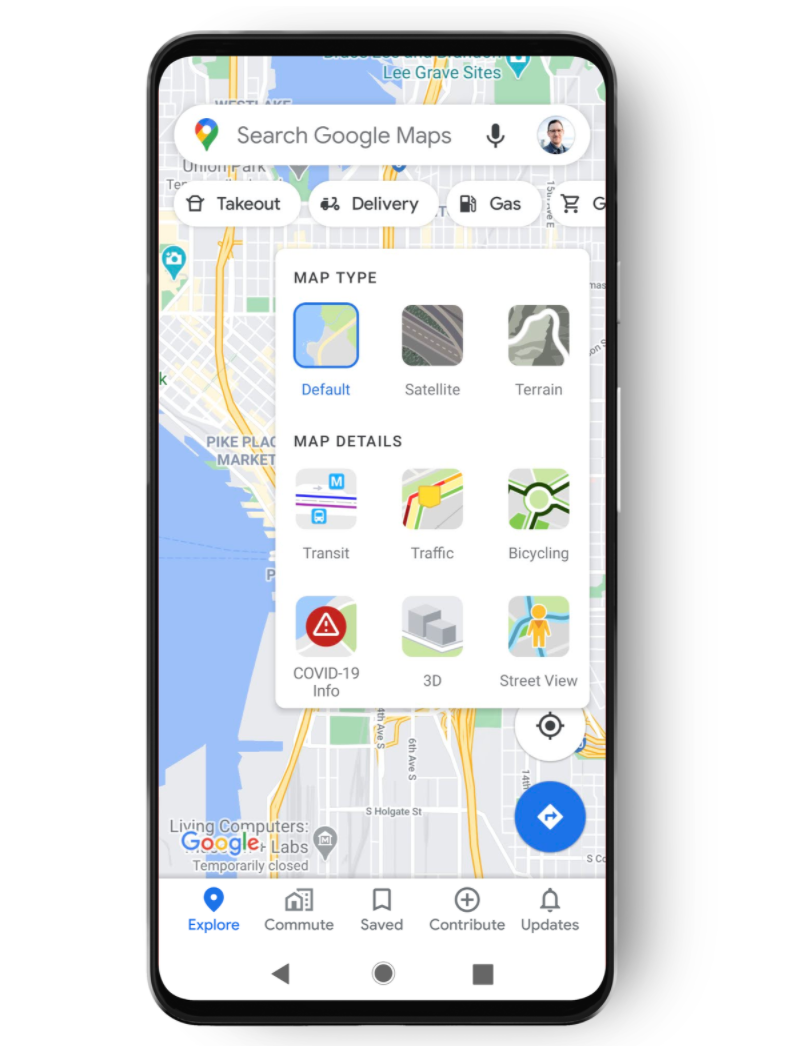
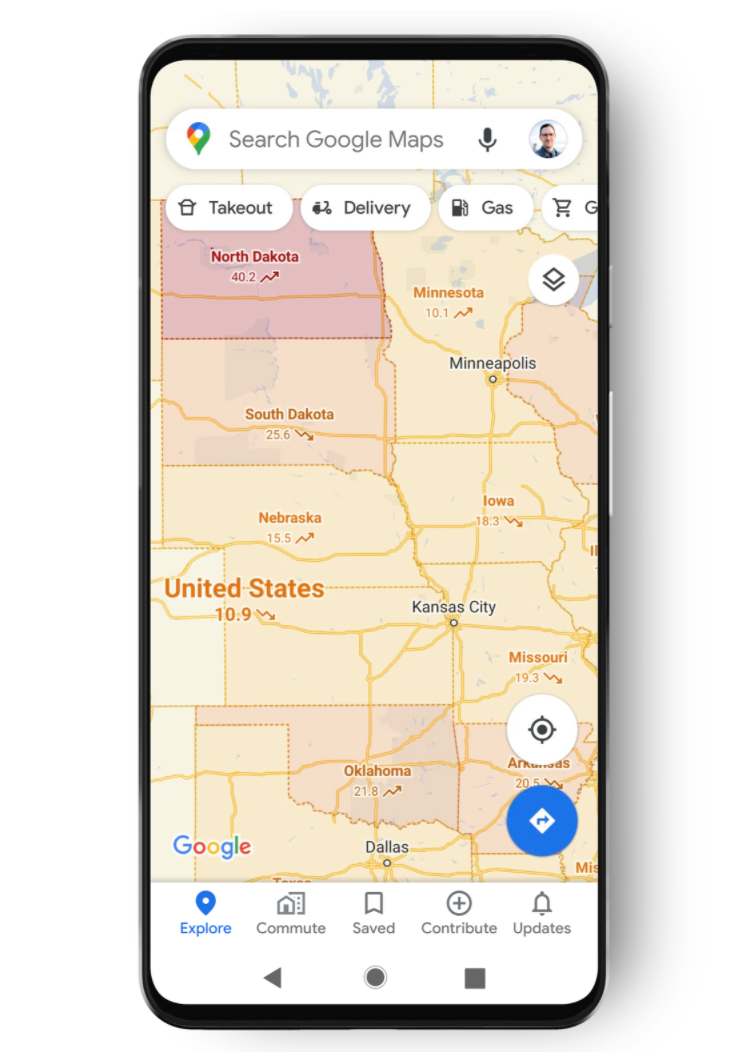
Users will soon be able to use a layer in the app that contains information about the pandemic. The COVID-19 map shows the seven-day average of new cases per 100,000 people based on data from Johns Hopkins, the New York Times, and Wikipedia, Google said.
The map will also be color coded to show density of new cases in certain areas. The coronavirus layer will be available in more than 200 countries, and on iPhone and Android this week.

Similar to the transit or bike map layers, users can choose the COVID layer to sit on top of their map type.

The color coded map displays increases or decreases of COVID-19 cases in designated areas. The demo released by Google shows regions as big as countries, down to as small as counties.
It also shows trending case data at the country level and state, county, and city level data where available.
The new coronavirus layer is aimed at helping people “make more informed decisions about where to go and what to do,” Sujoy Banerjee the product manager for Google Maps, said in a blog post.

This is not the only COVID tracking app Google has launched during the pandemic. Google and Apple developed the Exposure Notification System based off of user bluetooth signals.
Googles new COVID-19 map feature comes just before fall and winter, which experts fear could bring a second wave of the virus in the U.S.


