I hate email.
I don’t use the word hate lightly. Like many people, I get an ungodly amount of email on a daily basis. Since millennials have shunned phone calls (I don’t mind them) everyone sends emails. Everyone. But even as we get more of it than ever before, email remains just as awful as it’s ever been.
Many companies, including Google, have tried to fix email, with little success—until, perhaps, now. Google may have just developed a solution that will make email less awful with Inbox, its newest email application.
One thing should be made clear: Google is not pushing Inbox as a Gmail replacement, but a complementary piece to the popular email service. And that’s what it is: Inbox is a combination of Gmail and Google Now, the assistive service that is the best product Google has put out in the last five years.
Inbox (currently invite-only) is an intuitive email application that can organize your emails better than any other product I’ve seen. Utilizing its two flagship features, Bundles and Highlights, Inbox can turn the 10 minute process that is looking through 50 unread emails into a simple function that will take less than two minutes.
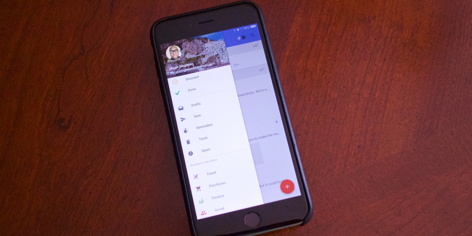
Bundles are an evolution of the tabbed gmail interface users were first introduced to last year. Gmail tabs sorted your emails by social, promotions, and updates, but that left a number of areas unsorted. Bundles take this sorting to a new level, with a more intelligent sorting process that can divide your emails into sections including travel, purchases, finance, and updates.

Inbox will pull all of your relevant emails into the proper categories. Flight itineraries will end up in travel, with the details of your flight neatly arranged at the top. This is amazingly helpful, especially when looking for older emails. If you already use labels in Gmail, you can turn on bundles in the labels settings.
(As you would expect, Inbox only works for gmail accounts. It also doesn’t currently work with Google Apps email accounts.)

Highlights finally brings glanceable information to email. Attachments, including links, images, PDFs, and YouTube videos, are pulled to the forefront, letting you scroll through your inbox and find important information without having to actually open an email.
Introducing Highlights to the native Gmail app would have been a big deal, but you add it with Bundles and a freshly designed app using Google’s new Material Design language, you have something that could be special.

Inbox does include other noticeable features, like Reminders, which gives you a single app to manage your to-do list. Snooze, which lets you schedule a notification for an email at a certain time or place, is a feature Mailbox and other apps have employed for some time. What separates Inbox from every other email app that does it is Google can do it natively. There are no extra labels or folders that need to be added to your account—it just works.
There have been some reported issues with Inbox inaccurately sorting emails in Bundles, and when I sent an email yesterday, it didn’t go through, leaving me to find it in the drafts folder four hours later. But all the glitches I’ve seen so far could be fixed with an update.
What I didn’t expect is for Google to release an app that could be the best email solution I’ve seen in years. I’ve used many email clients over the years, and none have grabbed my attention like Inbox. It took less than 15 minutes for me to delete Gmail from my phone after using the new app.
Yes, some of Inbox’s features have been implemented in other email apps, but those apps weren’t native, and having these features integrated natively into Gmail gives way to simplicity. And that’s all we really want from email.
Inbox, which is invite-only right now, is available on Android and iOS, as well as on the web (if you’re using Chrome).
Photo via Micah Singleton | Screenshots via Google


