Launching a new logo is an exciting time. It’s basically a makeover of an organization’s public image. Executed properly, it increases brand awareness and creates buzz among people who get excited about marketing.
Executed improperly, your organization becomes the laughingstock of the internet. That’s precisely what happened to Smart North Florida, an economic development nonprofit in Jacksonville, Florida.
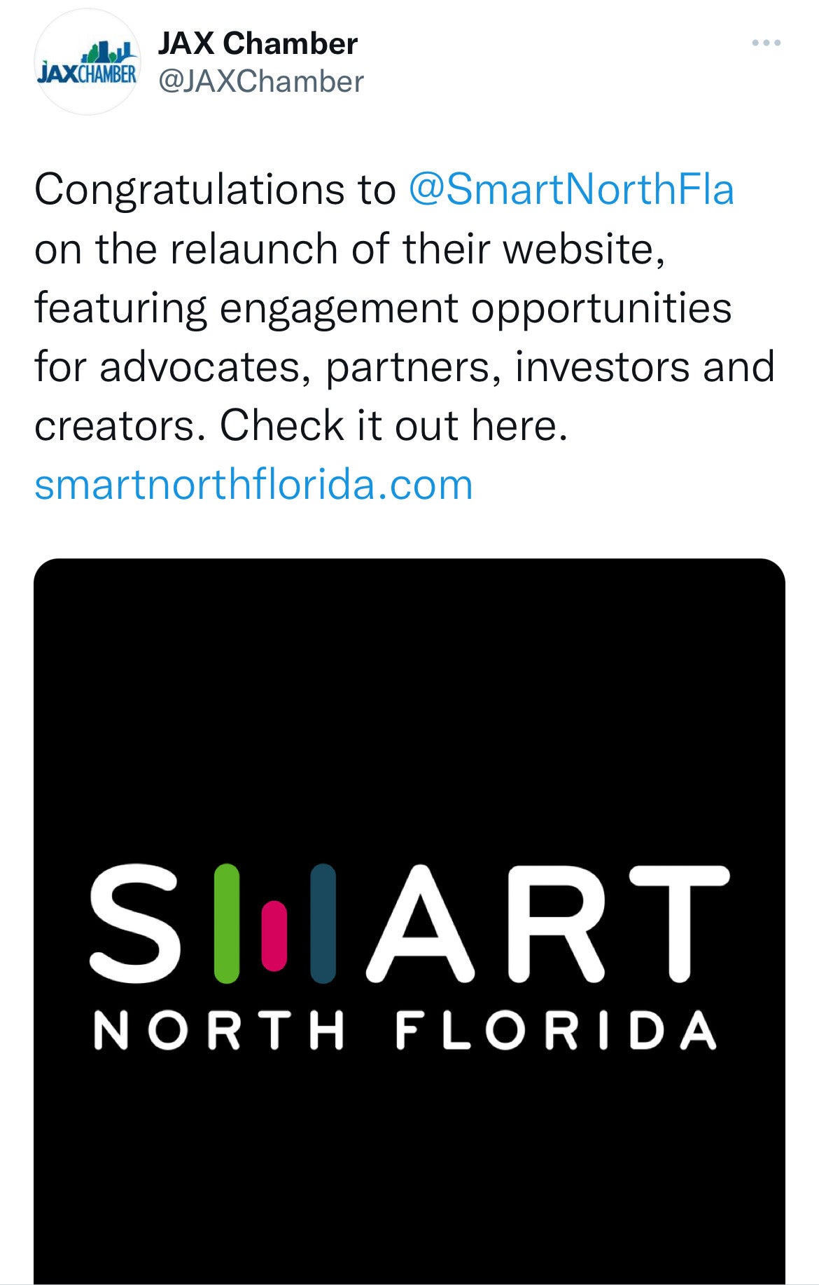
On Tuesday, the local chamber of commerce tweeted congratulations to Smart North Florida on relaunching their website “featuring engagement opportunities for advocates, partners, investors and creators.”

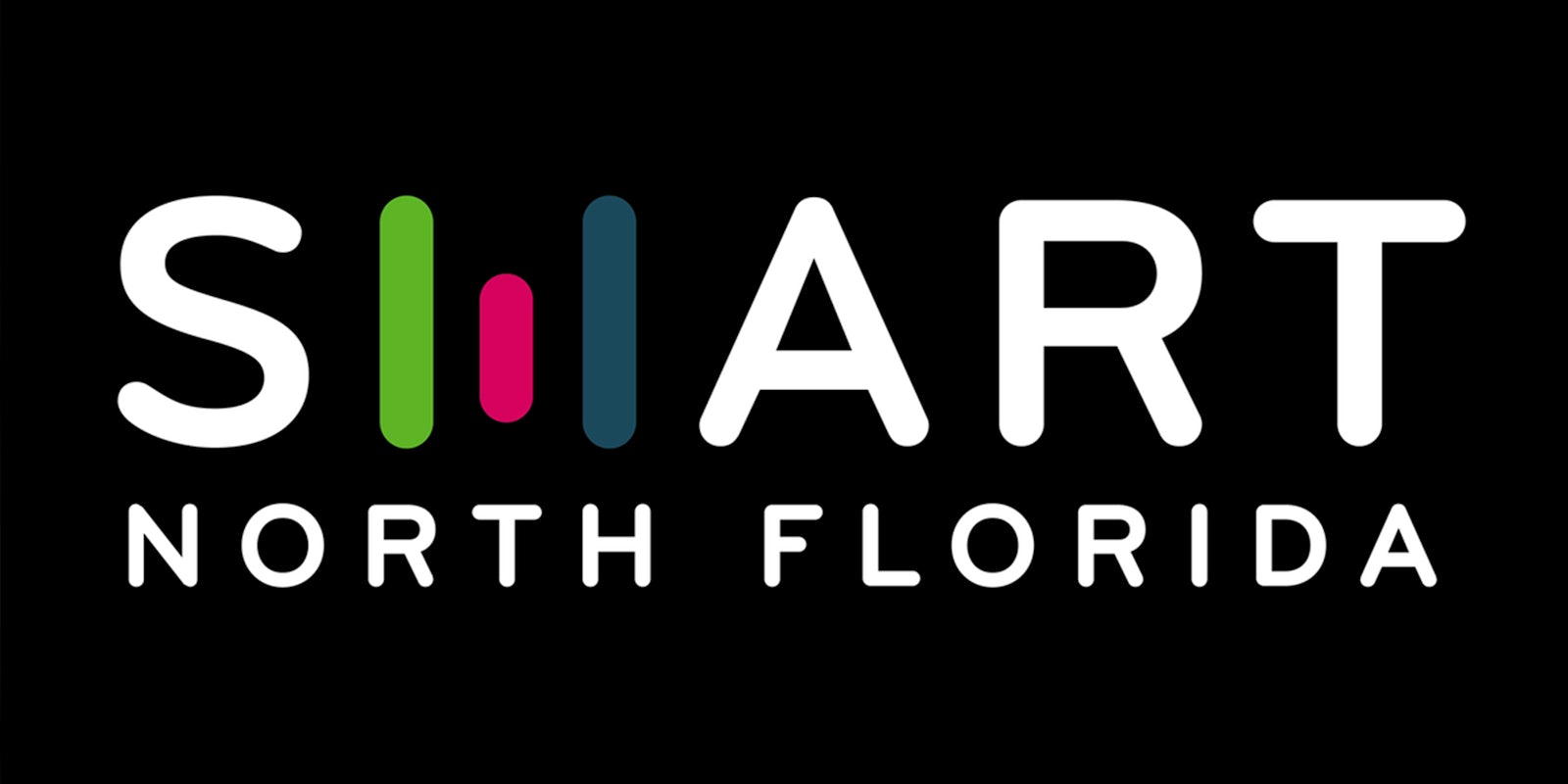
Most people probably didn’t read that far into the tweet, however. They couldn’t stop looking (and laughing) at the logo. It’s intended to say “smart,” but because of an unfortunate design of the “m,” most read it as “shart.”
“Seriously, how the hell did they not see that it looks like ‘SHART’?!?!” tweeted @ian_and_corgi.
“Glad to see local companies taking a page out of the Jaguars’ playbook and calling themselves SHART,” commented @ryaneatscake.
For many, the marketing fail called to mind a statue Jacksonville recently announced it intended to erect on the waterfront. The multimillion dollar statue is arguably intended to say “Jax,” the city’s nickname. But to others, it says “derp,” “lerp,” or “lex.”
The statue generated so much mockery, Barstool Sports wrote about it.
“I mean who doesn’t see this for the disaster it is and say something,” tweeted @tvjoe12 of the shart logo. “…Somebody got paid to make this and now Lerp has competition and I’m not happy.”
Jax Chamber eventually deleted the “shart” tweet. And Smart North Florida even went so far as to delete its Twitter account.
Alas, it was too late. The shart had escaped.
“I am available to join your marketing team,” said @gracegard.
On the bright side, a lot more people have heard of Smart North Florida now.


 aaaaaaaaaa (
 oh no
oh no