One of Facebook’s new spin-off apps is back at it again. The company has relaunched Slingshot, a product of Facebook Creative Labs and the company’s answer to the ridiculous popularity of Snapchat.
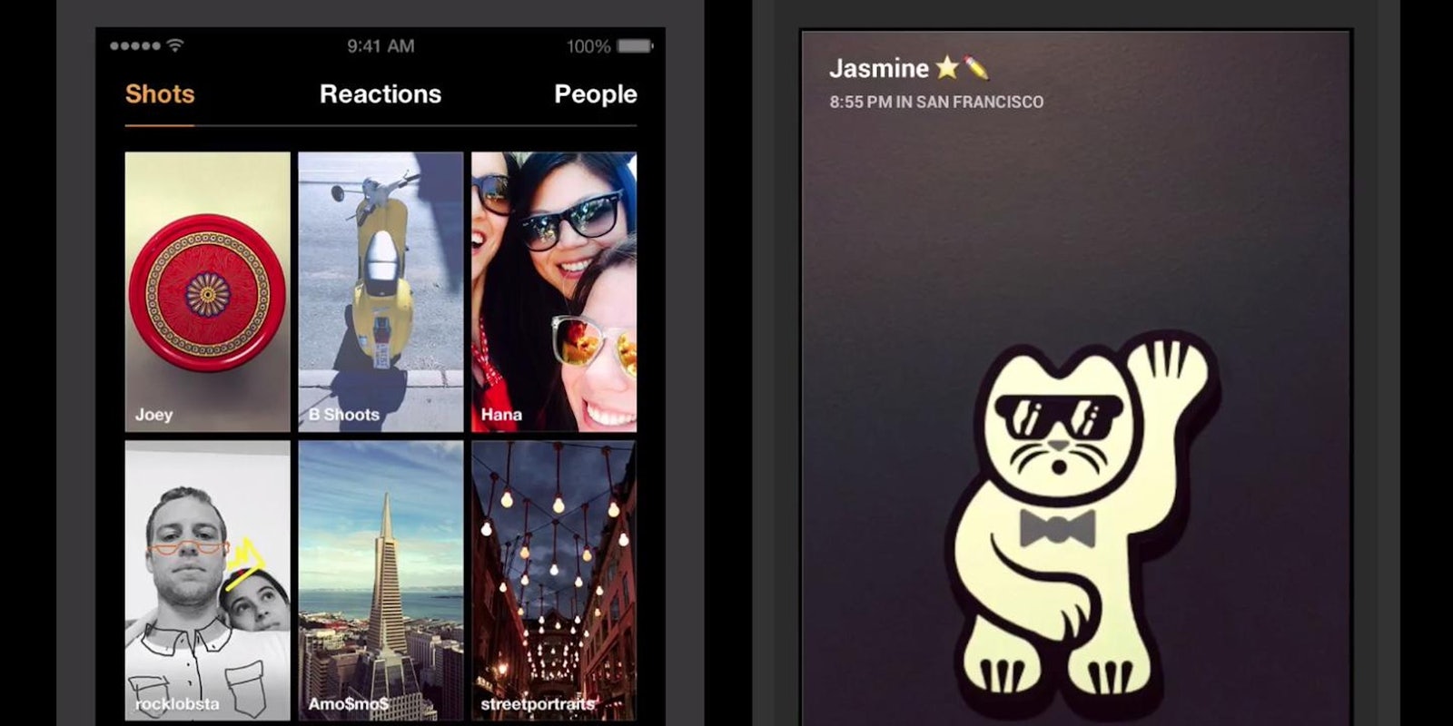
The new version of Slingshot, which bears a not-coincidental resemblance to Snapchat Stories, invites users to share “shots” to a curated area, where they drift around for the next day:
Every time you pull down the camera you’ll see a grid of the most recent content from the past day—shots only stick around for 24 hours or until they’re swiped away. We’ve also made it easier than ever to move between shots, reactions, people and the camera with our new swipeable tab design.
Beyond the Stories-esque feature, the new Slingshot reduces the number of taps necessary to perform basic functions in the UI; lets users filter, draw on, and preview shots they might want to “sling”; and adds an Explore tab to show you content beyond your immediate friend circle.
Like Snapchat, Slingshot is all about ephemeral messaging. Originally, Slingshot required a reciprocal message-swapping relationship before users could read what had been sent to them. Unsurprisingly, that mechanism was a barrier to engagement, and Slingshot lifted the requirement—the app’s only unique feature—in an update two months ago.
All told, Slingshot is now a more thorough Snapchat clone than ever—which means there’s even less reason to use it in place of the real deal.
If you want to check it out anyway, the latest version of Slingshot is available for Android and iOS.
Screenshot via Slingshot/Facebook Creative Labs


