Facebook is freshening up the look of its News Feed with several minor tweaks that add up to a cleaner, more modern user interface.
The company announced the changes in a blog post Monday, admitting it needed to make its platform appear “more conversational and easier to read and navigate.”

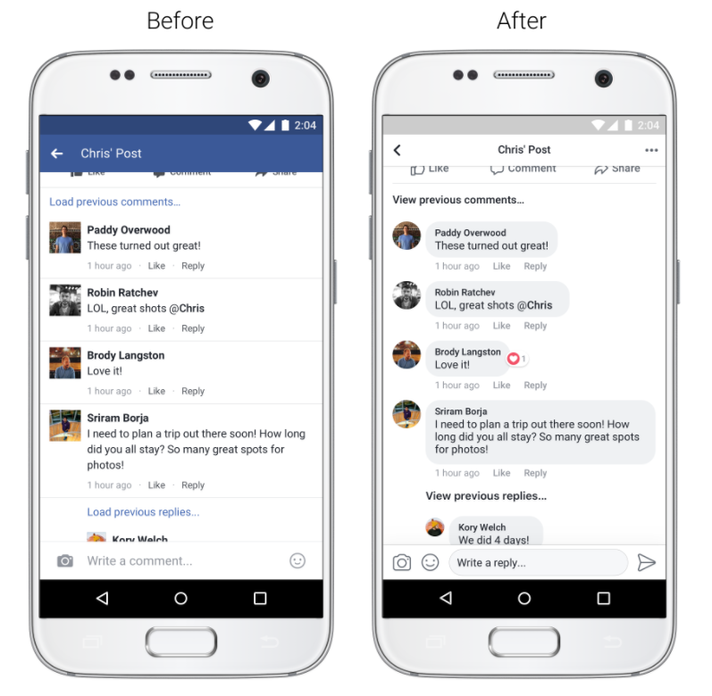
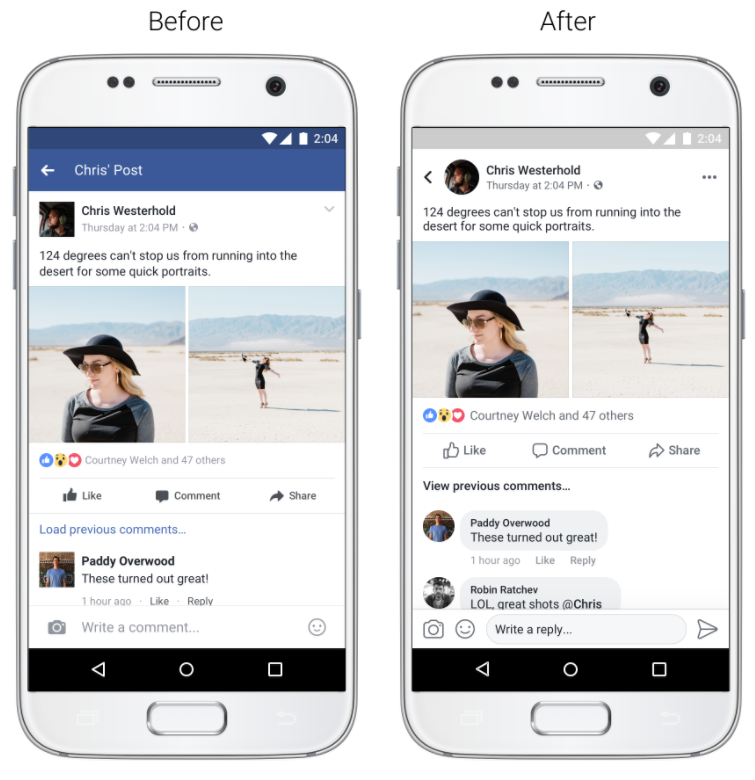
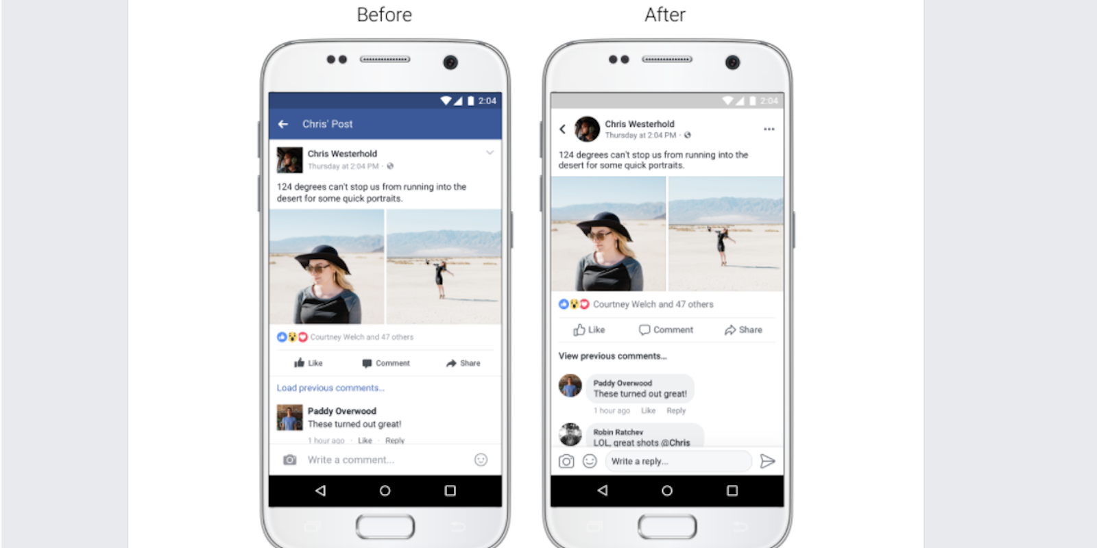
The most noticeable change is to the comments, which now appear as separate chat icons. This makes a post’s comment section look more like a Messenger conversation than a thread of individual replies.
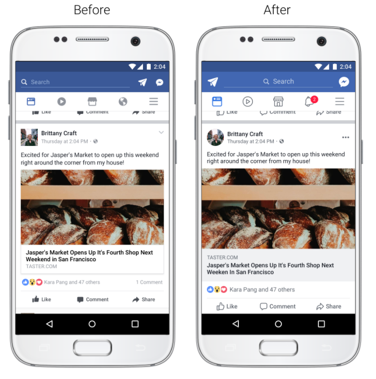
Facebook is also making tiny adjustments to the look of the News Feed. You’ll have to look closely to see the differences, but the general idea was to increase the size of icons and move things around so they’re easier to press. The downside of up-sizing is that you’ll see less content on your smartphone screen at one time.

You’ll also notice the notification icon is now a bell instead of the globe that used to change depending on where in the world you logged in from. I never really understood the globe, but hey, Facebook recently hit 2 billion monthly active users, so what do I know?

Other News Feed changes include an increase in color contrast—the top of your feed will look more blue. And in a very Twitter-like move, profile icons will change from squares to circles, because everyone wants the corners of their face chopped off. The social giant also says users will be able to see where a link takes them before clicking on it.
Facebook plans to release these design updates over the coming weeks.


