Hey, that website everyone forgot about nine months ago finally has an iOS app. Ello, the social network that gained a week’s worth of buzz for not tracking users or displaying ads, unlike its competitor, Facebook, has fallen by the wayside.
Will the release of a mobile app be the start of the Ello renaissance? Probably not, but the app sure is interesting!
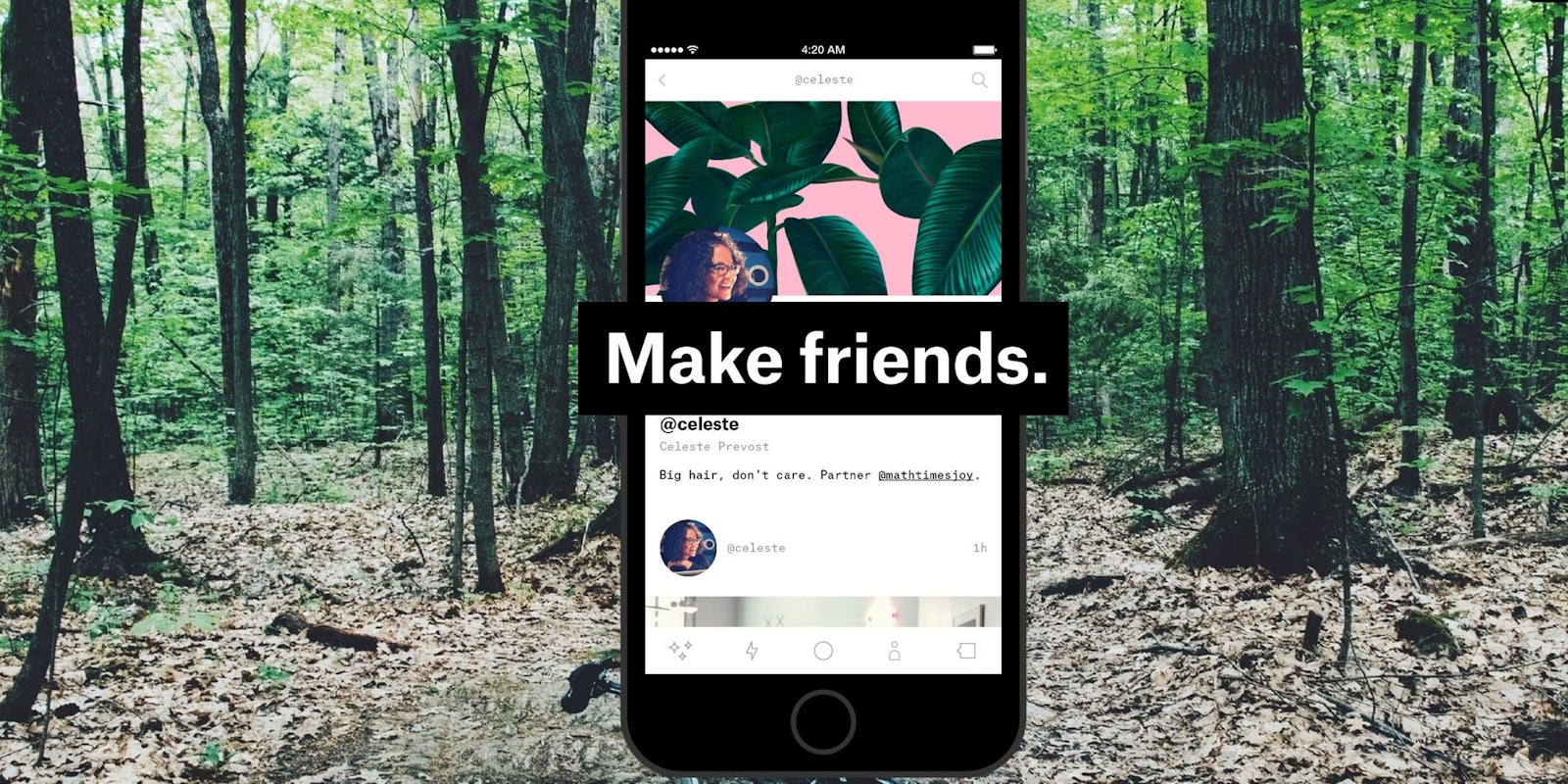
The app keeps the website’s simplistic, black and white design. Most notably, there’s no ads, just streams of content. It’s hard to overstate how refreshing it is to only interact with content without being pestered about buying weight loss pills or a gun.
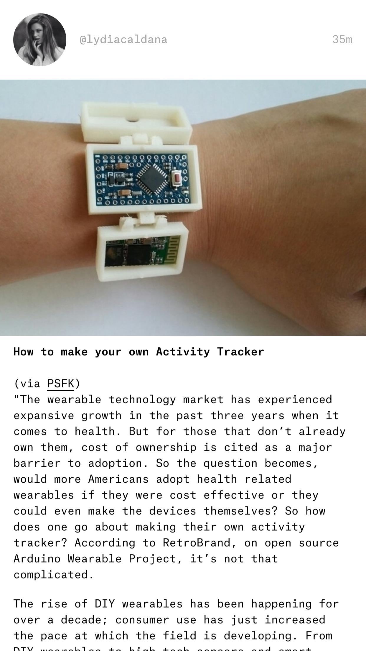
The post view is neat and easy to read. The image takes priority here and stretches past the margins of the text.
The discover tab, almost identical in function to Instagram’s discover tab, serves up text and image posts.
Since its initial launch, Ello has beefed up its features. Users can now comment on posts and “love” content—standard social media stuff.
Really, Ello is just missing one thing to make it one of the perfect social media platforms: users. Without users, the service doesn’t really amount to much. It’s unclear if the release of an iOS app will have people crawl back to Ello, but I’d reckon the app is nine months too late.
Screengrab via Ello


