BY LEX BERKO
Whether public transportation is the bane of your existence, a necessary evil, or your favorite part of modern infrastructure, we all can agree that, at the very least, subway cars and buses make some pretty damn great data visualizations.
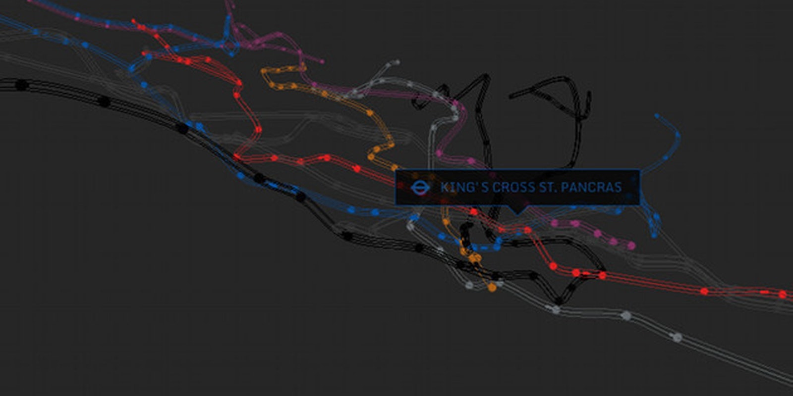
Bruno Imbrizi is the latest developer to add to the already sizeable catalogue of transport visualizations. His project, announced on Tuesday and only known as “experiment 7,” uses data acquired from the London Underground to generate a three-dimensional tube map that is equal parts elegant and disorienting.
Imbrizi’s visualization is fully interactive. Visitors can choose which lines to watch, the speed of the visuals themselves, and the angle from which to view the whole system. For whatever reason, neither the Circle nor the Waterloo and City Lines are available, but it otherwise displays the entire underground based on prediction summaries acquired from Transport for London.
Of his design, Imbrizi wrote on his blog that, “I wanted more of a cool visualization based on the tube data, rather than an informative/useful map.” His goal was to do something new. Originally, his plans included creating an auditory component to his visualization. “I could assign a different note for each line and the live feed would create random music all day long,” he wrote. Unfortunately, he quickly realized this wasn’t possible and changed course.
However, Imbrizi’s sonification idea has been touched upon before for other cities. A two-year old visualization created by Alexander Chen, Creative Director for Google New York’s Creative Lab, uses a similar idea to turn the New York subway system into a virtual stringed instrument, even mimicking the vibration of strings as lines traverse one another.

Alexander Chen’s Conductor.
Chen’s visualization, called Conductor, begins with real-time data. At whatever time the page is opened, the viewer will see trains operating as they are at that very moment. Conductor then speeds up to cover the twenty-four hour loop of subway cars as they move on their pre-determined paths. It looks like a more vivacious version of Snake.
Read the full story on Motherboard. Screenshots via Lex Berko


