As launch day for the Apple Watch creeps ever closer, the Cupertino company seems to think its new wearable will be so revolutionary that we won’t know how to use it right away. To remove any confusion before your 15-minute in-store appointment, Apple is releasing a series of “guided video tours” that show off how the Apple Watch will work.
There are currently four tutorials/promotional videos up on Apple’s website, with seven others labeled as “coming soon.” It’s the best glimpse we’ve received so far at the Apple Watch up close and personal. Here’s what we learned.
Force Touch and the Digital Crown are key for navigation
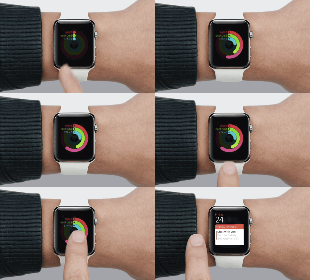
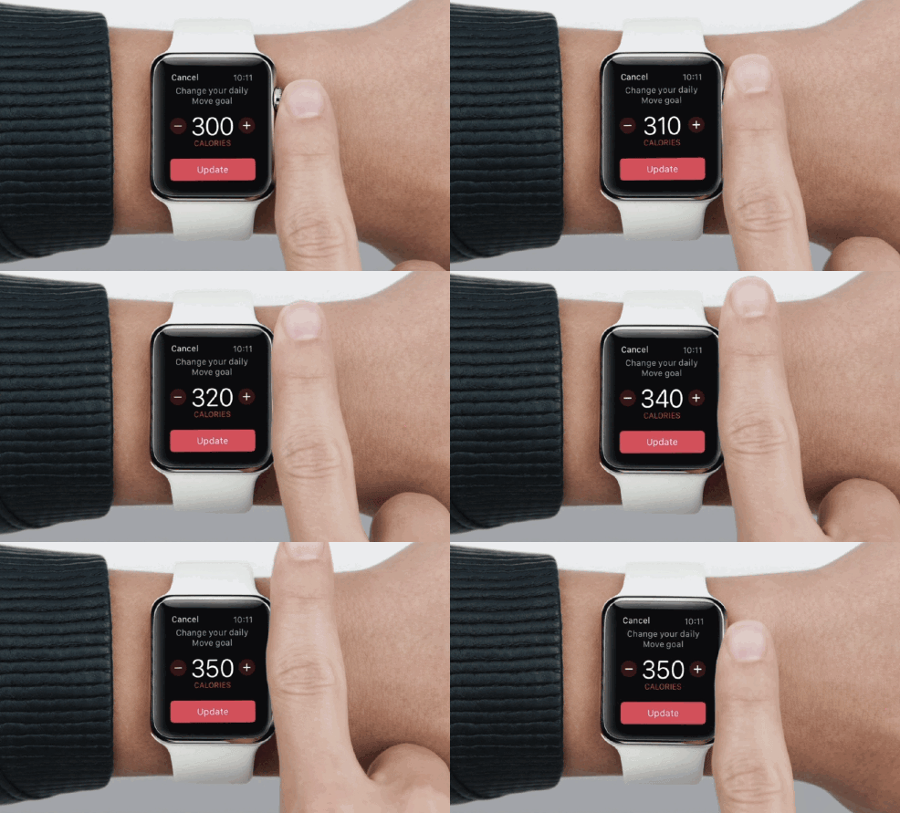
The Apple Watch has a touchscreen, which generally means that everything will be done with a swipe or a tap. Inputs are a little different on the Apple Watch, though.
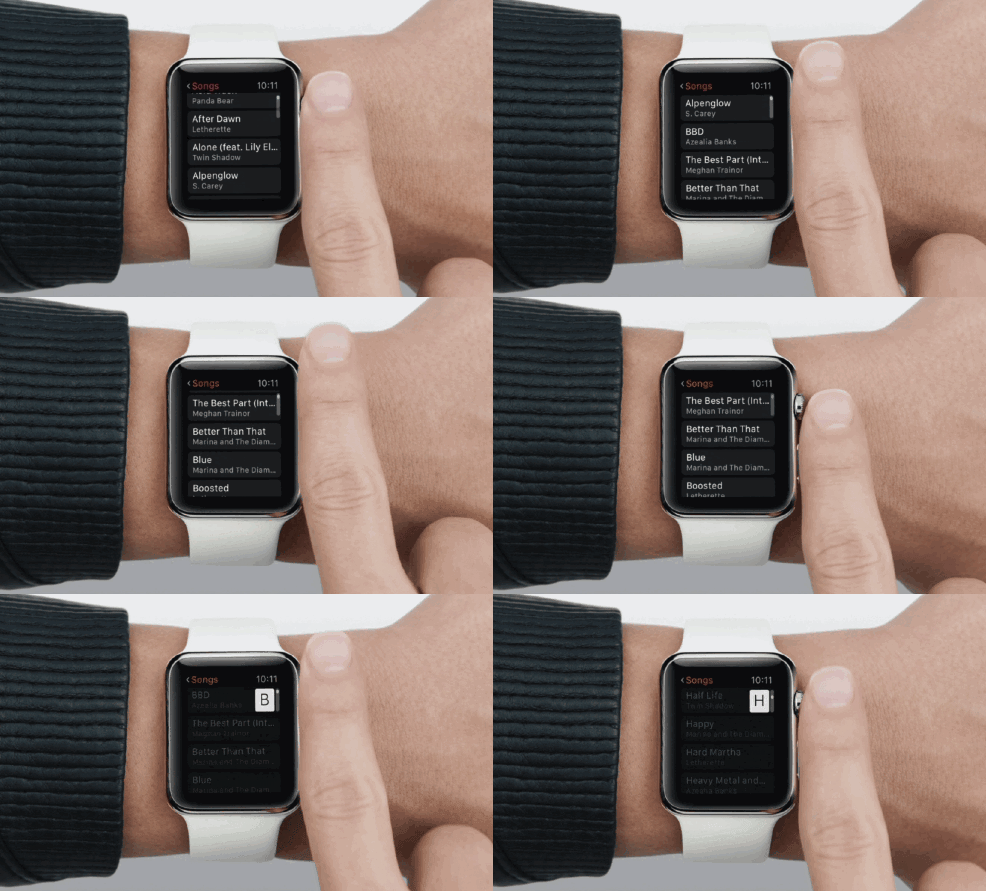
Using the Watch face purely as a touchscreen would block content (not that you have fat fingers, they’re totally normal! Stop worrying about it) so Apple placed the “Digital Crown” on the side of the device to help handle navigation. It gives the Apple Watch a more authentic feel by maintaining the design of a standard watch, but it also will serve to handle movements like scrolling through feeds. It’s basically the click wheel from the iPod revised. It can also be pressed to select content, return home, or call upon Siri.
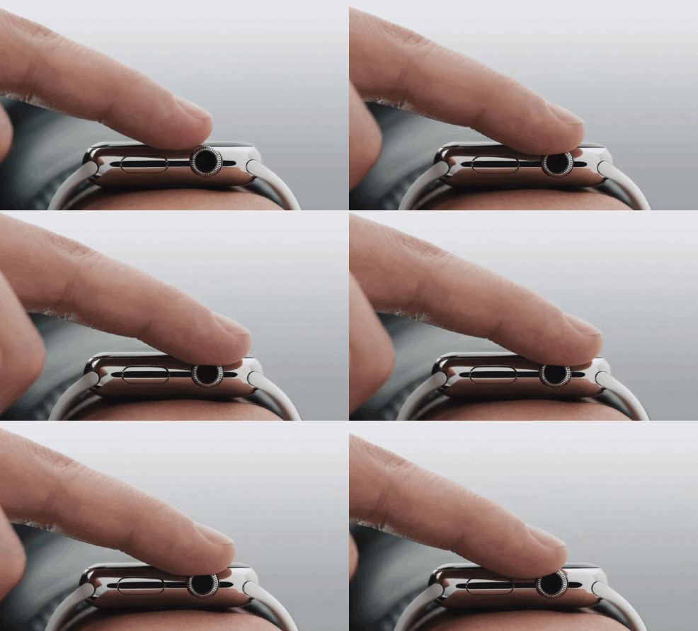
Apple’s new favorite term, Force Touch, is on full display with the Apple Watch as well. The pressure sensitive press, which was shown off with the new MacBook’s trackpad, is put to full use on the wrist. A firm press on the screen brings up hidden opens. Press down and hold for a beat in Apple Maps to bring up a search or in Messages to reveal reply options. It appears it’ll be an integral part of interacting with the Apple Watch, and Apple is banking on it feeling like a natural gesture.
Animated emoji will weird you out
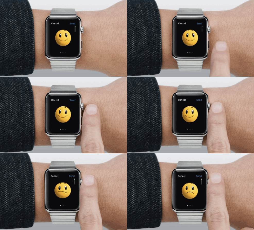
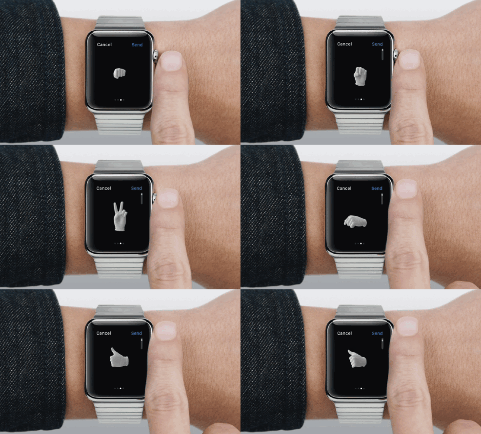
Apple is in the mood to reinvent just about everything on the Apple Watch, including tried and true features. Emoji are pretty young in the lexicon of communication, but they are an institution; everyone recognizes emojis. Still, Apple has given them a (possibly unnecessary) facelift on the Apple Watch, turning them into 3D, animated characters.
Everything from the familiar faces to hands recreating a variety of gestures now appear with an extra dimension that wipes out much of their usual cuteness. They look kind of weird and less shareable, as they seem like a standalone reply rather than something added to the end of a message. Also, the hands look like they’re permanently covered by a Michael Jackson-esque white glove. It’s all very odd.
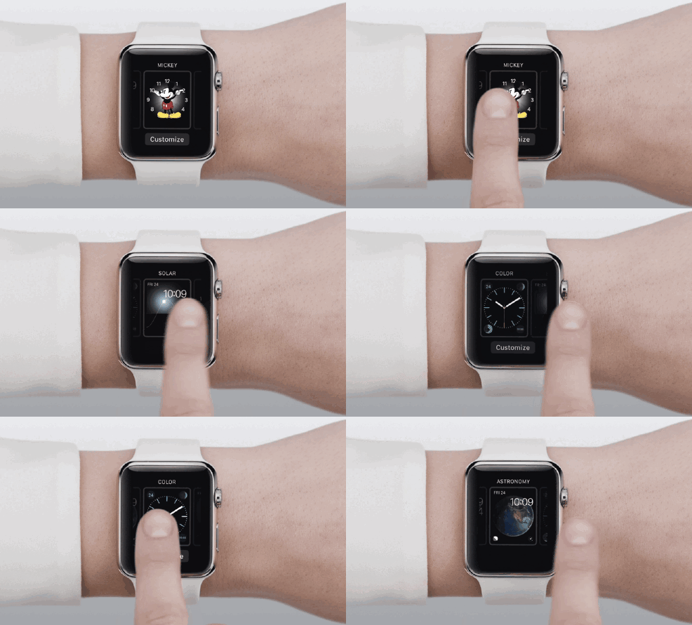
The Watch Face is extremely customizable
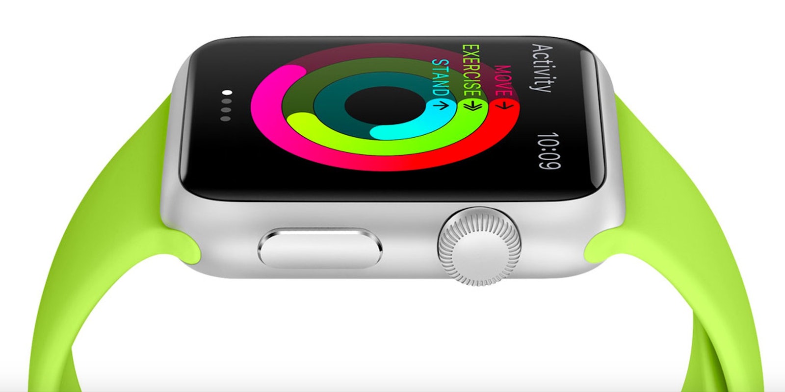
The watch face is kind of forgotten in the rush of features that we don’t typically see on a watch, but it’s basically the homescreen of the Apple Watch. It’s displayed by simply raising the watch to your face, and disappears when you aren’t holding it in a position that you can read it.
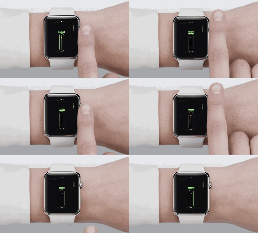
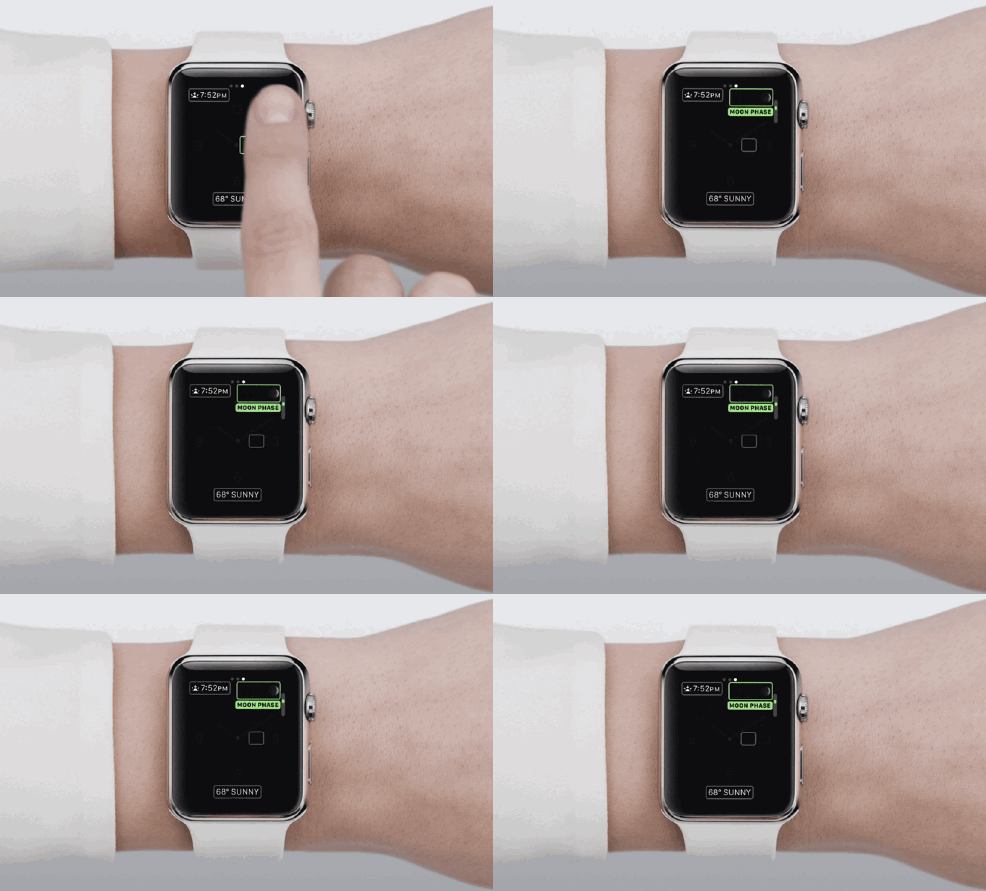
The watch face is also entirely customizable, with a wide variety of style choices that can be further modified to fit your sensibilities. The face can be changed at any time with a force touch on the current face, which leads users to a gallery of alternative options. Users can scroll through additional detail, colors, and periphery information like temperature, calendar events, or moon phase.
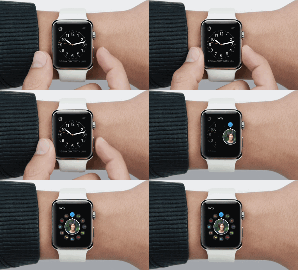
There’s a button just for your friends
There’s a button on the Apple Watch that Apple hasn’t taken much time to talk about. It doesn’t even have a name for it. Sitting just below the Digital Crown, the button takes you directly to your favorite contacts. Arranged in a circle, you can scroll around to the person you want to talk to and immediately find different ways to connect, including calling and messaging.
Digital Touch is the new poke
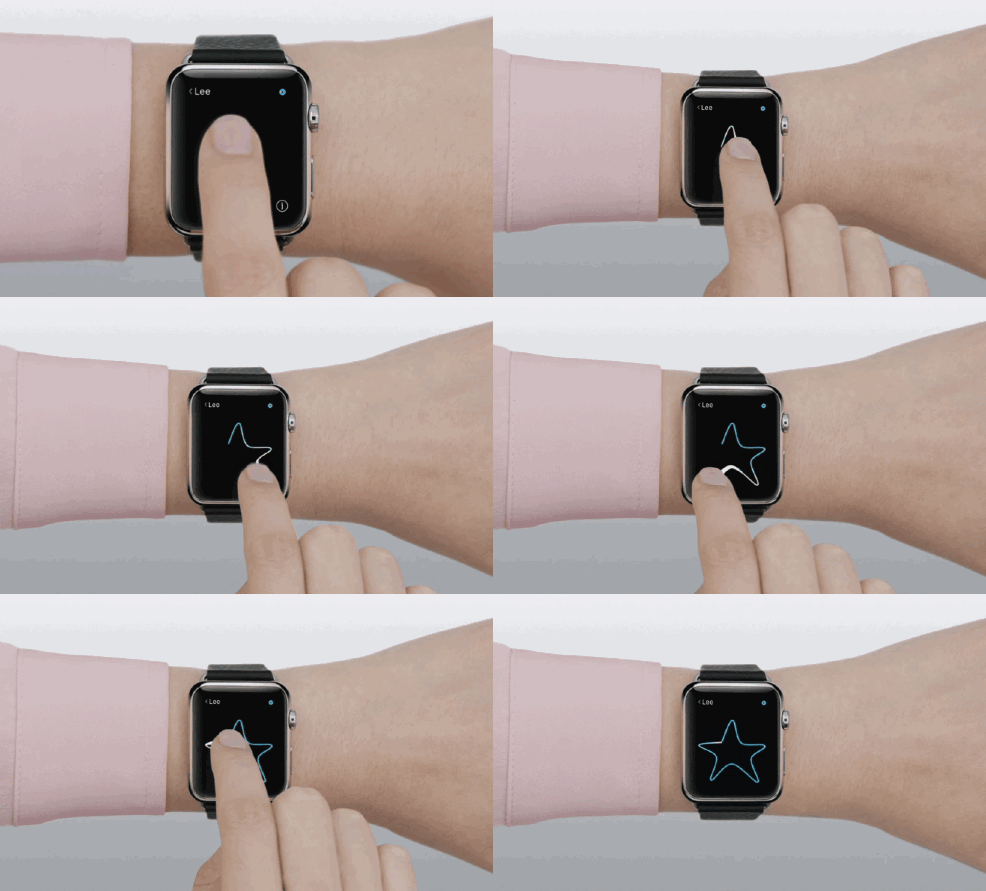
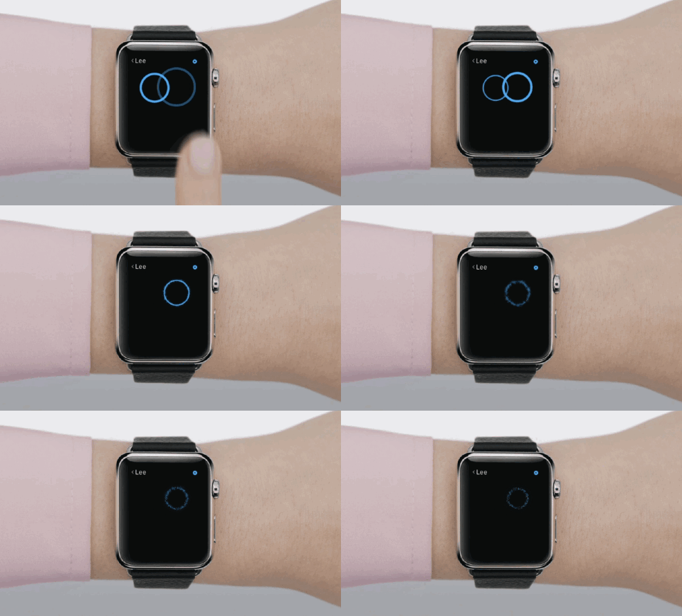
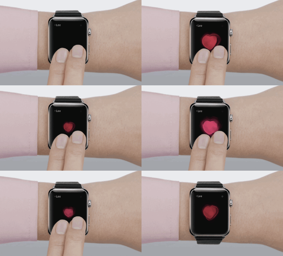
The other way to connect with friends and fellow Apple Watch owners is the new Digital Touch. It’s been shown off a little by Apple, but the preview video is the most in-depth look at it so far.
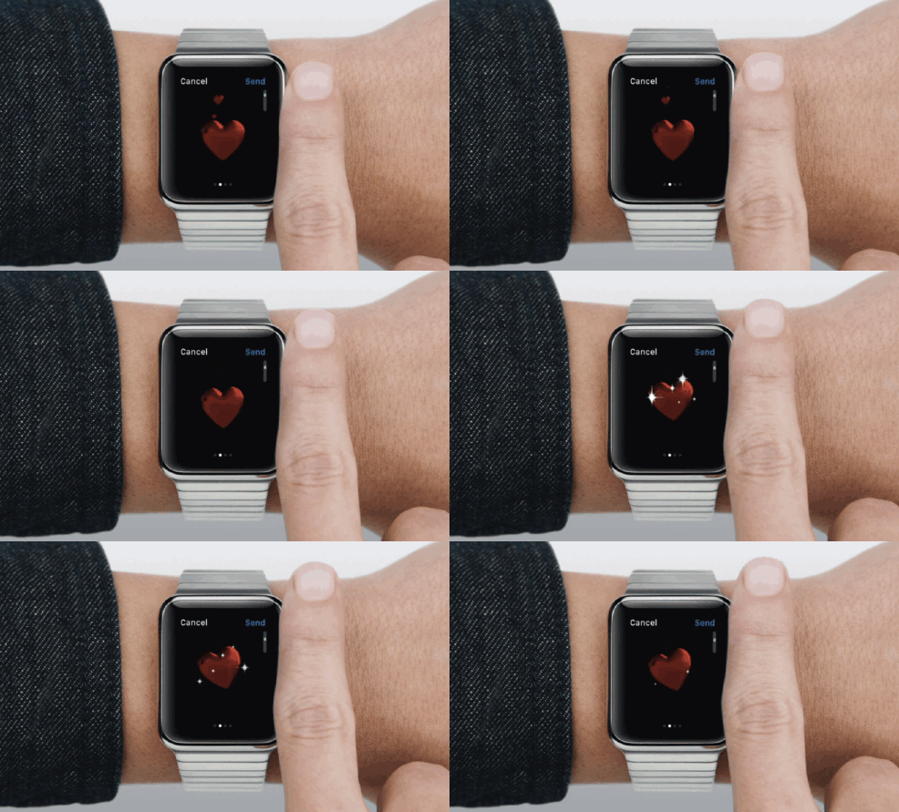
Digital Touch allows users to communicate in new ways that aren’t entirely useful. There’s the sketch feature, which can be used to send off quick drawings and will likely be used almost exclusively for drawing penises. Then there’s the heartbeat message, the strange and intimate feature to share your pulse with someone. Lastly, there’s the tap. Touch on the Apple Watch’s face and the tap pattern will be felt on your friend’s wrist. It has all the potential to go from fu to annoying, just like Facebook’s Poke did.
Photo via Apple

